
 ButterflyCannon have developed the brand story and designed the brand identity and packaging for Hawthorn’s London Dry Gin, which has just launched in the US and UK.
Hawthorn’s brand story is inspired by the CEO’s grandfather, who began distilling his own great tasting gin whilst serving in the British Navy. During his shore leave, he would often recount his favourite tale of “being sunk three times but never getting his feet wet”, whilst sipping his latest batch, appropriately enough, “on the rocks.”
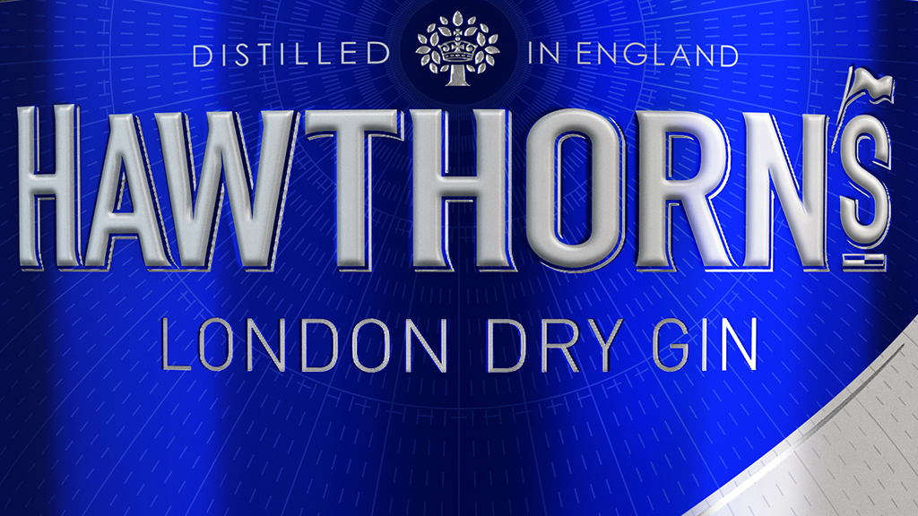
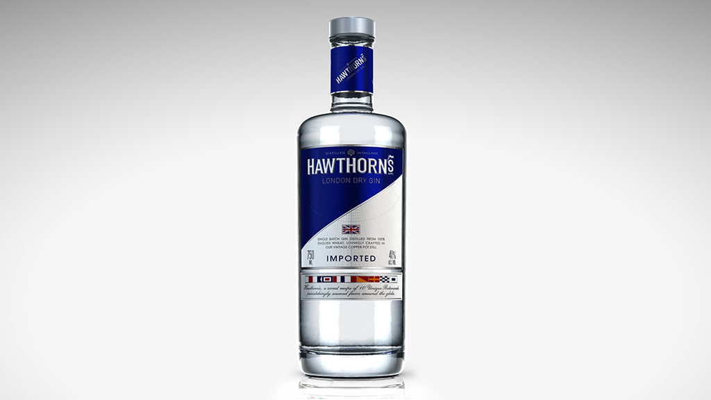
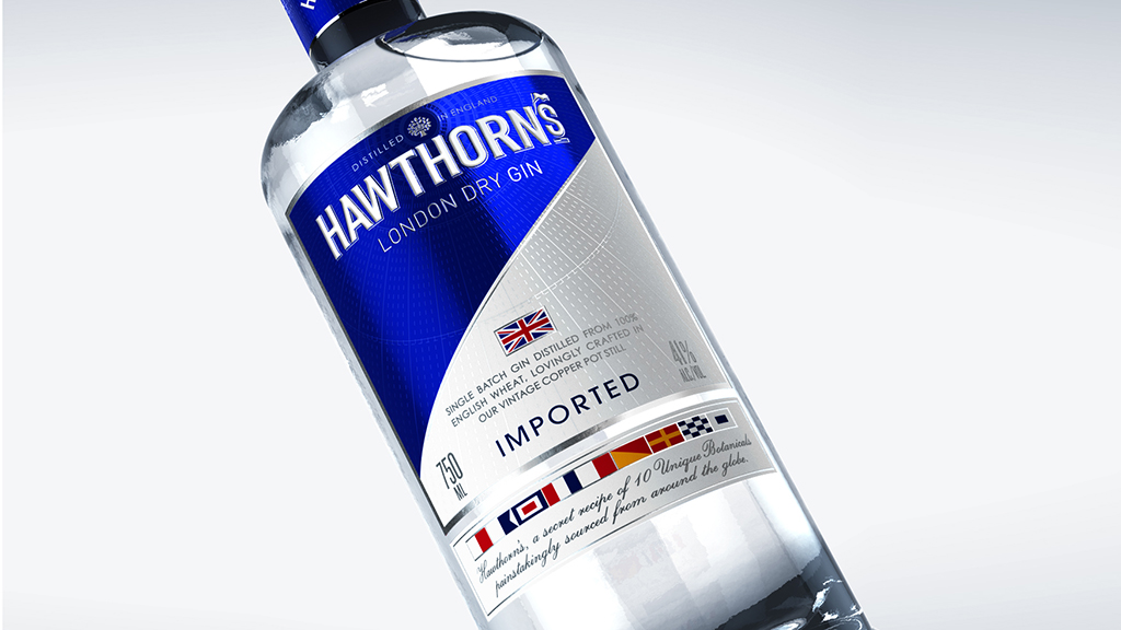
The brand’s naval heritage informs the design of the packaging, with a blue and white, flag inspired split label designed to create strong standout on shelf, whilst an additional row of nautical signal flags spelling out H.A.W.T.H.O.R.N.S on the secondary label gives an extra layer of discovery for those in the know.
Hawthorn’s is a gin distilled with 10 unique botanicals, painstakingly sourced from around the globe. The packaging reflects this seafaring aesthetic with multiple levels of craft and detail, such as subtle varnished lines of longitude and latitude radiating from the logo, which evoke voyages to exotic locations in search of the perfect botanicals.
 “It was a great privilege to work with 180 East. Defining a brand’s story is always an exciting and challenging brief, and our team have managed to create a striking yet premium identity, perfect for Hawthorn’s positioning,” says Jon Davies, ButterflyCannon creative director.
Hawthorn’s CEO, Will Turnage, adds “when I came to ButterflyCannon, I was immediately impressed with how quickly they got to the heart of my brand’s story and then subsequently translated this into a compelling visual identity, that was exactly what I needed to successfully launch Hawthorn’s London Dry Gin.”
You must be logged in to post a comment Login