
 Coca-Cola has finally unveiled its year long efforts to come up with a new packaging and branding, which will unify its drinks under a “One Brand” concept.
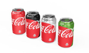
The brand identity consists of a ‘Red Disc’ visual element. Vice president of global design, James Sommervielle explained, “Originally, [the Red Disc] was first painted on advertising in the 1930s, 10 years after, in the mid ’40s, it was first used as a signage system in retail stores to signify to the public this is where you buy a real Coca-Cola.”
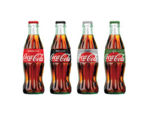 The Red Disc will appear on the cans of the original Coca-Cola, Diet Coke, Coke Zero, and Coke Life, which covers most of the body, while on the bottles it will look like a rising sun. It will also have different proportions and placements in advertisements.
While the packaging will not be identical around the world, the disc and the colour red will be universal. The cans will also retain its own unique sub brand colour, which will spread to its tab or bottle cap.
Sommerville also said, the full global rollout will not be completed until 2017.
You must be logged in to post a comment Login