
– Simon Pendry
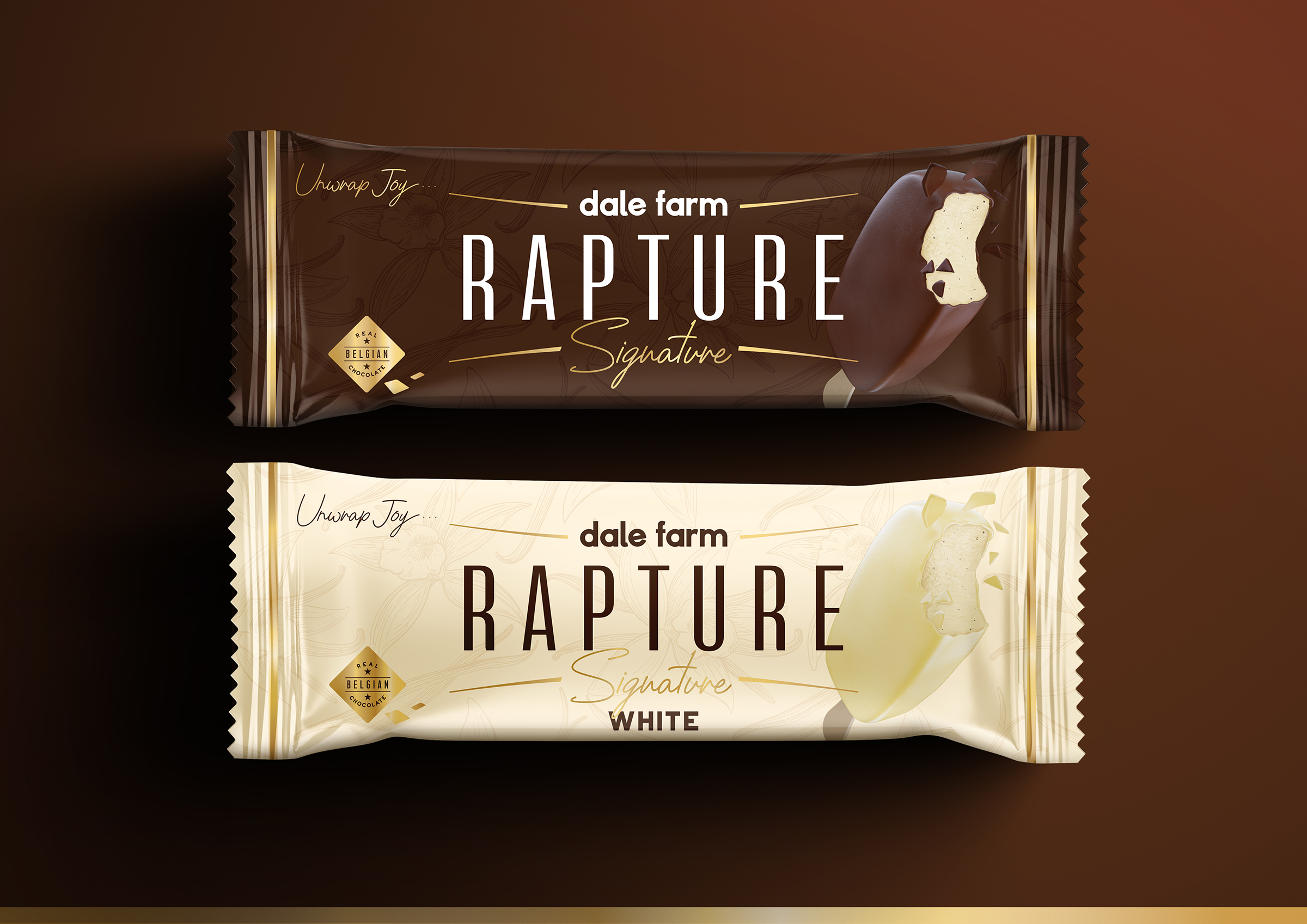
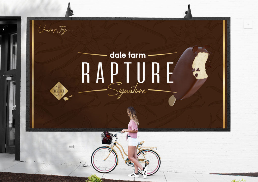
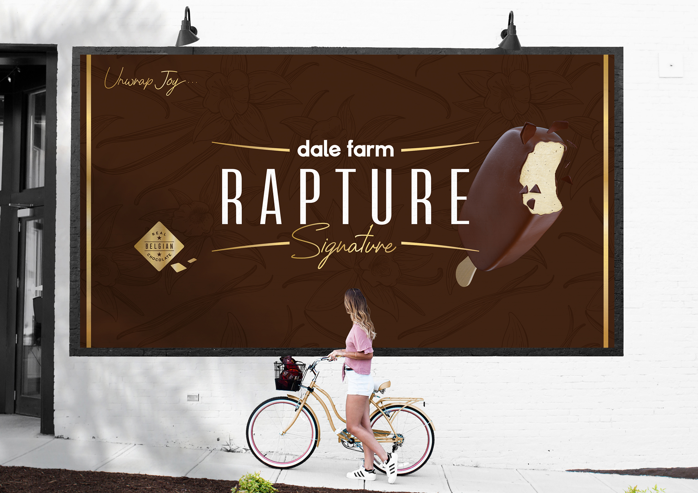
We were asked to redesign Dale Farm’s Rapture, their most indulgent ice cream bar range… and a brand with a heart full of goodness. This range of deliciously creamy dairy ice cream bars are wrapped in the finest thick Belgian chocolate, and are made with the most indulgent of ingredients.
The previous packaging design was very dated and generic, and the brand name acted as an apologetic manufacturer’s marque rather than a proud brand. This approach almost disguised the brand as a private label offering.
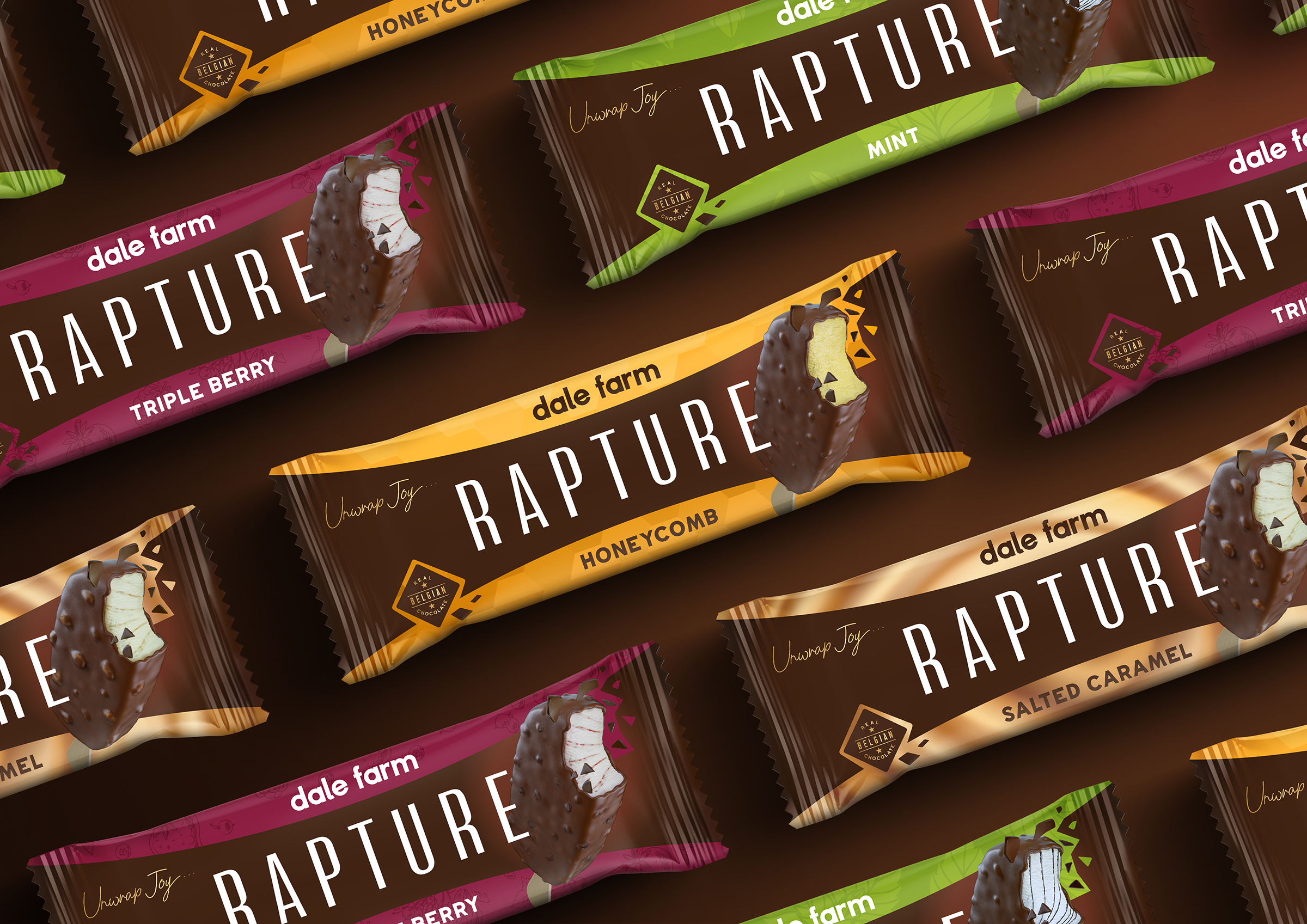
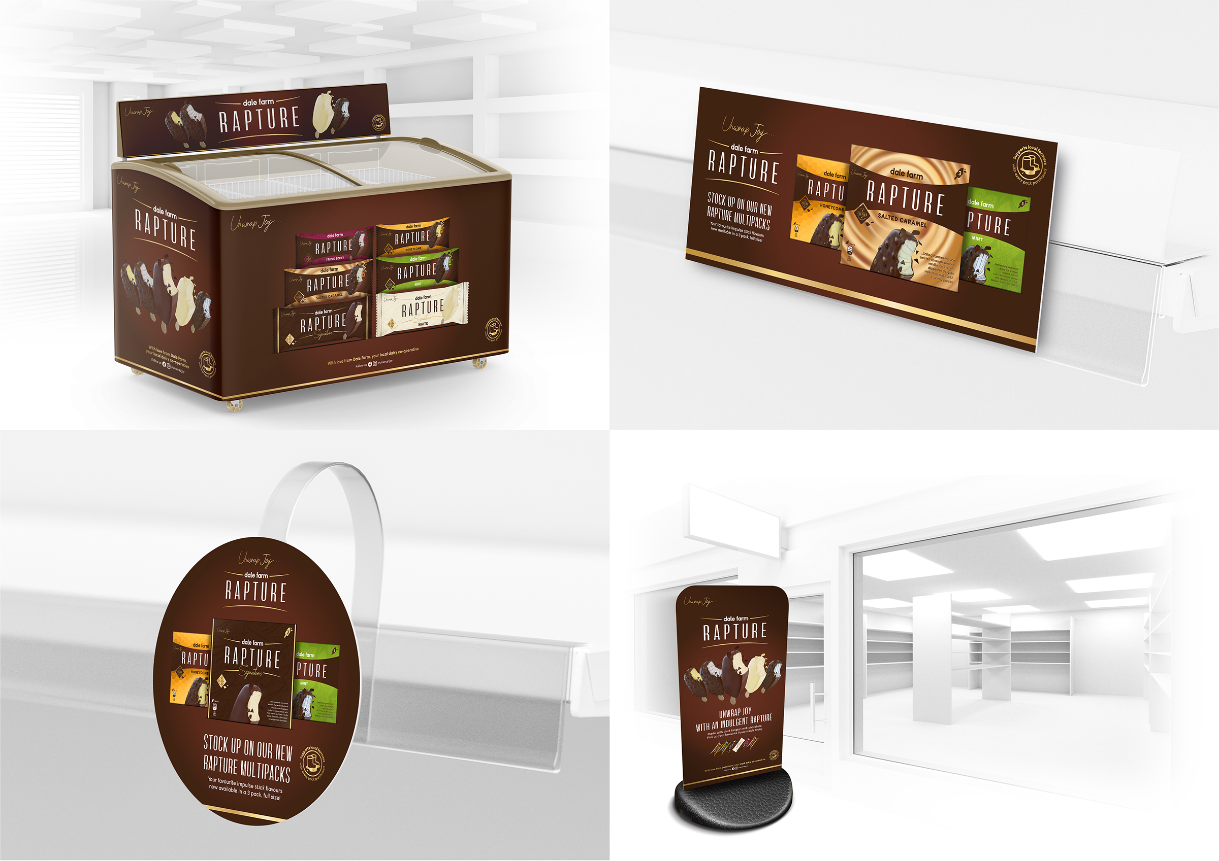
Our approach was to give the brand back its confidence, delivering a strong brand block in the freezer to aid findability, utilising a cracking chocolate band that visually speaks to the product experience of biting into a Rapture with its cracking thick chocolate casing.
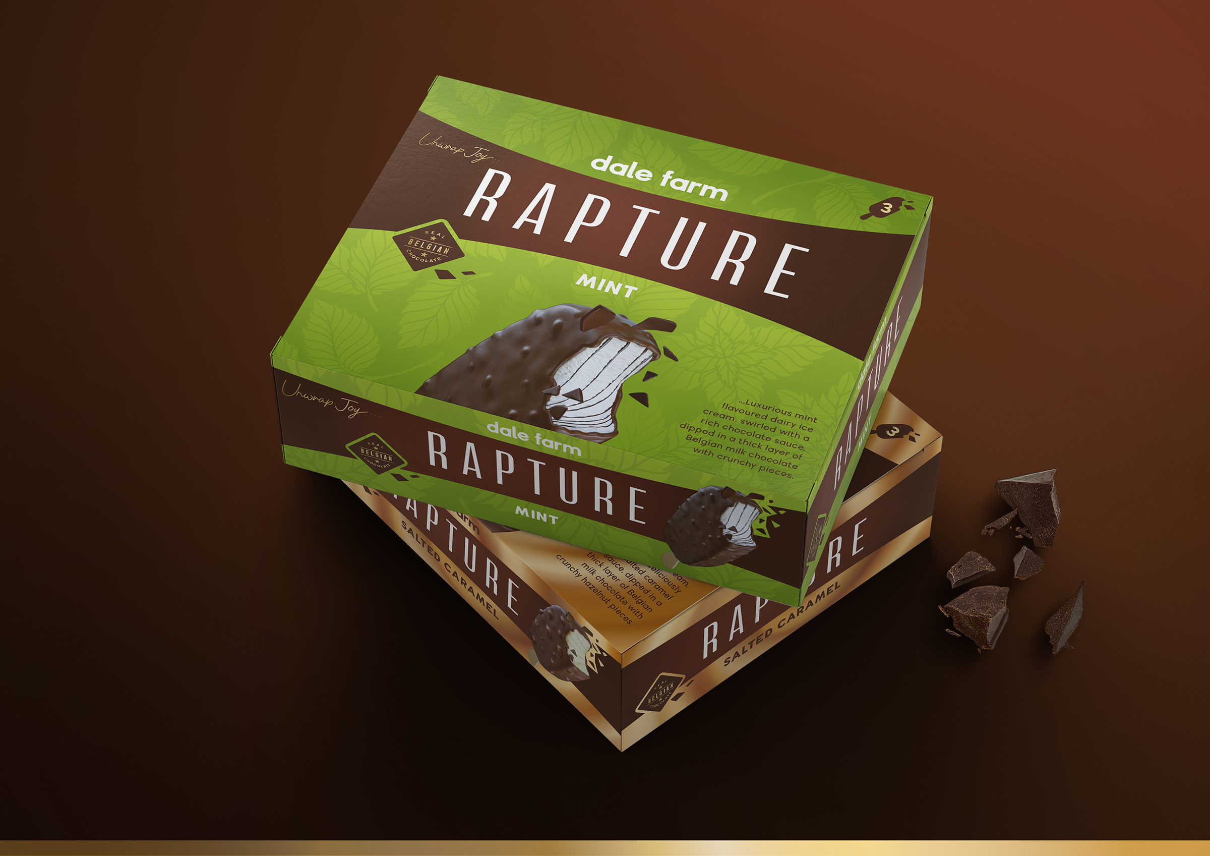
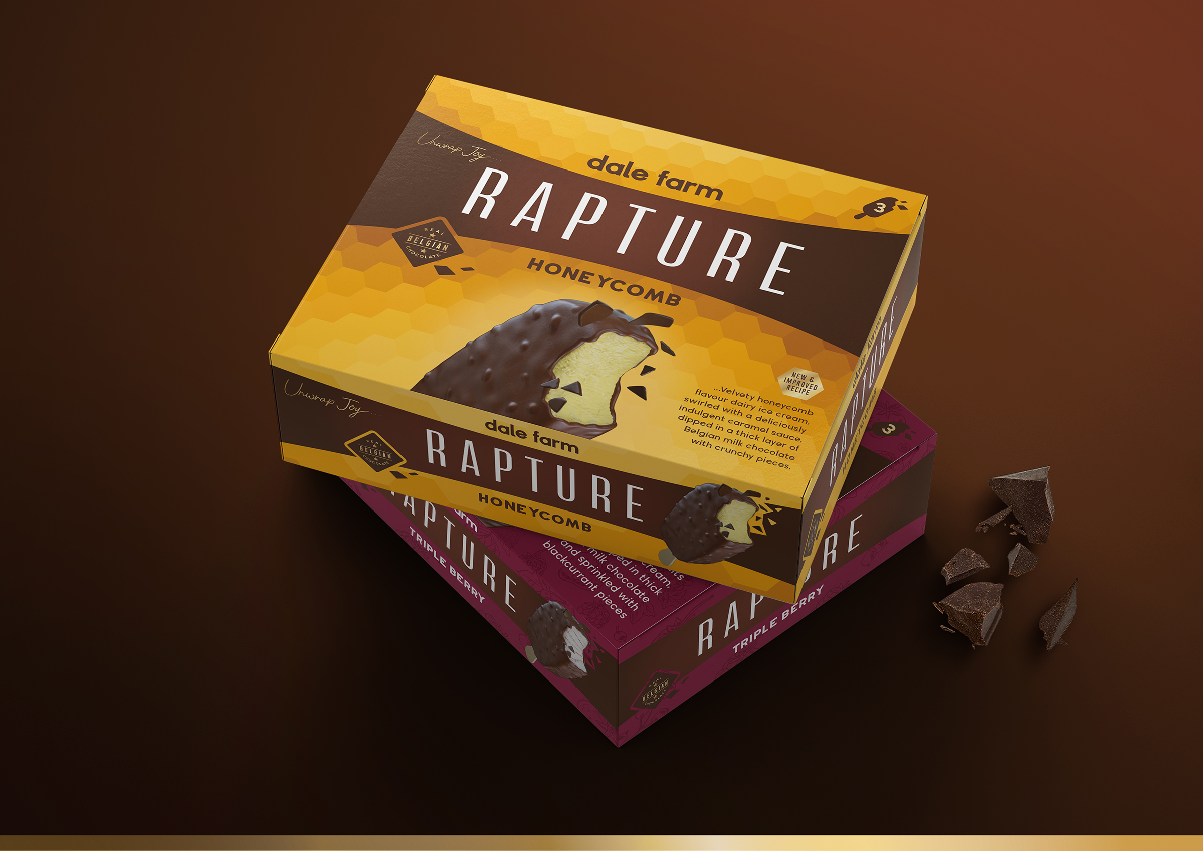
We further hero the Belgian chocolate, by highlighting it in a consistent device across the range, and by bringing the product shot of the bar to the forefront to reassure on taste. The variants are then clearly depicted with vibrant coloured changing backgrounds, so navigation through the range is now greatly simplified.
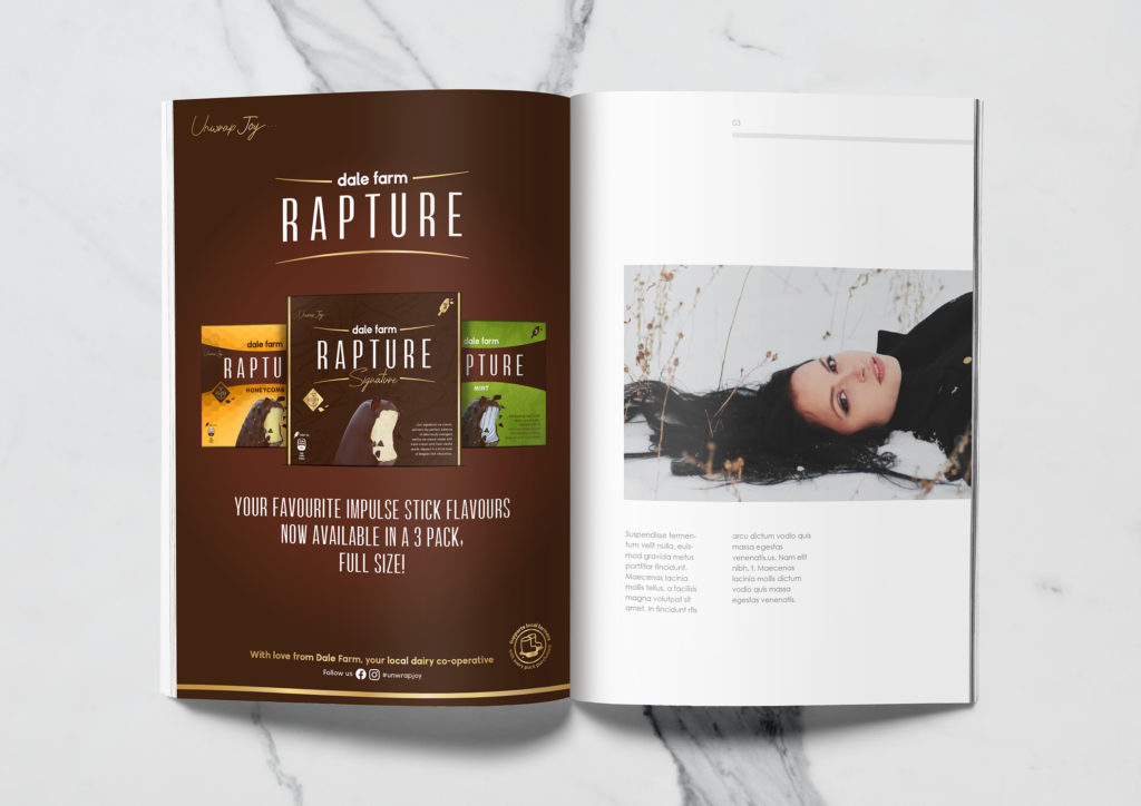
The creation of a ‘Signature’ range for the milk chocolate, and white chocolate variants highlights them as the pioneering original flavours that will always be the classics.
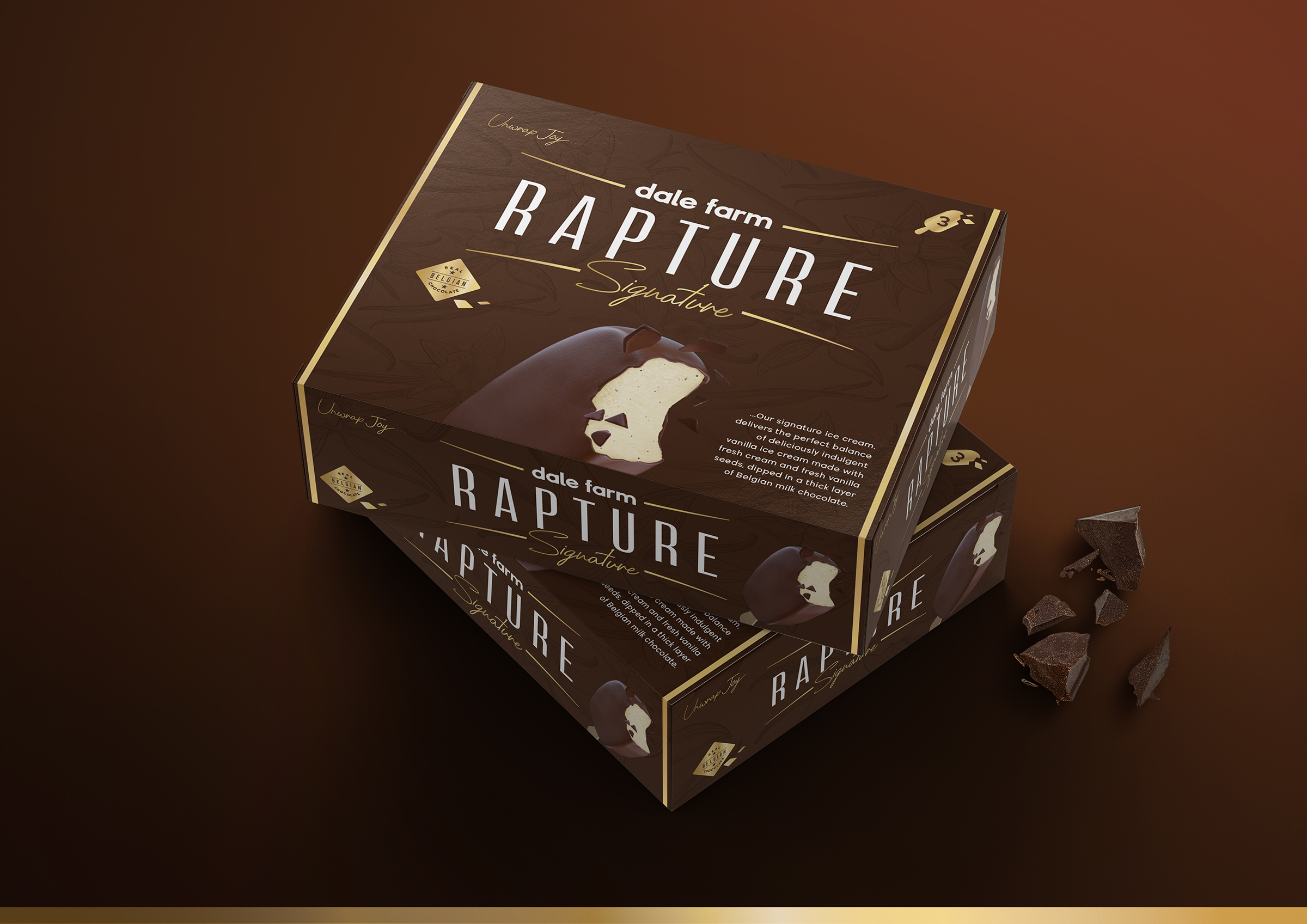
The brand of course extends into in-store multipacks that give us a bigger canvas to talk about the variants, and a suite of holistic point-of-sale items were also created to communicate with one voice to the consumer at shelf.
#UnwrapJoy”

mockups-design.com 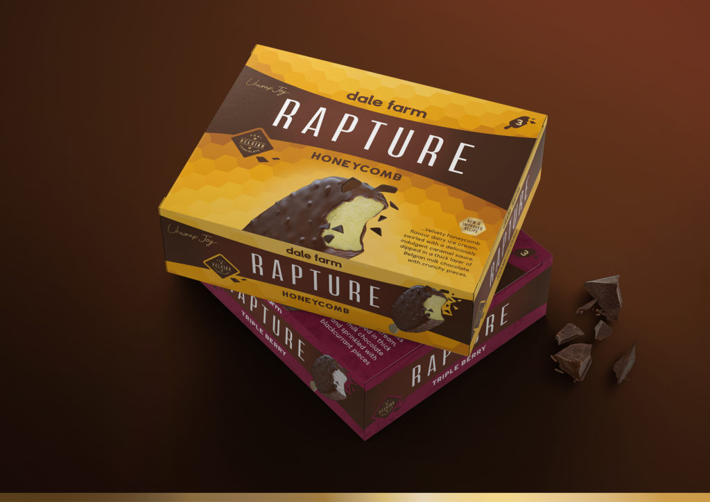
mockups-design.com 


Source: Simon Pendry
You must be logged in to post a comment Login