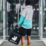
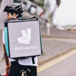
 Food delivery company Deliveroo has rolled out a new brand identity, refreshing the logo, wordmark and providing an equipment refresh to help its its riders (more often than not cyclists) stand out more on the street.
Branding agency DesignStudio worked with the company to deliver a new minimalised kangaroo logo, conceiving hundreds of possible entries.
Eventually, the sharpened Roo was settled upon however: “What we landed on was an evolution from our original and more literal take on the kangaroo, turning it into a striking new mark bold and impactful, but still maintaining the character and charm of the Roo,” DesignStudio explained on its blog.
 Additionally, company chief executive Will Shu echoed that the new identity and equipment will “increase our riders’ safety” due to the brightly coloured, hyper¬reflective kit, art direction.”
On sharpening the ‘Roo’ to make it more memorable and mobile-friendly, the design team said: “What we landed on was an evolution from our original and more literal take on the kangaroo, turning it into a striking new mark bold and impactful, but still maintaining the character and charm of the Roo.”
 A new wordmark also emerged from the rebrand.
A big part of the move was to increase the safety and visibility of delivery riders who give the brand presence in the physical word – now they will wear “hyperreflective material on the waist, shoulders and wrists of the jackets” to help them stand out.
The startup is looking to expand its appeal in its home market, the UK, having been founded in 2013. It recently implemented alcohol deliveries partnering with a number of independent brewers including Brewdog and Majestic to expand its offering.
Couriers will likely welcome the new safety measures having recently protested against Deliveroo’s payment scheme, which was accused of being sub-minimum wage, in August. Shu apologised, naming his staff the “life-blood” of the company and tabled a new offer.

Source: The Drum


You must be logged in to post a comment Login