
Grand Central, an independently owned chain of American restaurants, required a refocused brand approach. The brand’s aim was to reflect an independent spirit and a broader menu offering that would encompass the whole of the Americas, to attract more experimental diners.
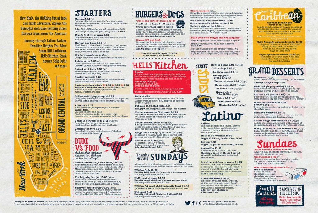
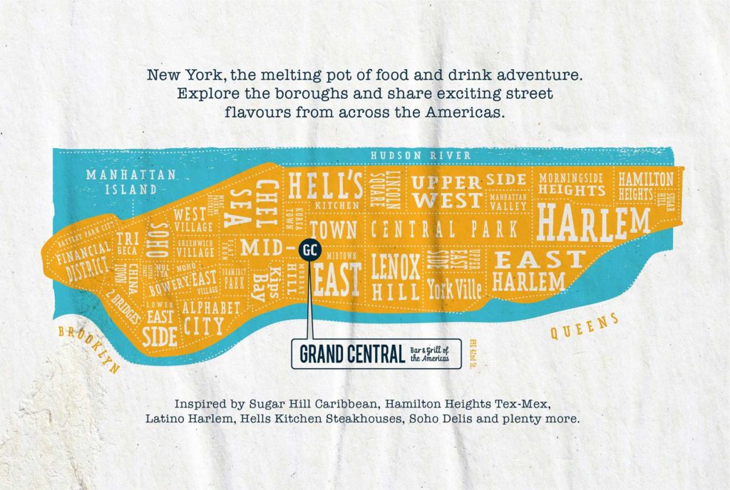
They approached design experts Eat With Your Eyes, to carry out this vision and they took New York, Grand Central’s existing North American base, and developed a new positioning to encapsulate the passion, energy and colour of Manhattan’s diverse Latin food communities.

The new identity evoked the horizontals of Manhattan but stretched down the Americas. The new strapline sums up the offer clearly. A map of Manhattan, along with a positioning statement, was developed to help customers and colleagues get much deeper into the foodie experience.
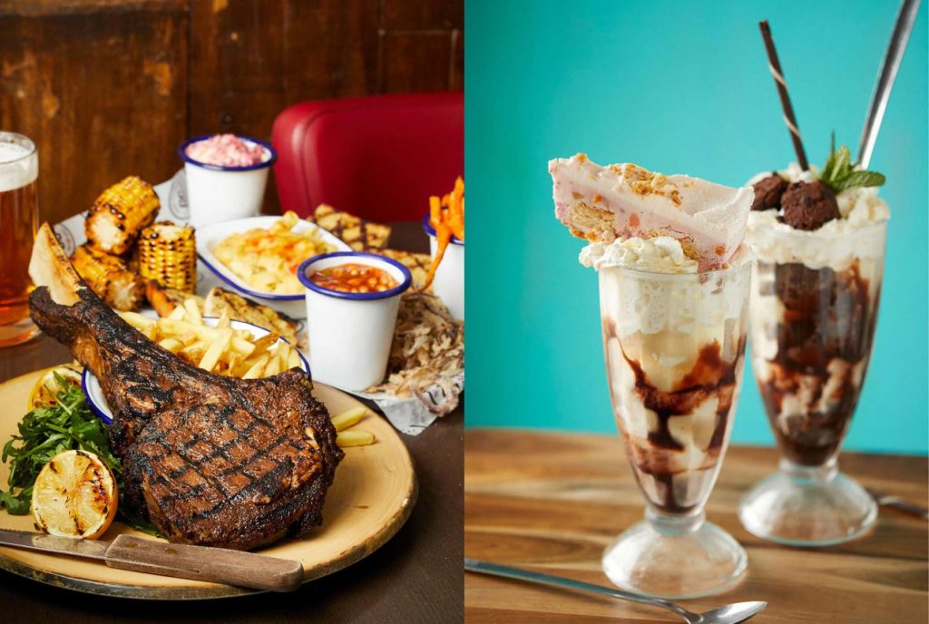
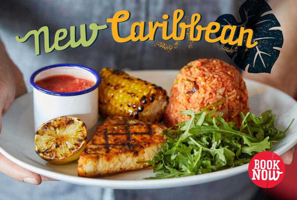
Hand drawn typography, loud colours and bold messages evoke the new spirit. It’s all about looking and feeling energetic, handmade, creative, playful, casual and social – a street food approach. The design house shot a set of core photos that sum up the diversity of the food and drink, designed all menus and social media assets.

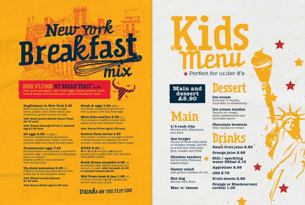

Source: Eat With Your Eyes

You must be logged in to post a comment Login