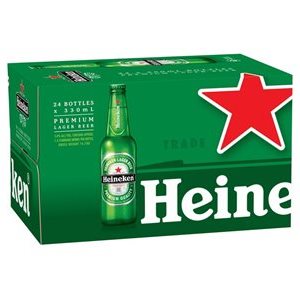
 Global beer brand Heineken have launched a new contemporary packaging design across its consumer six pack, and 24 pack varieties.
The new packaging features the brand’s iconic red star as a prominent feature on the front of each carton, symbolling quality and style, while maintaining Heineken’s status as a progressive and premium international beverage.
The new design enables consumers to instantly recognise the brand, serving as a powerful tool for fast purchase decisions.
Nada Steel, marketing manager at Heineken Lion Australia told Food Magazine that the brand’s new packaging design has been created to further stand out in a competitive marketplace.
“Our packaging design has evolved to provide a premium eye-catching product to ensure Heineken stands out amongst a competitive market.”
“The average shopper is spending 30 seconds in the cool-room. With Heineken’s new packaging design instantly standing out, we hope to deliver superior basket size and increased margin for our retailers.”

You must be logged in to post a comment Login