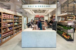
 Panzer’s Deli & Grocery in St John’s Wood, London has unveiled a refreshed brand identity by Here Design. A local institution and household name since opening in the 1940s, Panzer’s Deli & Grocery offers international foods from more than 80 countries around the world and is particularly famous for its smoked salmon and warm bagels.
Launched by original joint-owners, Czech and Austrian duo Panzer and Vogel in 1944, over time Panzer’s has amassed a loyal following of local customers and following its recent reopening has quickly been established as a London food destination.
Reinventing a Local Institution
Despite a devoted customer base, when Panzer’s Deli & Grocery was bought by entrepreneur and businessman David Josephs in 2014, there was little dispute that a modernisation of the décor and identity was needed.
 Here Design worked closely with architecture practice Holland and Harvey to revitalise the brand, introducing an updated visual identity that complements its new bright and clean interior design, and speaks to the rich heritage of both the original founders and the dedicated Panzer’s following.
Rebranding Without ‘Branding’
The challenge was to present a more modern identity without alienating the existing customer base so Here Design approached the brand refresh with a very light touch. As a longstanding figure in the St John’s Wood community, Panzer’s Deli & Grocery has a depth of story that is rare in modern retail, offering a wide library of content for Here Design to draw from.
 Here Design moved away from the simple serif of earlier years to a bespoke hand-drawn logotype, taking inspiration from 1940s Austrian street signage in a nod to the original owners’ Jewish heritage. This logotype is then paired with a clean sans serif typeface to modernise the brand language.
The wider identity incorporates this legacy but with a fresh, modern take, pared back and refined in a subtle interpretation of the institution’s nuanced history, and retains the same warm sense of nostalgia and happiness that returning customers have always experienced.
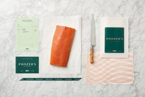
As one of the last stores in London to hand-slice smoked salmon on the premises – a service no longer offered in luxury food halls such as Harrods and Selfridges – Here Design looked to celebrate Panzer’s’ commitment to the craft and skill of this vanishing practice by placing it centre-stage in the refreshed identity.
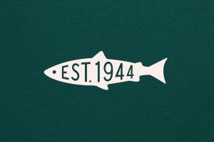
 A bold new graphic pattern mirrors the smoked salmon itself, running in curved ribbons across dusky pink tissue paper – a hue used across the wider brand identity, alongside greens and more neutral tones. A bespoke signature fish symbol is also used as a general sign-off across all forms of communication.
A Rich Library of Details
Venetia Thorneycroft, Senior Designer, Here Design says: “When we were approached with the opportunity to deliver a brand refresh for Panzer’s Deli & Grocery we knew we would have to show some restraint. There is such an extensive library of details in the history of this local food emporium that we had to step back and consider the project with a much lighter touch. Where a radical change would have been too heavy-handed, the new identity is embedded in the heritage of Panzer’s but still feels contemporary, speaking to both the existing loyal followers and welcoming new customers to explore the shelves for new discoveries and home comforts.”
Here Design delivered a brand refresh for Panzer’s including a new identity across signage and packaging, from bags and aprons to postcards, ribbons, bags, smoked salmon packs, tissue paper and individual cardboard hampers.
Source: Here Design

You must be logged in to post a comment Login