
 Here has designed the packaging and identity for new artisanal gin brand Thomas Dakin.
The design agency was briefed to develop the brand in a way that leveraged the 250-year distilling heritage of Thomas Dakin, the 18th century pioneer of high quality, premium gin.
Here’s task was to convey the masculine, straight-talking nature of Dakin, contrasted with “the pretentious connotations of much Southern-oriented gin drinking” while elevating the making processes and botanicals used.
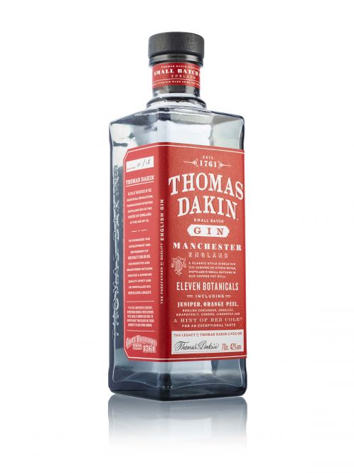
The agency observed that there are no predominantly red gin labels, and noticed a parallel with redness throughout the project: the red cole (one of the key, more unusual botanicals in the recipe) and the red-brick warehouse buildings of Manchester and the industrial North.
This led the way to designing a brick-like square bottle, with bold embossed type, and a dominant red label. The label was inspired by packaging references from early to mid-19th century, with an abundance of messaging, and a variety of type faces.
The smoked grey glass bottle, a reference to square apothecary vessels, aims to reflect the industrial heritage of Thomas Dakin. Here extended these visual and physical motifs across the brand, to the website, point of sale and events.
Thomas Dakin Gin launched in Manchester on 21 July 2015.
You must be logged in to post a comment Login