
 Are you done with sugar? Have you given it up or indeed cut back so much that you no longer experience sugar cravings?
Well join the millions of others who have put their health first and turned their backs on this sweet devil that is more addictive than crack cocaine. So what does this mean for your palette, are your taste buds looking for a fresh, savoury, taste sensation as an alternative to the sugar laden soft drinks that saturate the current market?
Well, look no further; Hornall Anderson has taken a leaf out of the exciting gin category to create a new sophisticated savoury tipple to appeal to adventurous consumers and a beautiful packaging design they can’t wait to show off to visitors.
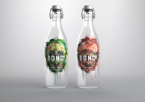
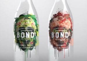
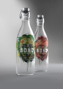 Organic and natural; made in small batches; Bonds blooms with intrigue bursting from an edgy skull motif that is layered with an elegant palette of florals and botanicals. The Cucumber, Rose and Juniper variant showcases a glowing skull billowing with big, blowsy rose heads. The design is deliberately disarming, using striking illustrations that are disrupted by splattered and dripping paint.
Design Director at Hornall Anderson, Craig Harriott, explains the packaging design draws attention to its organic, small batch and natural qualities. The skull illustration is comprised of the botanicals which make up the various flavour profiles, providing an interesting contrast and playing on the unique selling point of Bonds, which is a healthy drink, while contrasting this with an image of a skull, together with the tagline: What’s your poison? Together this adds humour and personality. A clear bottle allows shoppers the see the quality of the liquid within and reflects its purity.
 Harriott adds: “Today’s consumers want healthy soft drinks which are sugar free, but which also feel fun and exciting. There is a gap in the market for a premium soft drink which taps into these trends and a product like Bonds would be the answer.”
The illustrations are by Hornall Anderson’s illustrator Chris Charlton, who says: “We wanted to create an intriguing and curious look, as well as a brand identity, which could work across different touch points. The skull is a universal symbol that is edgy and appealing to this audience. When you look at the craft gin sector, it is using eye catching design to grab consumers’ attention. We took inspiration from the success of craft gin, for our bold and exciting illustrations for Bonds, to create a healthy soft drink which adults would be able to consume with pride.”
Source: Hornall Anderson
You must be logged in to post a comment Login