
 International brand design agency Bulletproof has created a contemporary new masterbrand identity and packaging design for Norway’s leading chocolate brand Freia, as part of a complete ‘brand world’ review.
Following a chemistry meeting with three rostered design agencies, Bulletproof was appointed by Freia brand owner Mondeléz, in Spring 2013.
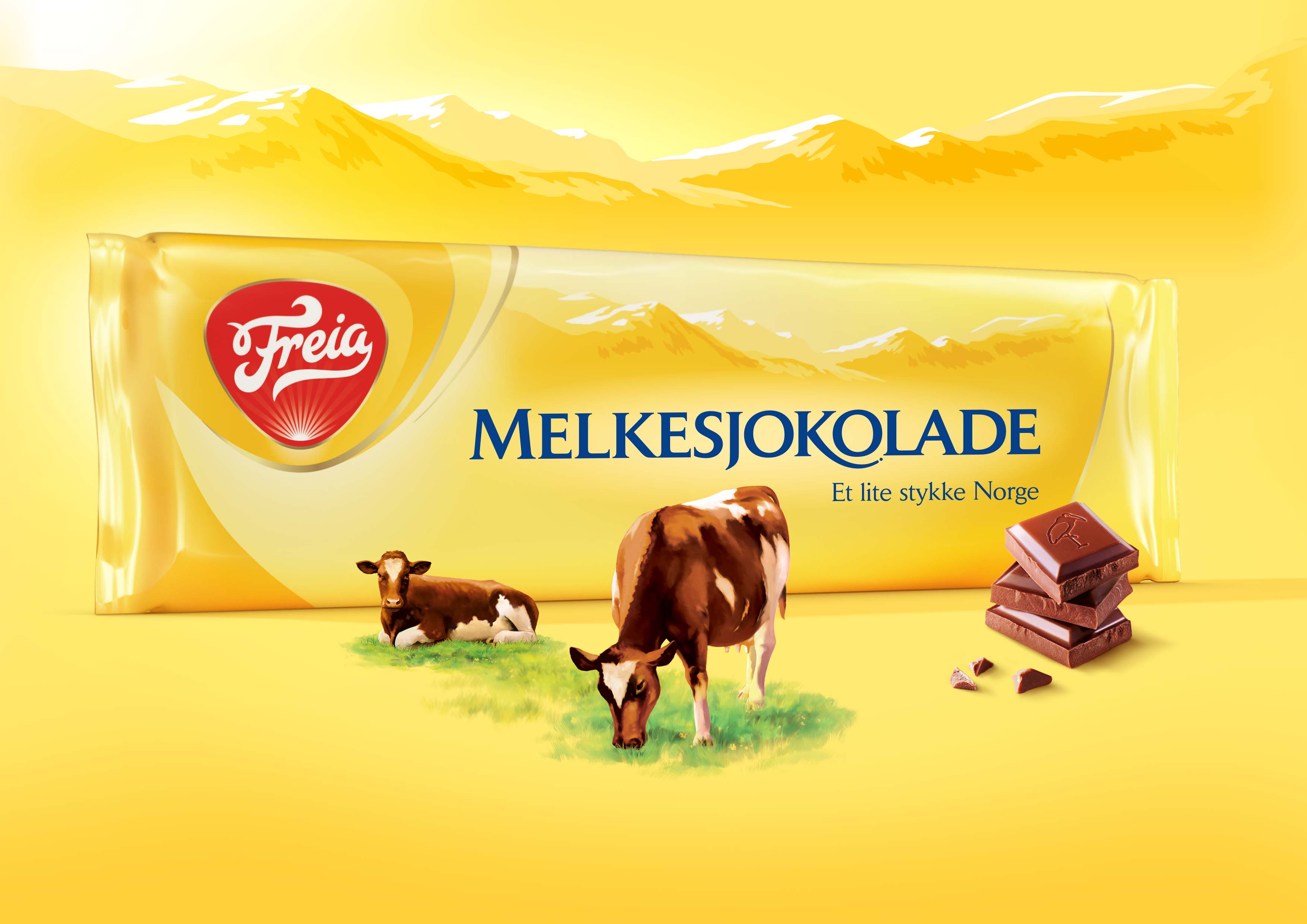
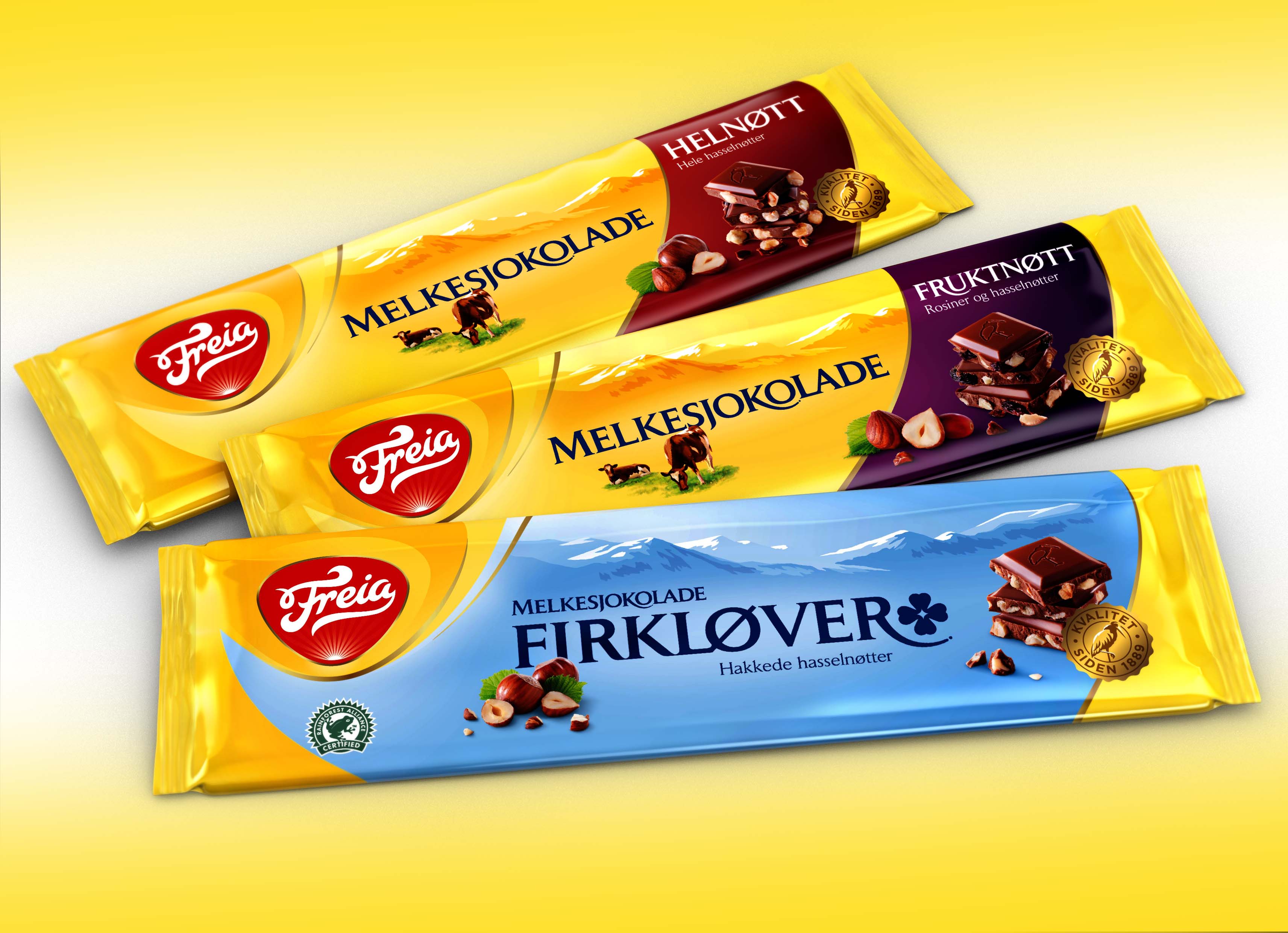
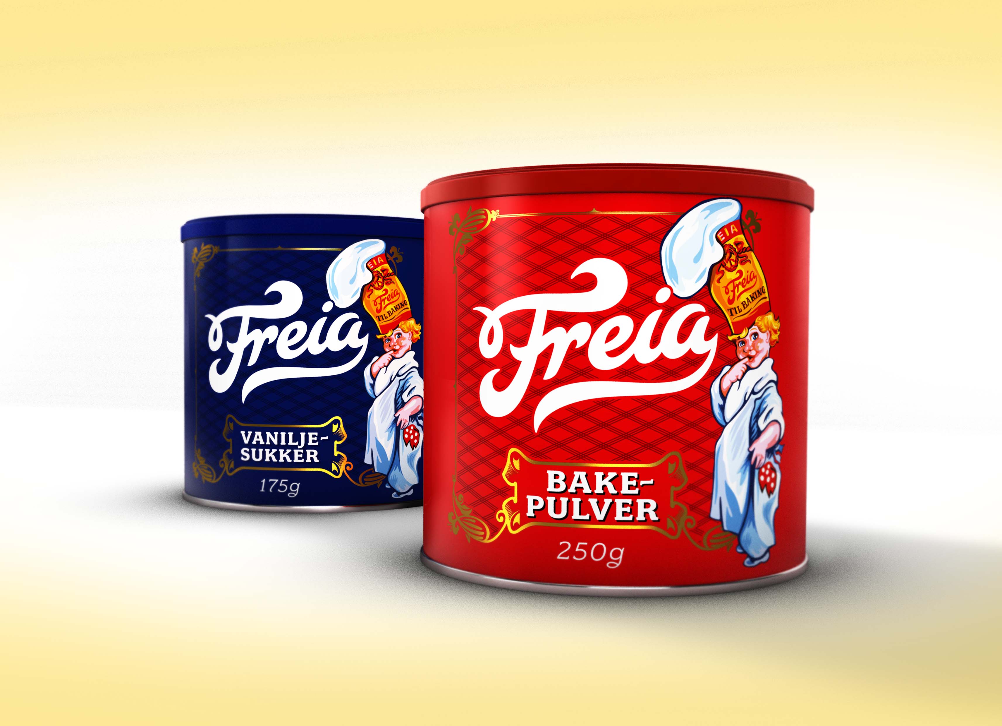
Freia is part of Norwegian heritage and culture – it’s a brand and an institution. Launched in 1898, the Freia brand portfolio has grown extensively over the years and now features a diverse range of products, sub-brands across various categories e.g. eating chocolate, cooking chocolate, baking products, biscuits, desserts and hot beverages, each with their own look and feel.
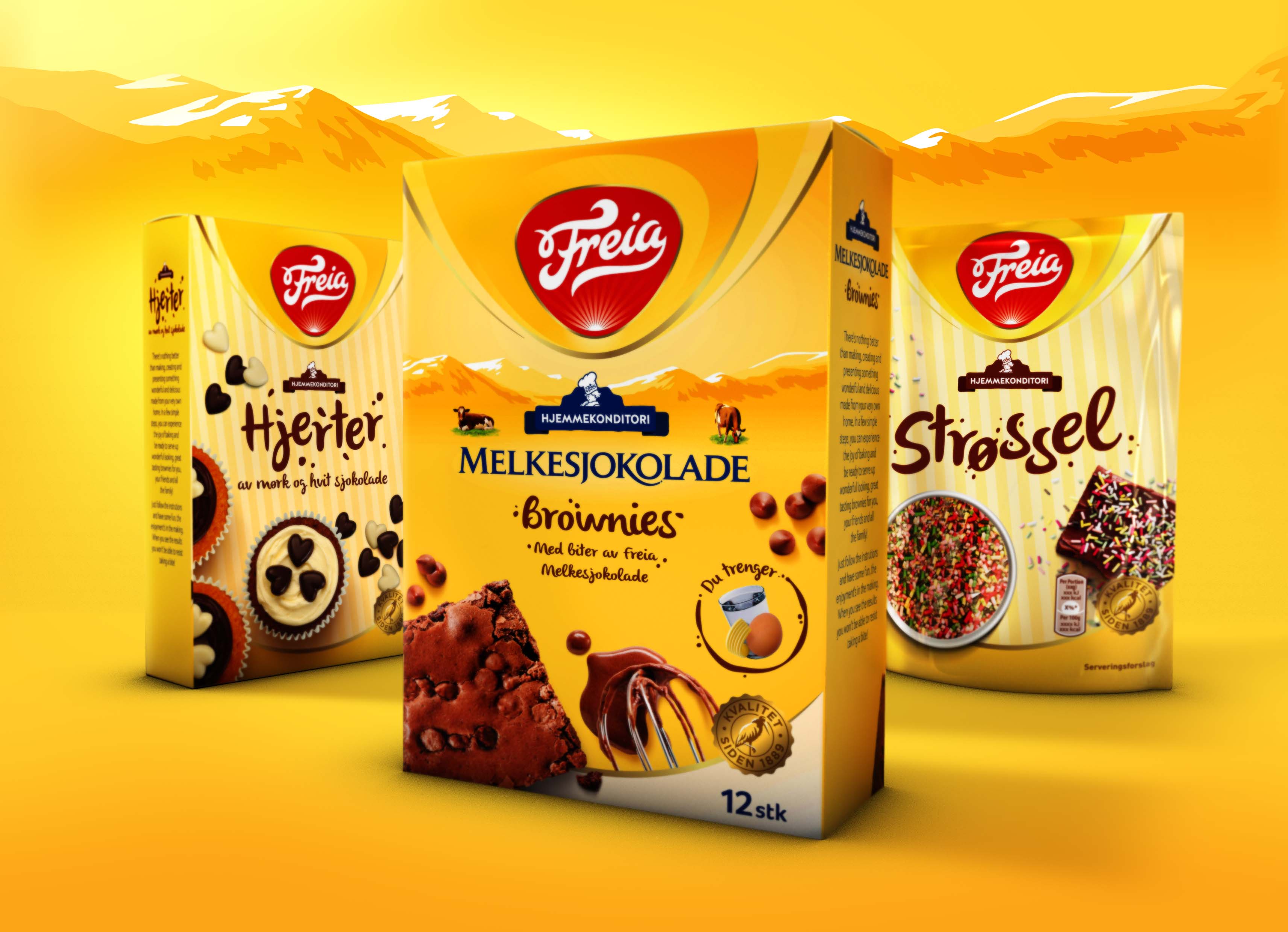 Bulletproof was briefed to create a new positioning for the brand that could be reflected through a masterbrand identity. Following this, the agency was then tasked with creating a new brand architecture to unify the complex and disparate cross category product portfolio of 250 plus variants.
Commenting on the project, Bulletproof London creative director said:
“Freia holds a special place within the hearts and minds of Norwegians; it’s an integral part of their heritage and culture. We wanted to build on this and make that emotional connection even stronger. This is how we landed on the idea of building ‘Kos’ – a special Norwegian word that translates as ‘coziness’ – into the very heart of the brand. During our initial meetings with the team, we were taken to see the Freia clock in Oslo, a landmark of great emotional 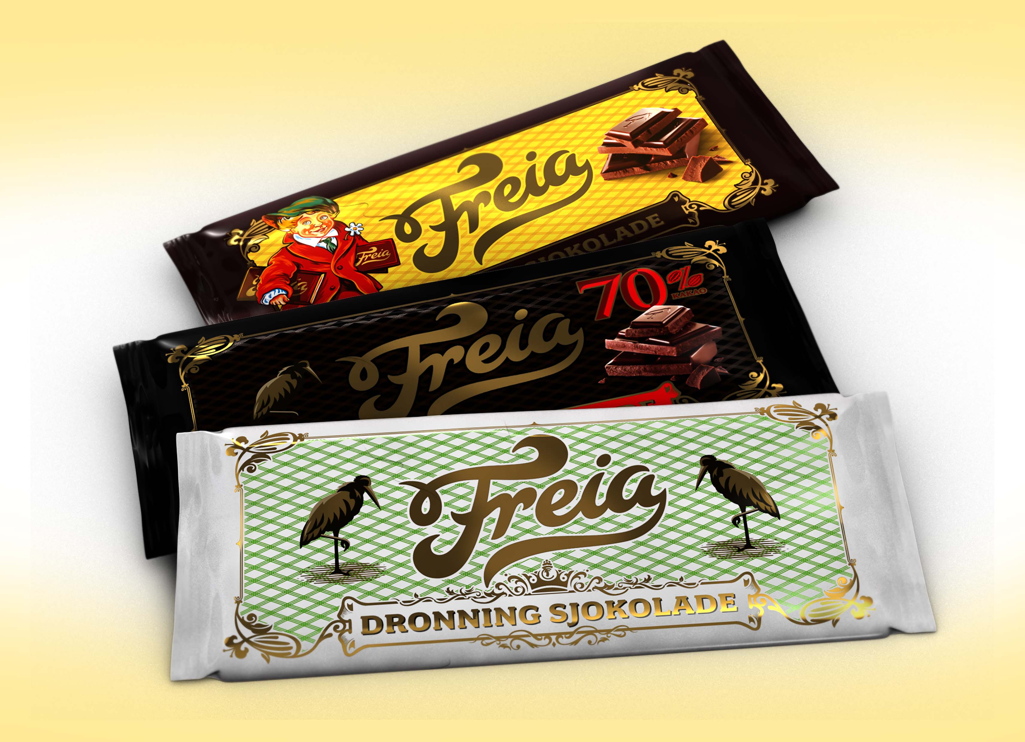 significance for Norwegians.”
“We immediately felt there was a strong idea there just waiting to be unearthed. Inspired by the Freia clock, the new masterbrand identity features light fractals emanating to radiate warmth and ‘Kos’ across the pack, the idea being that everything is literally ‘touched’ by Freia.”
“Once the masterbrand idea was landed, the small task of harmonising this hugely diverse and varied product portfolio began. This was achieved through a distinctive brand architecture and approach, which allowed the different category codes and sub-brand personalities to shine through, while simultaneously ensuring visibility and standout at fixture.”
 “Working with the Freia brand has been an amazing experience and we’re incredibly proud of the results – we only hope that the Norwegian public feel the ‘Kos’ as much as we do.”
Freia senior brand manager said: “For this project, we decided to look for a design partner outside of Norway – an agency with a fresh set of eyes and no emotional ties to the brand. We chose Bulletproof based on the level of their creativity and our belief that they had the ability to understand the cultural references and the unique position a brand like ours has in the marketplace.”
 “We think the idea of ‘Kos’ behind this design is super relevant for Freia as it allows us to leverage our equities and history. The clock ‘belongs to the people’ – our consumers – and so does Freia. We deeply appreciate how Bulletproof has been able to leverage this across the entire portfolio with the golden lines, which radiate and bring everything together in perfect harmony. We certainly chose the right agency!”
The new packs will be available throughout Norway as part of a phased relaunch, with selected chocolate tablets being the first to market.
You must be logged in to post a comment Login