
 Branding and packaging design specialist Parker Williams has refreshed the packaging for the UK’s original pomegranate juice brand Pomegreat – a decade after it designed the original.
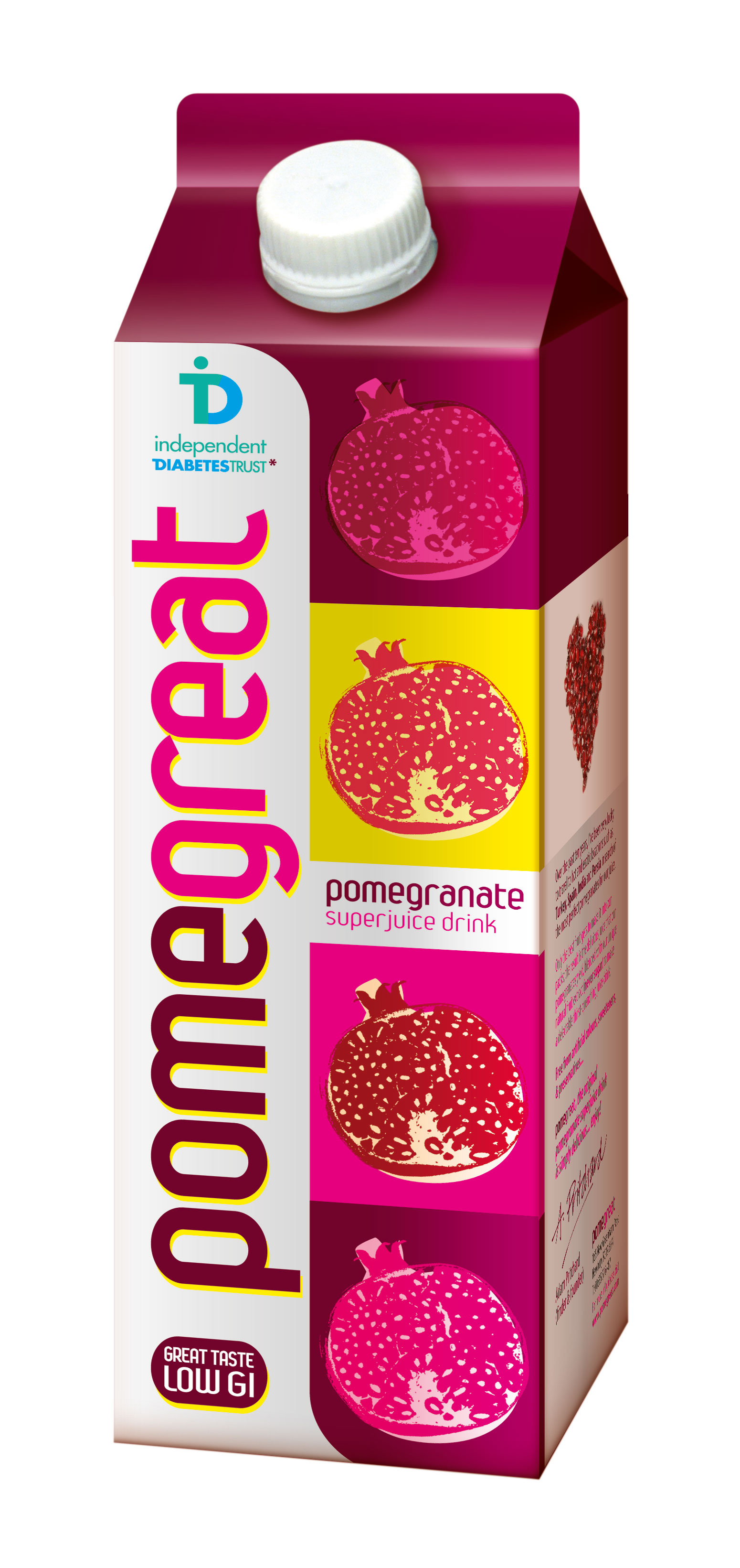
The redesigned pack builds on Pomegreat’s former visual equities created by the agency: a confident, vertical brand logo and a series of pop art- inspired illustrations of pomegranates in bright, clashing colours to create on-shelf standout. The pack also highlights Pomegreat’s low GI index, and incorporates the brand’s partnership with the Independent Diabetes Trust, to emphasise the juice’s health benefits.
Parker Williams designed the original pack for the brand’s 2003 launch. It was subsequently redesigned by another agency. The brand returned to Parker Williams this autumn for a revamp following a slide in sales.
Jo Saker, creative director at Parker Williams, said: “We went back to the brand’s roots to take what we knew were successful elements, and gave them a contemporary update. We wanted to ensure the brand reminds customers of all that is innovative and distinctive in the brand’s heritage and that the pack stands out in an aisle full of photographic fruit images. The Pomegreat story is testament to the power of the pack when it comes to championing the product to consumers.”
You must be logged in to post a comment Login