
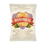
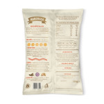
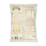
Pearlfisher has designed the brand strategy, name, tone of voice, brand identity and packaging for Manomasa, the new tortilla chip brand from All Good.
Pearlfisher was tasked with moving away from Mexican clichés and the brash, artificial world of party snacks and has created a bold, characterful celebration of the ‘real’ Tortilla chip.
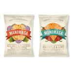
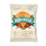
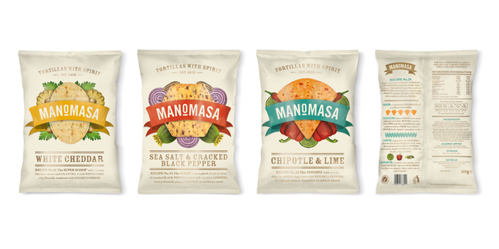 The product range pays homage to the original Mexican Tortilla chip – the Totopo – whilst branching out into new tastes, sensations and textures inspired by street food culture.
Speaking about the concept Pearlfisher Creative Director, Sarah Butler, commented:
“The Manomasa brand identity is simple yet celebratory; a proud statement of what these chips bring to the table with their real ingredients, generous spirit and desire to bring people together over delicious foodie experiences. The rich yet contemporary pack allows us to showcase the depth of creation that has gone into each variant,” commented Pearlfisher Creative Director, Sarah Butler.
“A montaged illustration style celebrates the unique layers of taste and a bold, graphic language of expertise de-constructs each detail – from the specific shape and the 52 attempts it took to get the right texture and taste – to the best way to eat it beyond the bag. The brand speaks with the vision, expertise and real passion of its creators, re-introducing us to this heroic but often overlooked, tasty staple,” added Sarah
All Good are happy with the concept presented to them by Pearlfisher. Their Marketing Manager, Charlotte Simpson, had this to say:
“The design for Manomasa perfectly captures the spirit and creative personality of our brand. Our absolute passion for tortilla chips has been seamlessly bought to life whilst celebrating the exciting, raw and vibrant world of street food – an innovative first for the category.”
The brand launches in Whole Foods Markets and Ocado stores nationwide from this month.

You must be logged in to post a comment Login