
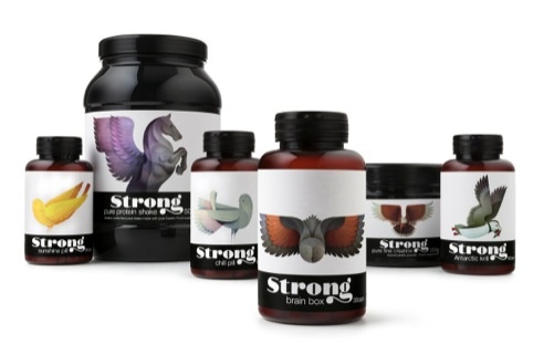
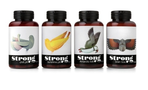
Pearlfisher has developed the branding and packaging for new nutrient brand Strong, based around a series of bird illustrations.
The consultancy commissioned illustrator Andy Lyons to create a series of bird illustrations that would link to the benefits of the supplements.
For example and owl is used for the ‘Brain Box’ pills and a bright yellow canary features on the ‘Sunshine Pill’ packaging.
The brand name, meanwhile, is represented in hand-drawn typography.
Karen Welman, founding partner and chief creative officer at Pearlfisher, told Design Week, ‘The idea was to create an impactful visual story using a metaphor of beautiful and elegant birds that have hidden strength.’
Strong is initially being sold exclusively through London members club The Library, before rolling out to high-end high street and online retailers.
You must be logged in to post a comment Login