
![]() Integrated branding agency Ragged Edge has created a brand and visual identity for Foley’s, a new restaurant in Fitzrovia, London.
Integrated branding agency Ragged Edge has created a brand and visual identity for Foley’s, a new restaurant in Fitzrovia, London.
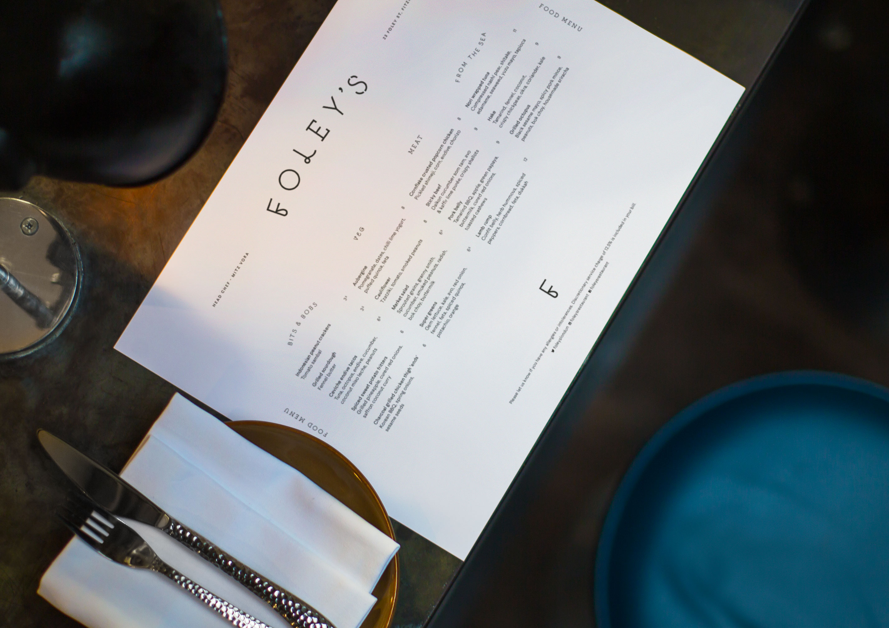
The design incorporates four different hand drawn typefaces to mirror the restaurant’s unexpectedly diverse offer.
Against the grain
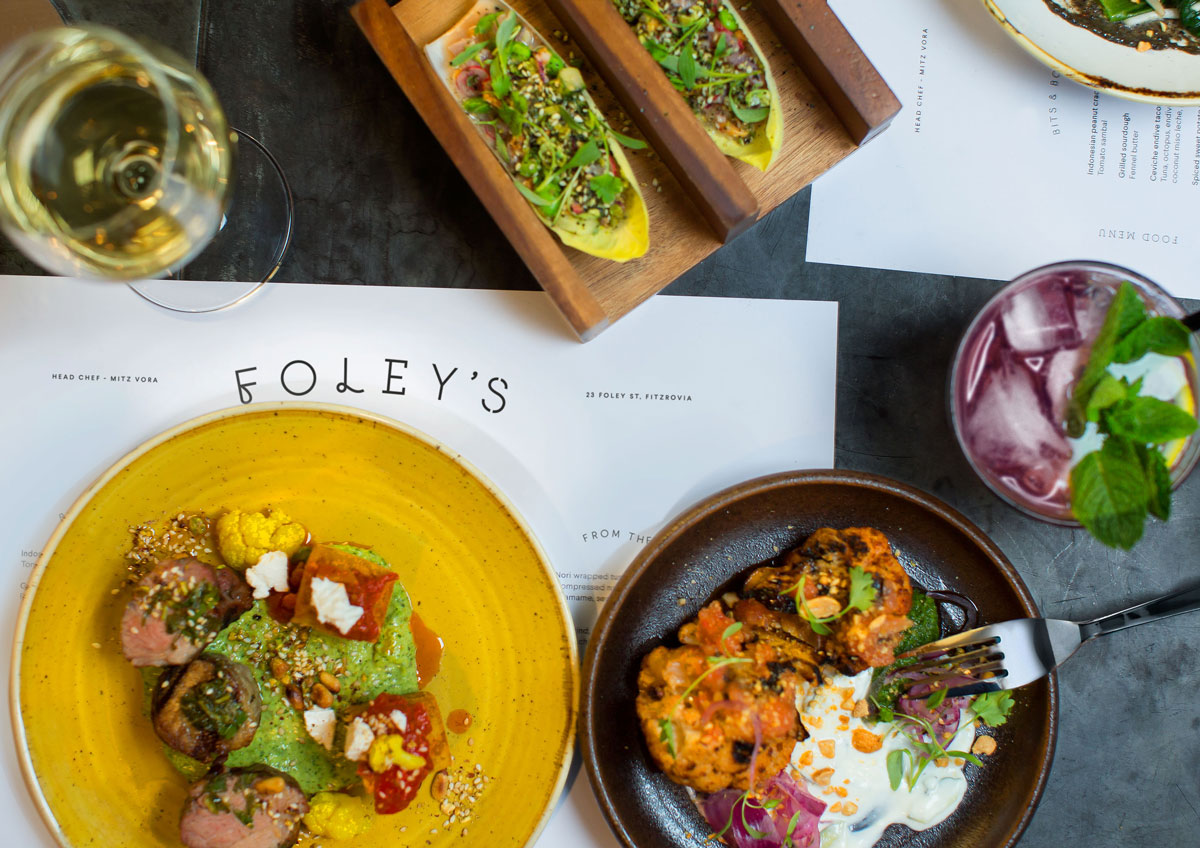
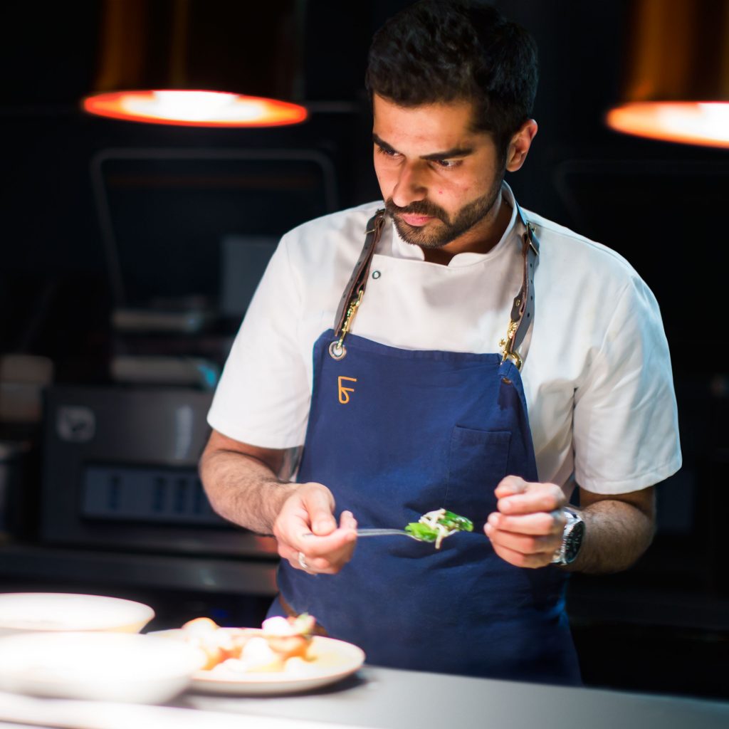
Foley’s is a newly launched restaurant in Fitzrovia, which was set up following a successful six-week trial as a pop up in Shepherd’s Bush. The restaurant opened in Foley Street this summer and serves an eclectic range of high-end dishes in a laid back environment.
Bringing good things together
The team behind Foley’s challenged Ragged Edge to create a brand that reflected their aim to do fine dining differently.
A series of workshops defined a bold vision for Foley’s: high-end food with an anything goes approach.
The restaurant ignores traditional constraints around specific cuisines and styles. Instead, they set out to bring a diverse range of ingredients, recipes and influences together in new and exciting ways.
Unexpectedly harmonious
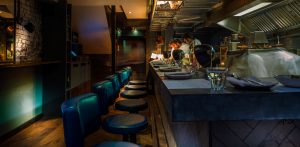 Ragged Edge delivered brand strategy, visual identity, interiors consultation and printed collateral.
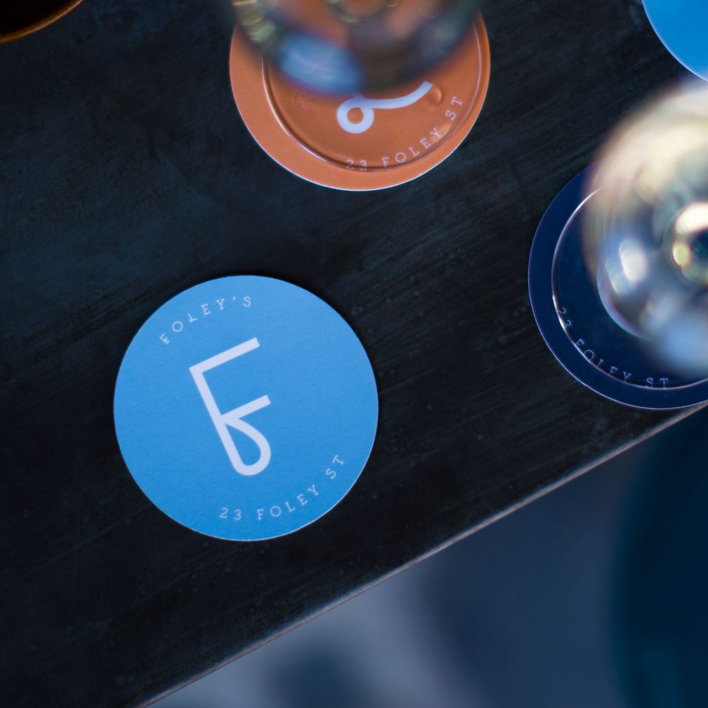
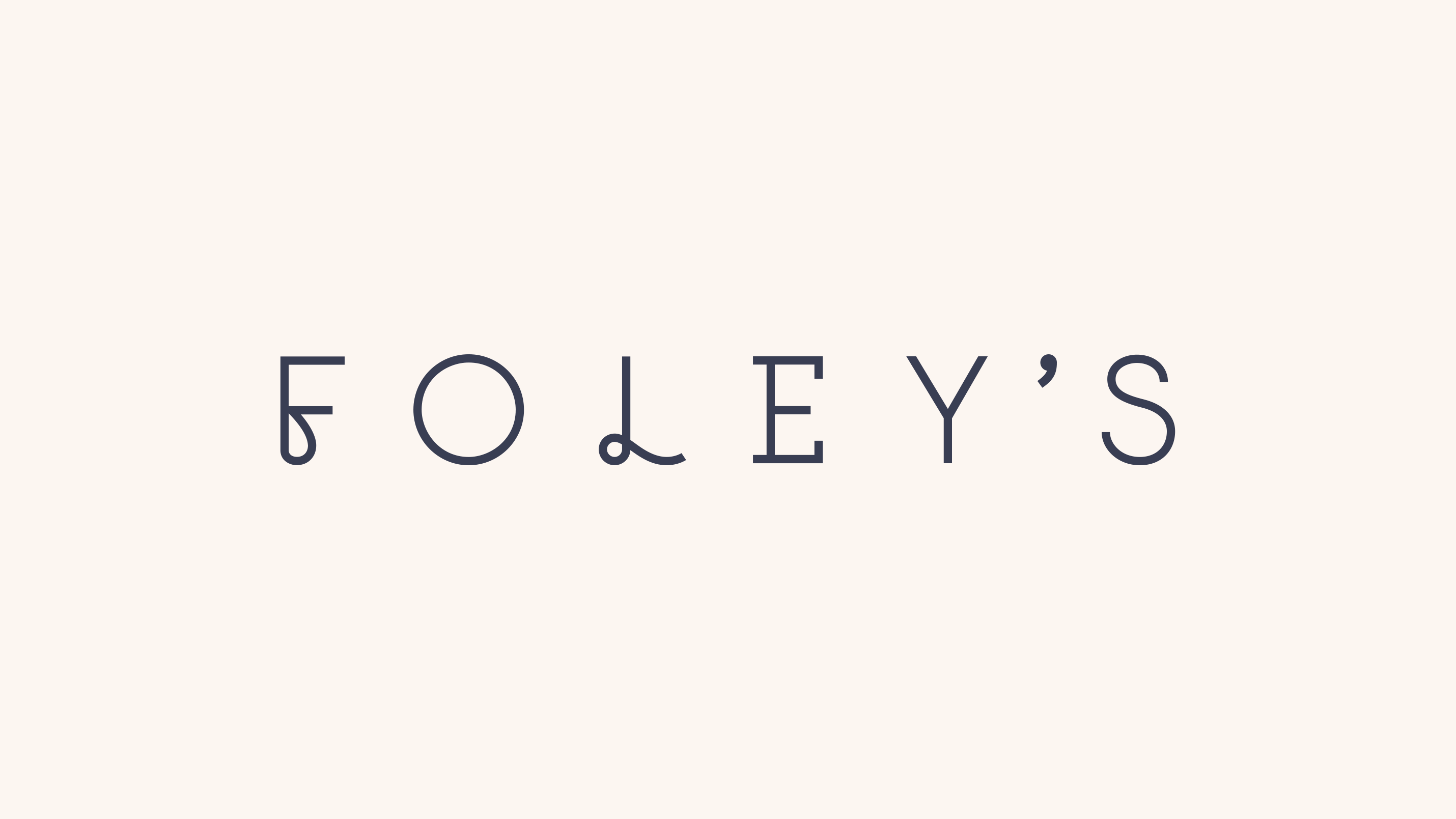
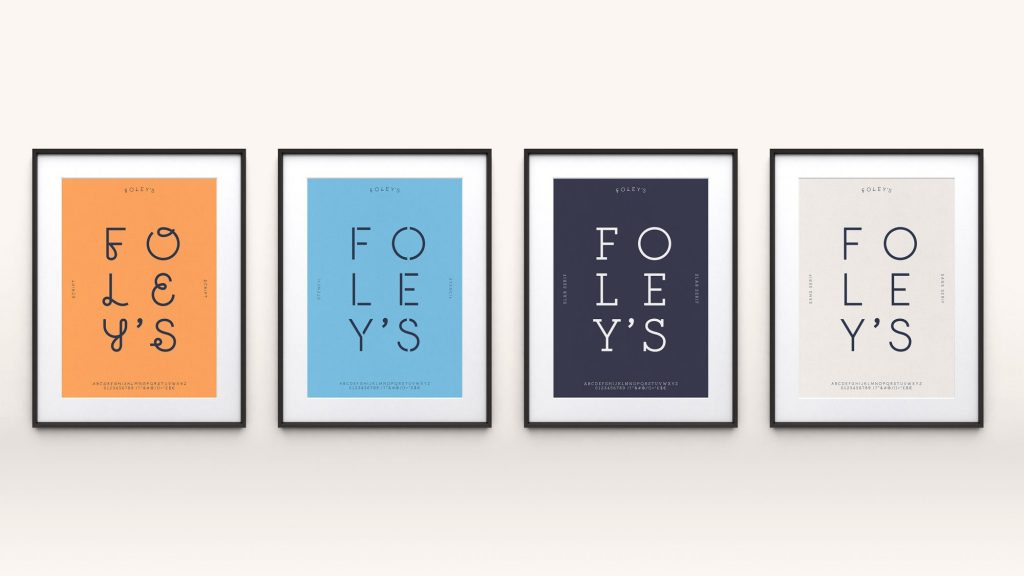
A total of four hand drawn, bespoke typefaces were created. Each typeface has its own distinct character which combine to form an unexpectedly harmonious whole, illustrating the restaurant’s eclectic approach. The typefaces included a sans serif, slab serif, script and stencil weight.
The typefaces are supported by a paired back design system that features a neutral colour palette,
complemented by bright blue and orange highlights
 Menus, uniforms and collateral are refined and elegant, yet playful and relaxed, just like the food.
Ragged Edge also teamed up with PAC Architecture to ensure the design and interiors complemented one another.
Max Ottignon, Co-founder, Ragged Edge, says: “The restaurant’s anything goes approach led us to a brand idea that was rich in creative possibilities: bringing good things together. This was expressed by the four hand drawn typefaces that could be combined in a range of different ways to create an eclectic yet harmonious result. The logo, which features letters set in each of the typefaces, is the perfect expression of Foley’s disruptive approach. The simple, paired back nature of the rest of the identity system came from a desire to remove any barriers between the customer and the food.”
Scarlett Guess, of Foley’s, adds: “Ragged Edge helped us to capture the ethos of our new restaurant and the brand they created embodies it perfectly. Best of all they delivered it with the same care and attention we put into our food. We couldn’t be happier.”
Source: Ragged Edge
You must be logged in to post a comment Login