
Global creative brand agency BrandOpus have partnered with the UK’s number one micro-snacking brand Rustlers to define a new brand strategy and visual identity, which will be launching across the UK this month. The rebrand is in response to Rustler’s ambition to grow market share and expand into new categories.
Adrian Lawlor, Marketing & Business Development Director at Kepak comments “We needed a visual identity that could grow our core portfolio and give us permission to innovate with new products in new occasions. This meant improving clarity between existing products within the portfolio, while enhancing premium and quality where appropriate.”
BrandOpus’ work positions Rustlers as the ‘Anytime Hero’ – with a self-assured, no-nonsense and street smart attitude. John Ramskill, Creative Director, BrandOpus comments “Being able to deliver a quality flame-grilled burger in two minutes is a bit of a life hack, so we sought out create a visual language that evokes a sense of honesty, savviness and resourcefulness but in a relevant & dynamic way”.
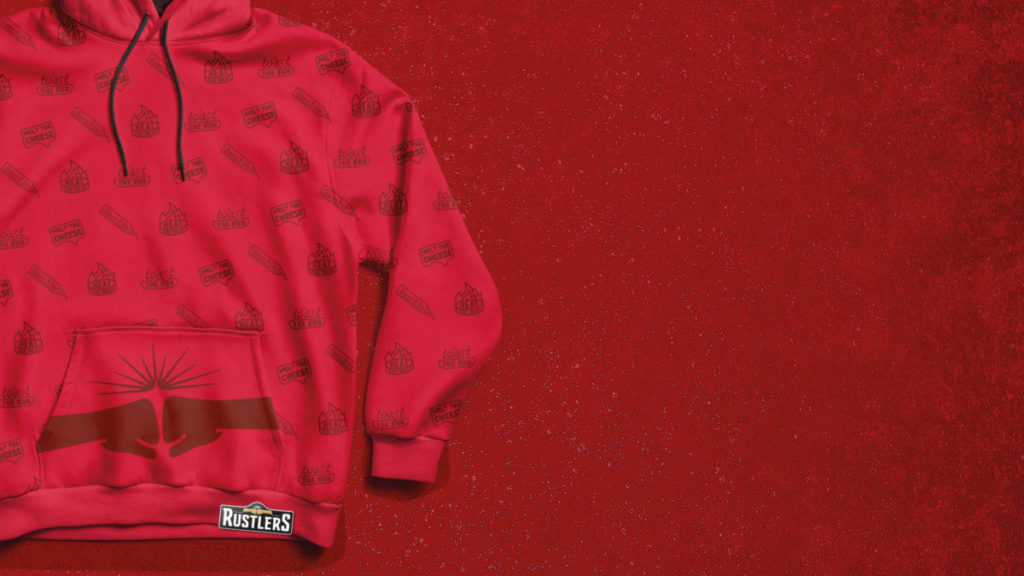
The brand’s new fist-bump iconography that sits at the heart of the visual identity helps Rustler’s move beyond product cues with emotive symbolism. Ramskill comments “The fist-bump moves beyond the brand’s literal and functional associations of flame grilling, and celebrates the straight-up satiisfaction that Rustlers is all about”.
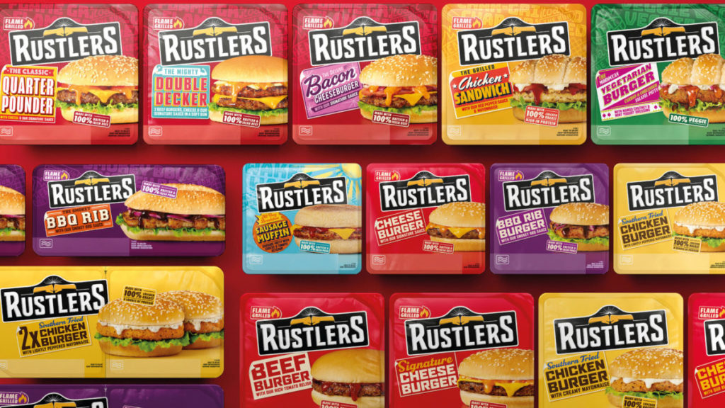
The new identity also brings in a bold colour pallete across each product range to boost differentiation, ensuring easy consumer navigation and great standout at shelf. Product photography has moved away from idealised – but unrealistic – perfection, with more real-life depictions that better reflect the brand’s everyday credentials.
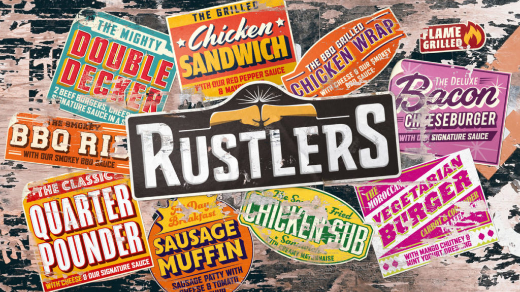
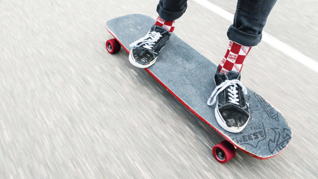
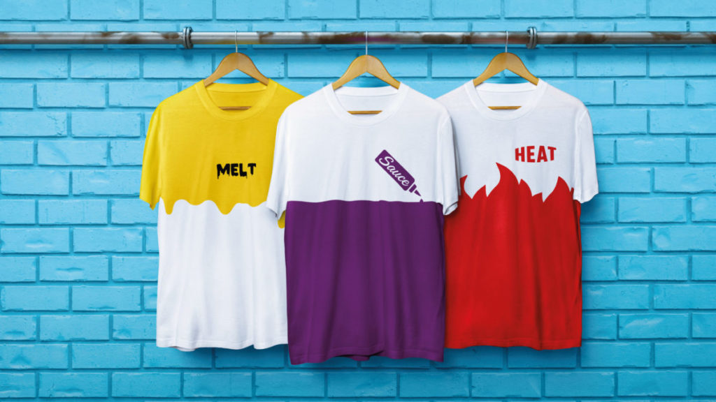
The new work has been brought to life across the brand’s visual identity and packaging.
Source: BrandOpus
You must be logged in to post a comment Login