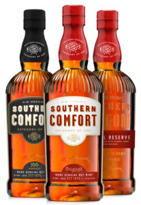
 American whiskey brand Southern Comfort has undertaken the biggest redesign in almost a decade as it looks to become more relevant to today’s consumers.
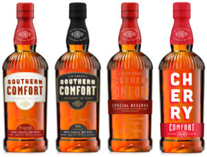
Carried out by Austin-based brand design studio Helms Workshop, the redesign encompases the entire Southern Comfort Family of brands including Southern Comfort 100 proof, Lime Comfort, Cherry Comfort, and the forthcoming Caramel Comfort.
Each line of the brand now carries its own distinguishing traits, while still echoing the overarching brand identity.
One of the most significant features of the new packaging is an icon on the neck and label, as well as the new bottle shape which draws from the brand’s heritage and uses the original fluted shoulders.
“We dug in and internalised the history and personality of the brand,in order to craft something authentic and meaningful for modern-day drinkers,” said designer and owner of Helms Workshop, Christian Helms.
 “From sifting through the vaults at Brown-Forman [owner of Southern Comfort] and breathing life back into heritage elements, to crafting a new bottle and brand language, the goal was to highlight what makes Southern Comfort unique. The result is a new package that feels confident and comfortable in its own skin, and looks great on the shelf.”
Southern Comfort founder M.W. Heron’s signature still features on the bottle along with the year of its original creation, 1874 and the strap line “None genuine but mine”.
Meanwhile changes in colour and font are aimed at elevating the modern cues of the brand while retaining its welcoming and approachable characteristics.

You must be logged in to post a comment Login