
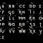
Scottish illustrator Steven Bonner has created a beautiful typeface for Ballantine’s Scotch Whiskey that reflects the tasting notes of the brand’s 12-year-old Scotch.
The illustrator has created several illustrated letters, each of which represents one of the main tasting notes found in the whiskey, including cream, oak and pear.
For instance, the letter ‘C’, crafted to look like a slice of orange, stands for the citrus note.
These flavorful letters are used in an illustrated animation that you will find on the Ballentine’s website.
Head over to the illustrator’s website to view more of his work.


You must be logged in to post a comment Login