Crodino is the beloved Italian non-alcoholic aperitivo with an unchanged secret recipe since its inception in 1965. While Crodino has long been a cherished staple in its Italian homeland, its global recognition was limited.
Recognising the untapped possibilities and Crodino’s potential to appeal to Gen Z consumers, we created a new brand visual identity that would serve as a springboard for global growth and resonate with the evolving preferences of the contemporary consumer.
In a challenging world surrounded by bleak news, we re-positioned Crodino’s new creative platform, aptly named “Open Sunshine”. It radiates positivity, offering a breath of fresh air and a touch of escapism for consumers seeking respite from the negatives in modern life.
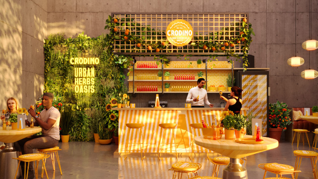

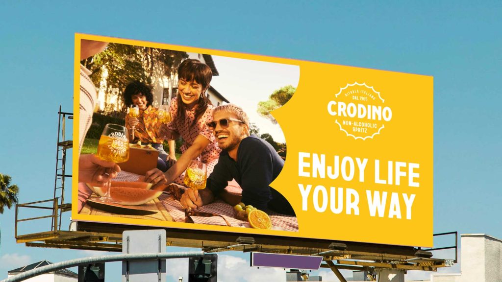
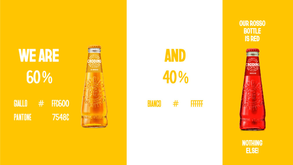
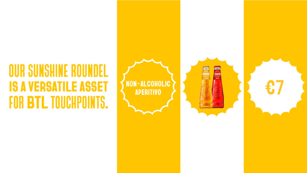
We brought the Italian style of Crodino to life at every touchpoint, repurposing the iconic bottle cap as a sun motif, enabling the brand to bring the energy of summer to any setting. We created a charming and playful typographic style by colliding different font weights and styles, complemented with 1970s-inspired bold and repetitive patterns, paying homage to an iconic era of Italian design. The result is a sunny visual and thematic cohesion that resonates with the target audience.
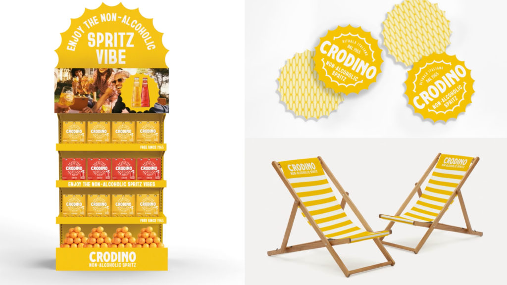

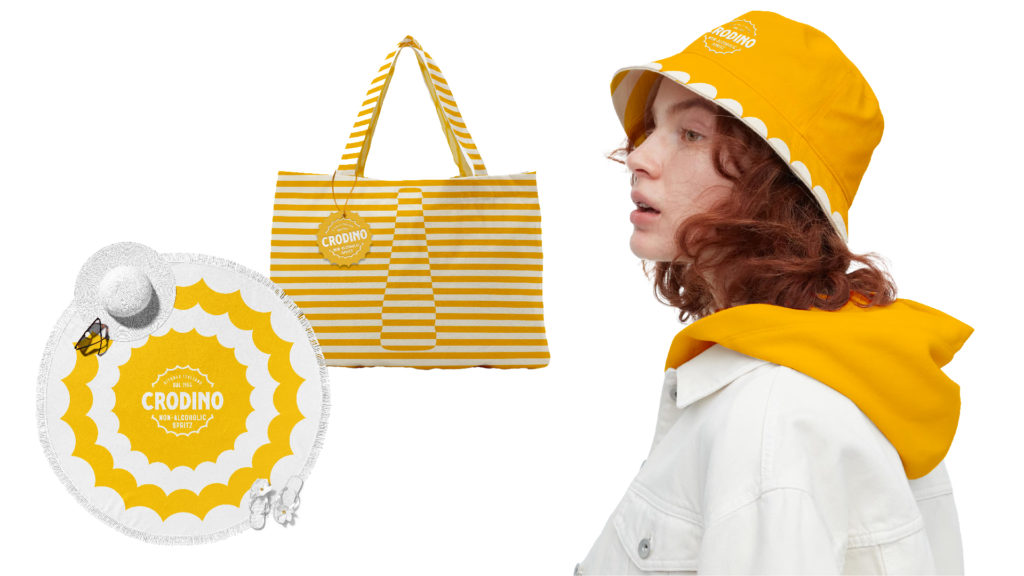
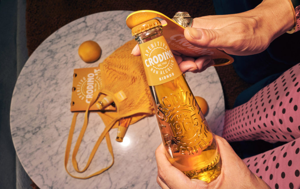
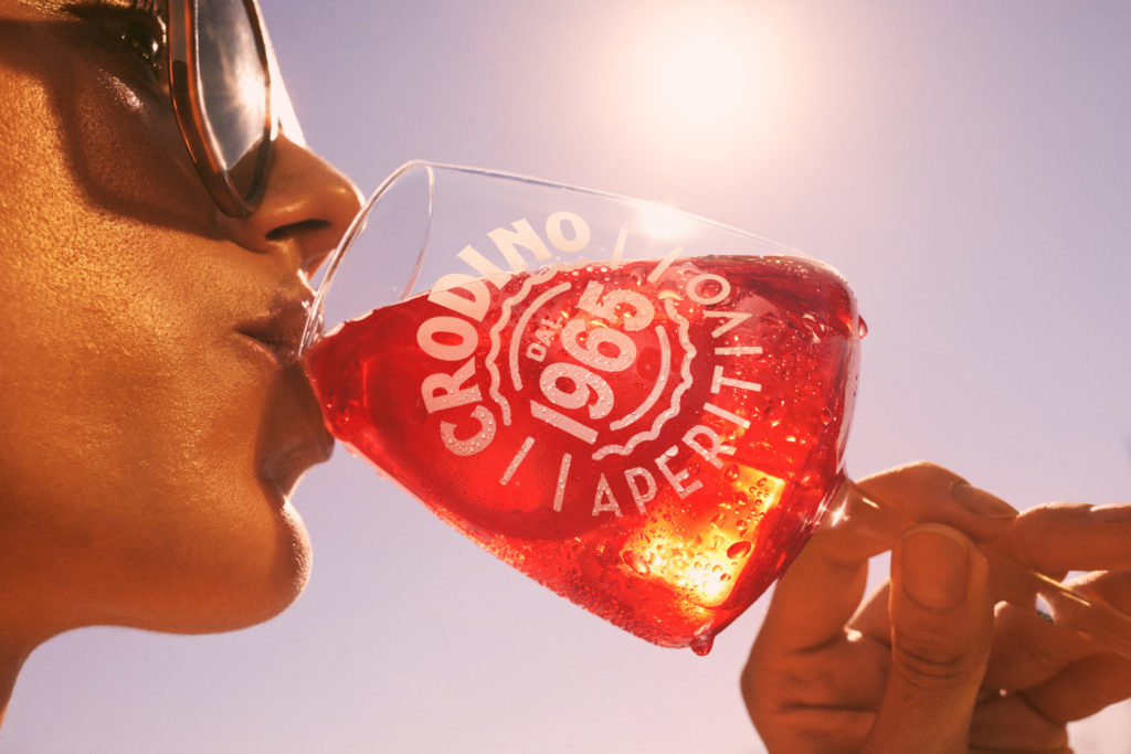
Beyond the visual transformation, Missouri Creative designed a series of activations that transform urban environments into vibrant and refreshing spaces, encouraging customers to break free from the everyday and embrace the warmth of Crodino.
Source: Missouri Creative

You must be logged in to post a comment Login