
One of the UK’s leading children’s cookery author, who has sold more than six million cookbooks worldwide, has undertaken a major packaging overhaul with OurDesignAgency to add further trust and credibility to the children’s chilled meals category.
It is hoped the Annabel Karmel packaging refresh, along with updated recipes, will reinvigorate the category by creating greater impact on shelf. The range’s new visual cues are designed to give parents confidence to shop the aisle when they are not cooking from scratch.
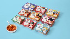
The relaunch will roll-out from 26th August across existing retailers Sainsbury’s, Tesco and Ocado (RSP £2.30), with further NPD in the pipeline. The range needed to feel less cluttered, with a driving creative to highlight the brand’s decades of expertise in recipe development for children.
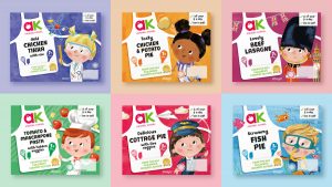
OurDesignAgency’s strategy was to focus on the impactful role that the range plays in feeding children’s imaginations and helping children to flourish through good food. The design solution, ‘When I grow up’, brings this idea to life with a line-up of playful little professionals including a scientist, pilot, chef, deep-sea diver and more, to capture the imaginations of shoppers.
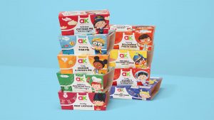
OurDesignAgency felt that the branded apron, which only existed on puree packaging, had the potential to work across this range. It helped to solidify Annabel’s cookery credentials, as well as creating a strong consistent branded asset on shelf.
Grant Willis, Creative Director OurDesignAgency, said: “Annabel’s untouchable expertise and credentials in children’s food sets these products apart from other branded competition. We felt this was summed up in the iconic apron device so we took it into this design and locked-up all essential branding, typography and reasons to believe within.”
OurDesignAgency added the decoration of cooking tools to the pocket to help read the shape as an apron and colour code the products through the range. Noticing that competitors in the sector were moving towards using animals, monsters or food imagery, the agency differentiated the range by focusing on children and the idea that these meals will nourish them and help them flourish.
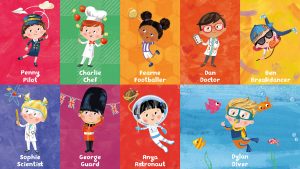
Children are playfully featured as a budding pilot, chef, deep sea diver, Queen’s guard, and more. A children’s book illustrator was commissioned to help create a sense of storytelling across the range. The textured, colourful, cut and paste style products are natural, crafted and full of goodness.
“To help clean the pack up, we settled on communicating just two key nutritional benefits on the front and the rest on the back of pack. These were all placed in a smart recipe notepad that signals more ties to Annabel and her expertise in children’s nutrition,” Willis says.
The illustrator also bought to life the key ingredients and back of pack, ensuring every touchpoint had been considered and every detail playfully on brand. Annabel’s story on pack sits next to her signature, again ensuring that the quality of these products is constantly being delivered across every element on pack.
A unique shape was also created to bring another element of playfulness to an otherwise functional sticker that tells the consumer the suitable age of the product.
Annabel Karmel says: “The time was right to start to build even more momentum behind this award-winning range and that’s why we approached OurDesignAgency. It’s so important that my packaging provides parents with reassurance when buying a pre-packaged meal and I’m really thrilled with the work that OurDesignAgency has created. I love the fact that my expertise is wrapped around the idea that whatever children dream of being when they grow-up, my trusty cookbook-inspired recipes make for the perfect way to fuel play and feed imaginations.”
Source: OurDesignAgency
You must be logged in to post a comment Login