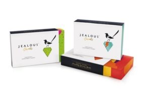
 B&B studio has rebranded Jealous Sweets, establishing a link between the name and the look, which is now anchored by a magpie and a changeable jewel icon.
The product is a jelly sweet aimed at adults, containing natural fruit juices and no gelatine, artificial colours or flavours.
B&B studio creative partner Shaun Bowen says, ‘The existing Jealous packaging wasn’t working hard enough to communicate the brand’s premium positioning and the purity of its products.
‘Also the Jealous name had no real link back to the sweets themselves. We set about linking the two through the idea of “covetable candy” – a concept that we visualised using a precious jewel icon and a characterful Magpie with an eye for something special.’
 The boxes comprise a die cut sleeve featuring glossing, embossing and foil blocking, which is secured by a gold foil tamper seal to a patterned lift-lid box.
Inside the box the sweets are presented in individually branded bags surround by tissue paper. Colourful patterns denote different variants.
B&B studio senior designer Claudia Morris says the project was about finding a way to present the ‘taste sensations from childhood’ to an adult audience in a contemporary way.
She adds, ‘The full pattern is obscured by the sleek and minimalistic black and white sleeve so you only get the full colour hit after purchase’.
B&B Studio has named the ranges, designed all packaging, the website and trade and consumer communications.
The new look rolls out in shops from the end of June.

You must be logged in to post a comment Login