
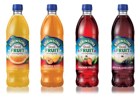
 Bloom has rebranded Robinson’s squash around a new “Real Fruit in every drop” proposition and has designed a new logo and packaging.
The consultancy was appointed in March 2014 by brand owner Britvic, which was looking to reaffirm Robinson’s status as a “beacon brand” in the category, according to Bloom managing director Jill Marshall.
Marshall commented: “There’s a lot of pressure coming from own ranges so they needed a new point of view on why to buy Robinson’s.”
She adds that there is a “real fruit taste because there is real fruit in every drop” so this became the focus.
To denote freshness a leaf has been added to the wordmark which has been redrawn and the “Estd 1823” now appears under the logo.
A photographer was commissioned to take pictures of fruit so that the images are true to the integrity of the new proposition according to Marshall. She says there has also been an effort to de-clutter the label and make the fruit “the hero.”
You must be logged in to post a comment Login