Plant-based and planet-positive, Tenzing Natural Energy needed to refresh their packaging design and more clearly communicate their natural, sustainable credentials, alongside the power and impact of the ‘energy’ drink.
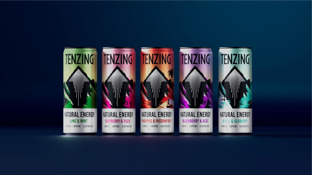
The category is busy, with new entrants fighting for shelf space. The brand needed a clearer, single minded design approach that would draw consumers in and provide bolder standout at shelf.
Boundless transitioned the design of the Everest inspired mountainscape to be effortlessly bold and heroic on pack, signifying the strength and impact of the natural energy from the ingredients, whilst also providing a powerful and eye-catching asset at shelf. The dark shadow of the mountain was used to create clear impactful space around the iconic arrow.
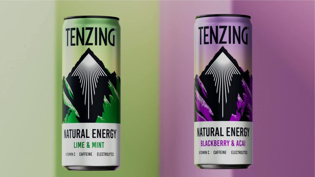
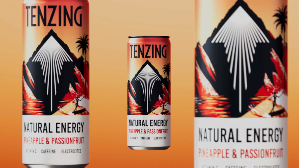
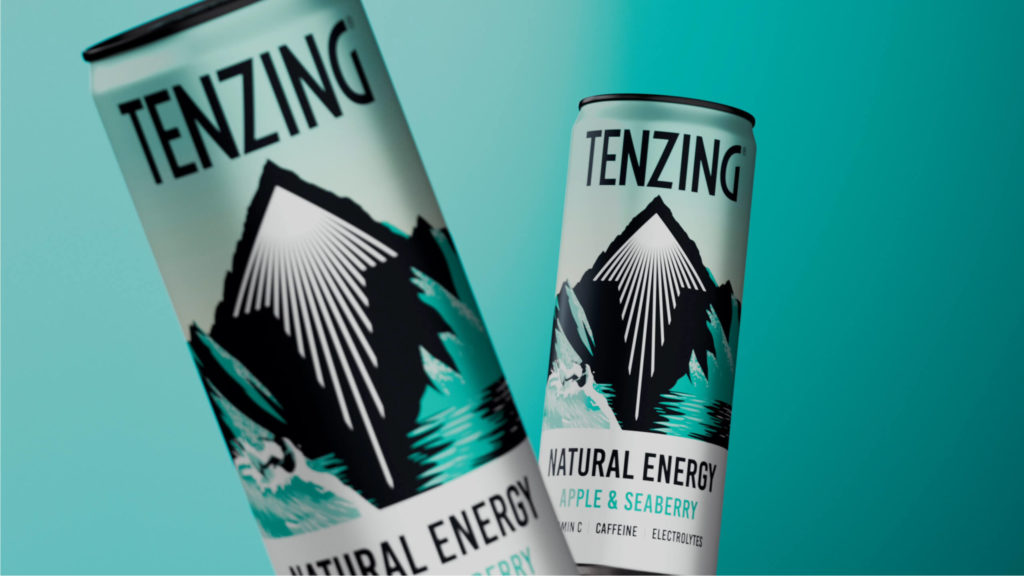
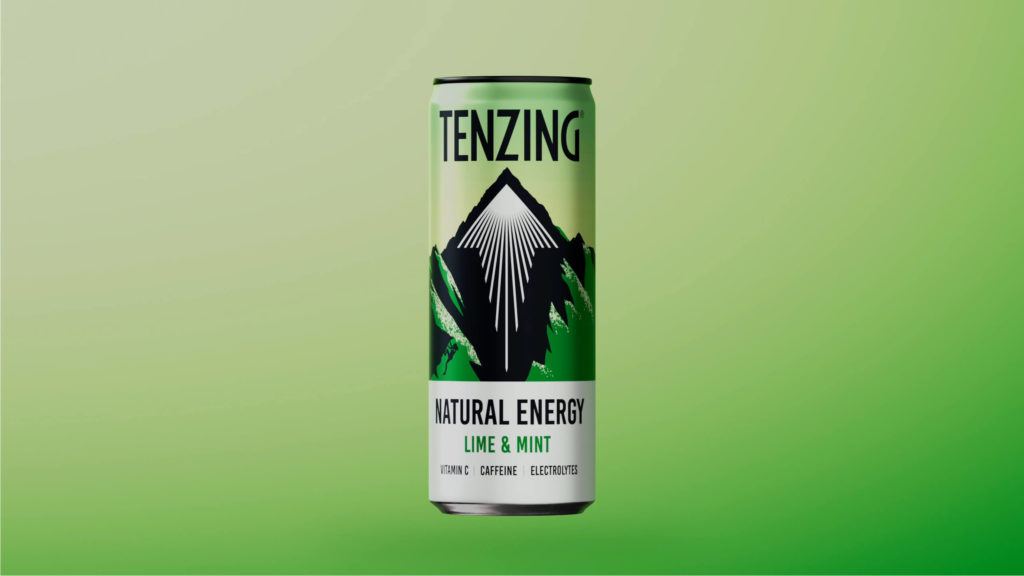
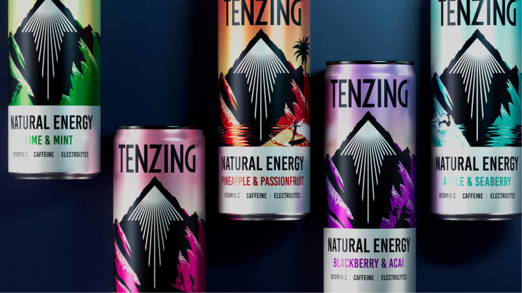
To retain and promote the pioneering mindset and lifestyle of the brand, discoverable silhouettes of outdoor pursuit enthusiasts can be found on pack, aligning with the brand’s positioning as being a product for the go getters and adventure seekers.The refreshed bold and fresh colour palette ensures a nod to the brand’s natural credentials, providing boldness and strength through a more consistent range.
Hamish Shand, Founder and Creative Director at Boundless said, “We have pushed Tenzing into a contemporary space of refreshment and strength, building on their existing recognisable assets and evolving the brand into a more compelling and bold new space. The refreshed designs bolster standout colours, the iconic arrow and unmissable logo aide navigation at the fixture. It’s been so exciting to be on the journey with Tenzing, helping them become a leading brand in a crowded category”.
Source: Boundless Brand Design

You must be logged in to post a comment Login