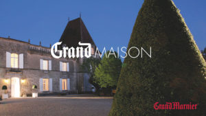
 Brandimage, a leading global consultancy of brand equity architects and designers, announced the launch of new identity and graphic style of Grand Marnier.
As part of the Campari’s group strategy to premium-ise its brands, Brandimage is supporting the repositioning of Grand Marnier in the world of luxury and develops its new visual identity territory based on a unique philosophy: LIVE GRAND.
A philosophy that emanates from the founder Louis-Alexandre Marnier-Lapostolle, eccentric creator who had the genius of combining bitter orange liqueur with high-quality cognacs. Since 1827, he has striven to spread the French savoir vivre throughout the world by transgressing the established codes of spirits.
 An intuitive dreamer with an avant-garde spirit, ambitious and passionate about art, co-founder of the Ritz, Louis-Alexandre has made Grand Marnier an indispensable brand in the greatest establishments; Fouquet’s, Maxim’s, Moulin Rouge, Savoy in London and an essential liqueur for high society Parisian parties.
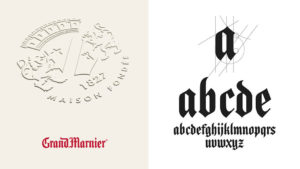
Brandimage has reshaped all its identity and stylistic codes based on this philosophy ‘Live Grand’. The brand’s heritage Gothic typography has been redesigned and modernised to become a distinctive signature with a powerful character.
The new identity has given rise to the creation of an “eccentric” alphabet entirely redesigned in Gothic lettering and juxtaposed with a minimalist Futura to set the brand in a modern and timeless style.
 The brand is redesigned around a trilogy of “Nude white” and “Oak brown” which ensure elegance and understated sophistication, punctuated by “Passion red” for the accent of eccentricity.
The crest, each of whose constituent elements has been redesigned and simplified, is affixed like a watermark to all the elements of the territory: prestigious print, stationary, packaging, POS.
Distinctive sign of the emblematic Cordon Rouge bottle, the red ribbon is played as a distinctive twist present in the Cordon Rouge territory.
Source: Brandimage

You must be logged in to post a comment Login