
- Independent design agency rebrands iconic British pizza brands at home range.
- Applying a clear and simple strategy that amplifies products across UK supermarkets.
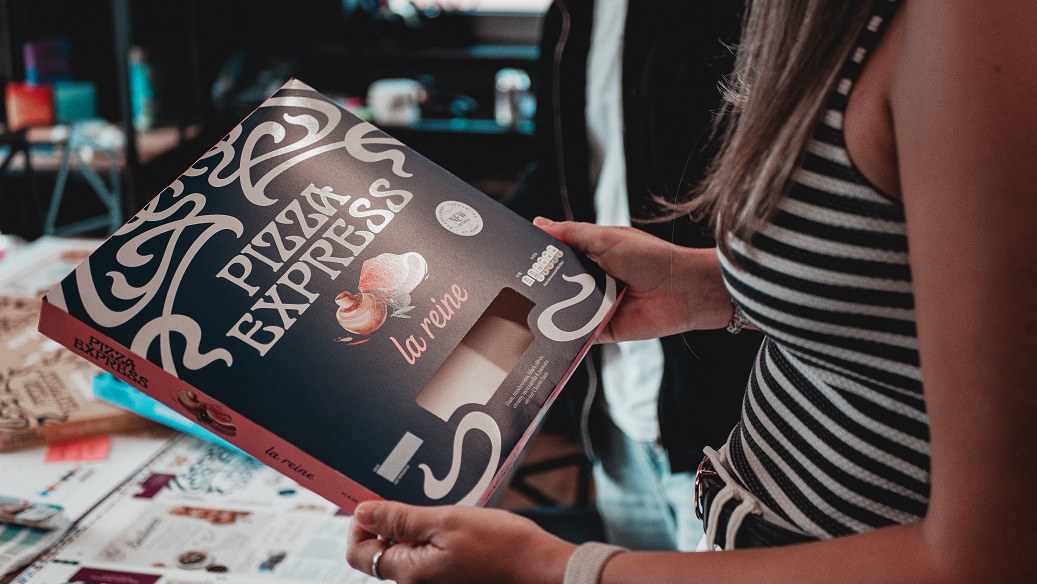
Independent design agency BRANDON and the British pizzeria group, PizzaExpress, have launched a new retail brand identity for their iconic chilled pizza portfolio. Encompassing a new Masterbrand identity, brand architecture and packaging design, the new visual identity imbues PizzaExpress’ 58-year history, whilst refreshing its approach, empowering the brand to extend its lead place within the grocery market.
Rich Mills, PizzaExpress’ Retail Director, said: “For over 20 years, we’ve been selling pizza with pizzazz in supermarkets across the UK and Ireland and this rebrand with BRANDON was an opportunity to transform not only our pizzas to offer customers clearer choice and better quality, but a new retail identity too. From our beloved pizzas to our iconic filagree roundel and colours, with this rebrand we’re standing out on the shelves in supermarkets across the country. We’re delighted with the eye-catching new look of our chilled range.”
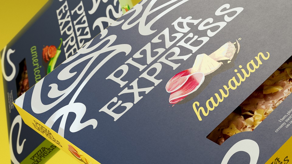
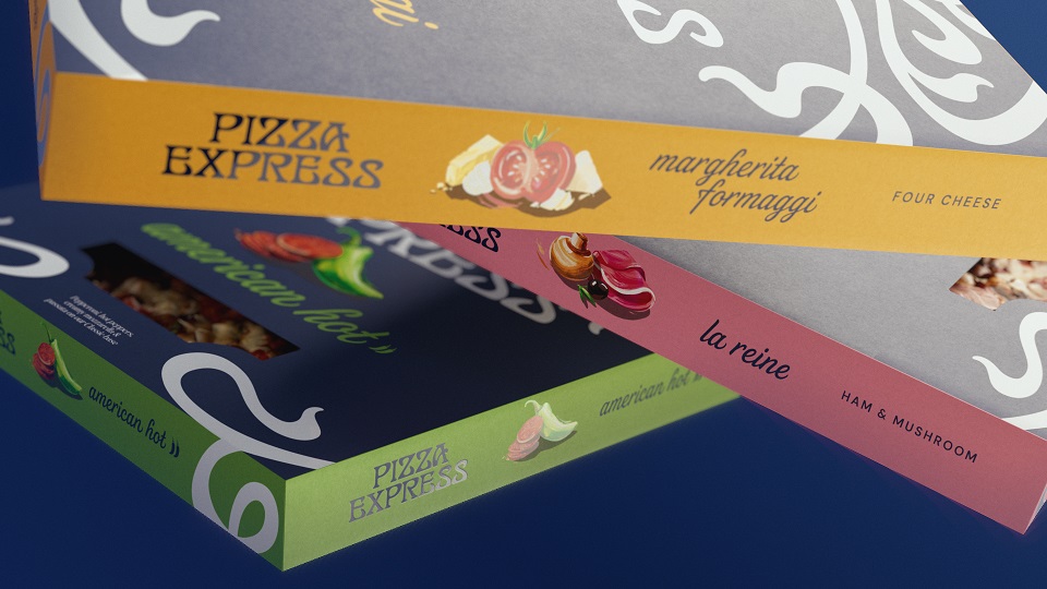
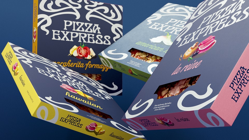
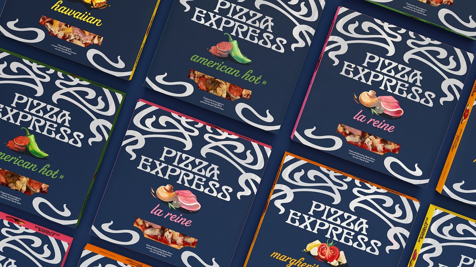
BRANDON reapproached the PizzaExpress product portfolio, developing three range tiers under a wider Masterbrand identity, each range born from one of the brand’s iconic pizzas – Icons (American, Margherita, Sloppy Giuseppe), Restaurant Favourites (La Reine, American Hot, Hawaiian, Margherita Formaggi, Pollo American, Pollo ad Astra), and BRANDON’s aim through the unique design of each was to widen the occasions from every day, weekly use to special occasions, elevating PizzaExpress’ presence in the home and on the shopping list.
Joe Bembridge, Design Director, BRANDON, said: “By unlocking PizzaExpress’ unique and iconic place in our lives, we’ve successfully revitalised a much-loved nations favourite. We looked back into the PizzaExpress archive to help us move the brand forward, unleashing its creative flair from its jazz and art history. We simplified and amplified the iconic filigree mark, the brand’s strongest distinctive brand asset, then simply unified it across the product portfolio as part of a wider Masterbrand strategy.”
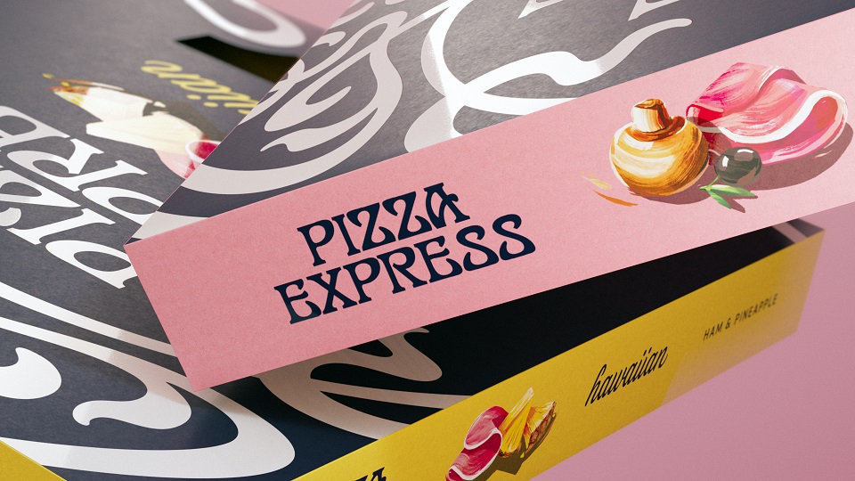
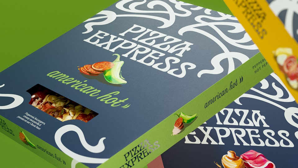
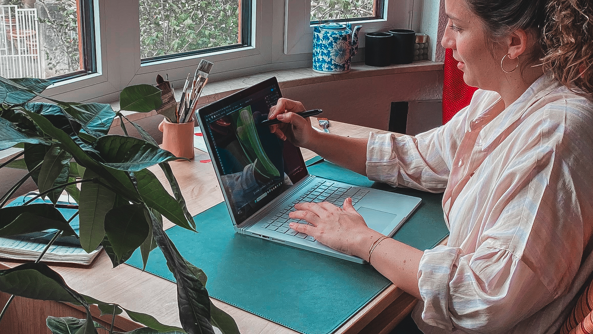
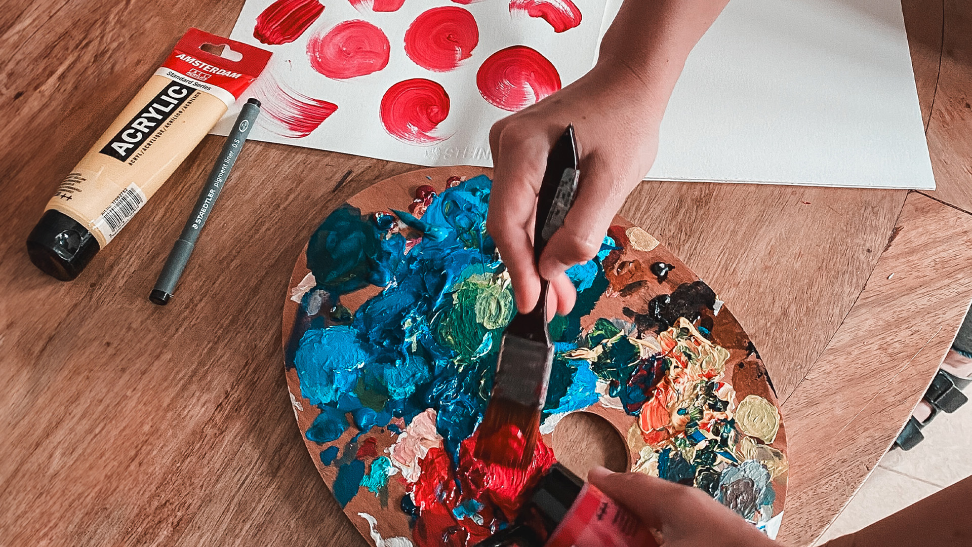
BRANDON’S core ‘Timeless Iconicity with Pizzazz’ brand idea was the foundation for the refreshed identity. Colour was utilised to help shoppers identify the three different pizza tiers. Colours that were already known by PizzaExpress shoppers as relating to certain pizzas remained (yellow is Margarita, blue is American, red is Sloppy Giuseppe), but the PizzaExpress ‘iconic blue’ was leveraged for the first time across ‘Restaurant Favourites’ and amplified with the flavours of the pizzas captured in an artistic brush stroke illustration style, created by illustrator Emily Simpson.


A painterly style that evokes the Soho flair and clearly points to the ingredients that sit atop the pizzas, Emily Simpson, Illustrator, said “It was an absolute pleasure to collaborate with BRANDON in creating these joyful and expressive illustrations. They combined two passions of mine – food and painting. The creative process was a lot of fun and involved composing hand painted brush strokes and textures to bring all the delicious ingredients to life.’
PizzaExpress is a long-held favourite in the UK, and with this in mind, BRANDON used the pizza artistry that is ingrained in people’s minds: the filigree logotype. Well known and recognised, the 56-year-old logotype was designed in 1967, by Italian designer Enzo Apicella. His ask was to replicate the aura of the first PizzaExpress; an image that has stood the test of time for over five decades. Using this iconic image, the agency asked lettering artist, Dan Forster to enhance the product descriptor typography, improving legibility at speed whilst leveraging the cusps and shapes of the key filigree distinctive brand asset.
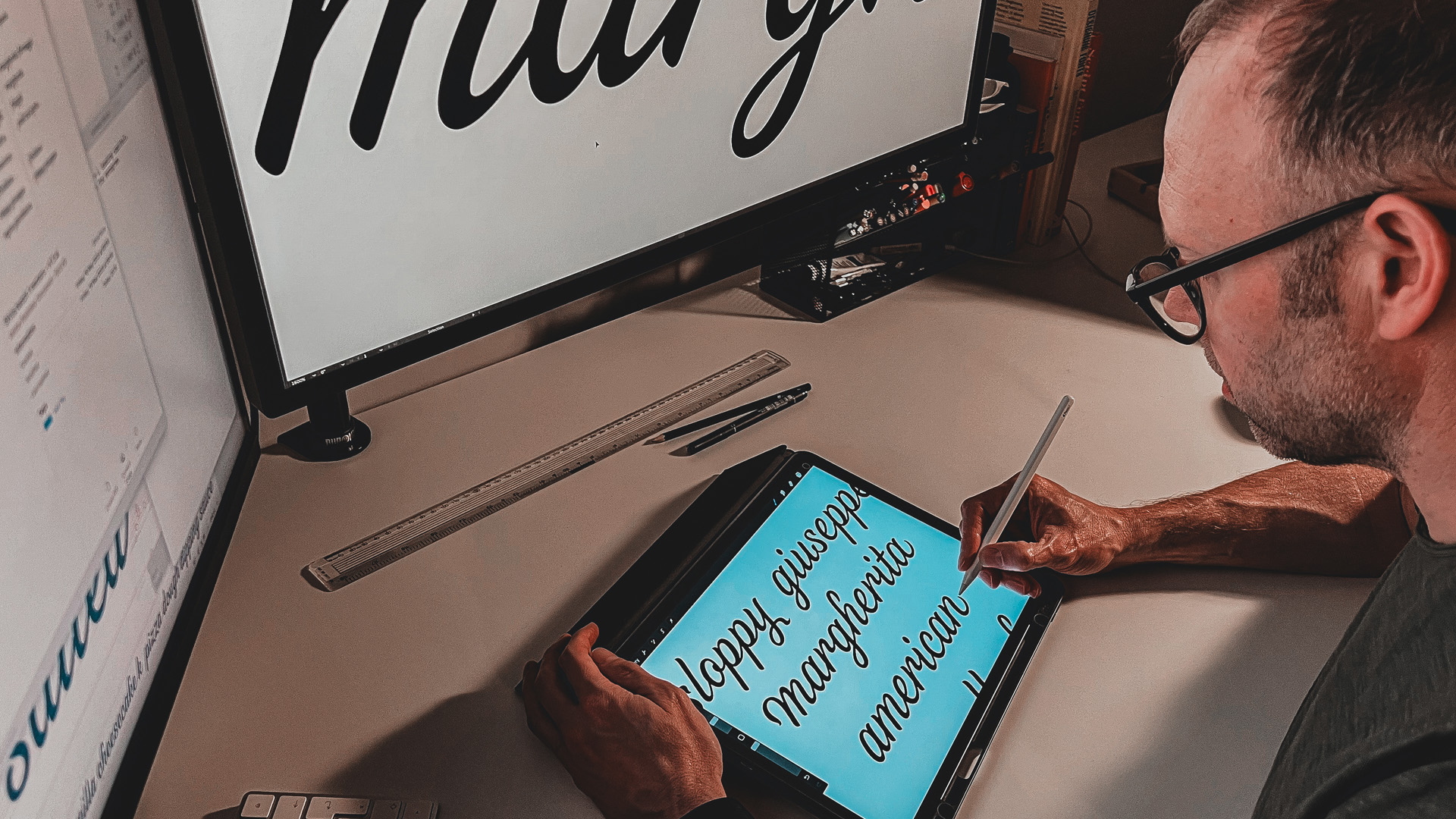
Dan Forster, Typographer, said, “The aim was to improve legibility on pack, and secondly, to echo cues from the iconic main brand marque, to create a more distinctive and ownable type style. A range of approaches were explored to find just the right balance of characteristics. The type was developed in a similar process to typeface design, with further adjustments made to individual characters to add more personality while also accommodating specific pack formats.”
Founded in 1965 by Peter Boizot, PizzaExpress opened its first restaurant in London’s Wardour Street. Inspired by a trip to Italy, Boizot brought back to London a pizza oven from Naples and a chef from Sicily. Today, there are over 360 restaurants across the UK and Ireland and a further 12 markets beyond. PizzaExpress’ passion of making dinnertime, showtime, is now possible within every UK home, courtesy of its chilled and ambient products.
The new brand identity appears across pizzas, pizza sauces, pizza dough, Dough Balls, and salad dressings from this month.
Source: BRANDON
You must be logged in to post a comment Login