
Considered the crown jewel of the Moon Mountain district, Monte Rosso is hard to forget. Rolling out across the steep, rugged terrain, in the majestic Mayacamas Mountains above the Sonoma Valley, the vineyard is home to some of the oldest producing vines in California. Monte Rosso Estate marks a significant milestone for the Gallo Luxury portfolio – uniting the site’s 140 year legacy with a refined, terroir driven vision and an inaugural release that reflects both tradition & innovation.
“There aren’t many places like Monte Rosso Estate; it is stunning. It possesses characteristics of a grand cru vineyard: some of the oldest vines in California, a unique iron-rich soil and an ideal exposure.” – Diego del Pino, Estate Director of Monte Rosso
With their extensive experience in creating aspirational brands, Butterfly Cannon was the perfect fit to bring the legend of Monte Rosso to the world with a brand identity and packaging as alluring as the wines themselves.
Working closely with the Monte Rosso team, including visiting the vineyard, their creative approach was inspired by a usually overlooked and overstepped element: the soil. The soil at Monte Rosso tells its own story. A deep, loamy red, saturated with iron, it seems to pulse with the earth’s vitality. This ferrous life gifts the grapes their vibrant acidity and magnetic character, qualities that translate into wines of uncommon vivacity and undeniable magnetism.
Zoe McGee, Strategy Director at Butterfly Cannon: “Iron is the lifeblood of Monte Rosso; it’s what gives the terroir its unique color and makes these wines so special. But iron is also in everything else in this wonderful universe; it’s the magnetic force that pulls us all together. It’s this that we celebrate on pack and off, the power of Monte Rosso to draw fine wine lovers in from all over the world.”
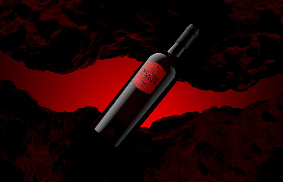
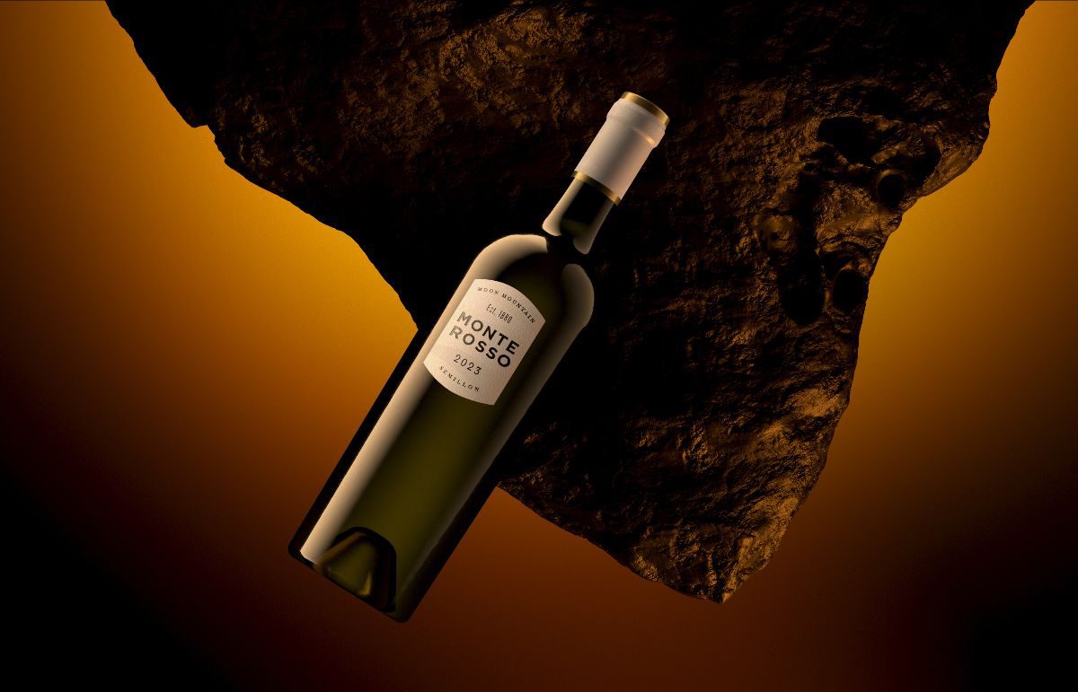
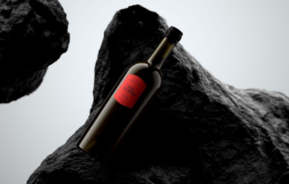
The iron-rich red became the central brand colour, used across the labels of the three red wines: The Essence, The Impression, and Los Niños. Balanced with natural, earthy tones as captured on the label of the only white wine in the portfolio: The Semillon. A subtle background texture embodies the natural beauty of the terroir and its organic forms. Every design element, from the tactile quality of materials to the carefully curated color palette and graphic treatment, reflects the vineyard’s majestic landscape.
Echoing the minimal intervention of the winemaking process, the bottle design is simple yet unforgettable. A single label draws the eye in; the original door of the Monte Rosso winery has inspired its distinct shape. The interplay of typography, layout, and form is guided by an innate symmetry, ensuring that nothing feels forced, yet everything holds a deliberate presence.
Diego del Pino, Estate Director, Monte Rosso, “From our very first meeting, Butterfly Cannon perfectly captured the nature of our project, a contemporary wine estate that is anchored in rich heritage and unique terroir. Their thoughtful, poetic strategy married elegantly with a captivating design that is both memorable and timeless. Thanks to their contributions, Monte Rosso Estate is poised to become an icon that transcends trends and will be here for generations to come.”
Beyond the pack, Butterfly Cannon created the brand book and website, which read like a love letter to the Monte Rosso Estate; breathtaking imagery and copy full of wonder tell the powerful story of Monte Rosso, making it hard not to fall in love with the brand. In the pipeline, to further bring the brand to life, Butterfly Cannon are set to look at brand collateral, including curating the consumer journey at the winery.
Source: Butterfly Cannon
You must be logged in to post a comment Login