
 Caulder Moore is overhauling the brand and positioning of dim sum restaurant Ping Pong.
The consultancy says it won a four-way pitch in January after demonstrating that Ping Pong’s communication can be better aligned with its core offer and essence, ‘Little steamed parcels of deliciousness’.
A new identity has already been developed, which will launch in November when the new interiors, designed by Andy Martin Architects, are unveiled.
The new positioning draws on Chinese cultural references and introduces a primary soft red palette with green tones and a secondary palette of charcoal grey and beige for texture.
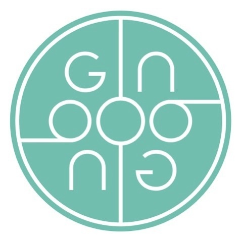
A roundel identity has been chosen because of the use of the circle in Chinese symbolism according to Caulder Moore designer Katy Stamp who says, ‘It also symbolises the beginning and the end of a new year, and a plate of food.’
The ‘i’ of Ping Pong is the divisible line down the middle of the identity. The logo will be applied to doors as a carved wooden block, and on double doors this will divide on the ‘i’.
Signage, menus, table dressings, uniforms, promotions, events, photography and a full range of printed collateral as well as new brand guidelines are being developed.
‘Different moods’ will be evoked in each part of the restaurant, which is known for its dim sum, cocktails, and tea.
The cocktail area will reference ‘the urban side of Shanghai chic’ through photographs, which will be applied to walls and used across menus and printed materials, according to Stamp.
‘The tea bar will be more relaxed with silks and the softer brown and beige colours,’ says Stamp.
Uniforms worn by staff in each area will reflect these palettes and the style – particularly of the chef’s uniform – will reference Chinese dress.
You must be logged in to post a comment Login