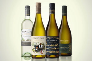
 Stoneleigh hails from Marlborough, New Zealand’s most famous wine region, with an enviable international reputation for producing the best Sauvignon Blanc in the world. The challenge with any brand redesign is to consider what stays and what goes. What equities are required to keep brand recognition amongst current consumers, whilst attracting new ones.
The Stoneleigh brand had strong foundations to work with; a unique and compelling sunstone story, a portfolio of wines that over-deliver in quality and a strong brand positioning of ‘A wonder of nature’. Co-Partnership’s task was to breathe new life into the brand, embracing the unique story of each wine with its own personality, whilst delivering enough brand consistency for them to be recognised as a family.
Stoneleigh’s Range
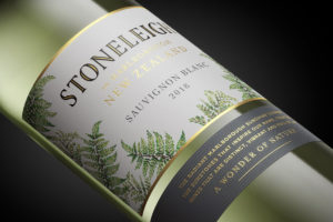 Stoneleigh’s range of entry level wines punch well above their weight for quality with the Sauvignon Blanc earning flagship status for the brand. This range required the most careful consideration as the recognition was extremely high amongst loyal consumers and as a result, the product was selling very well.
Co-Partnership approached the task like a restoration, keeping the architecture as close to current as possible, whilst introducing an update in the identity to hold the provenance in the brand mark. Adding the illustrative ferns to the main label was a revolutionary step for the range and worked hard to deliver on taste expectations, whilst being a distinct New Zealand symbol.
Wild Valley
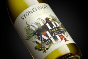 Wild Valley is Stoneleigh’s most natural expression of minimal intervention wine. Grown in the Rapaura vineyards, the grapes are wild fermented with naturally occurring yeast to capture all the character untamed nature has to offer.
With the previous label receiving little-to no recognition in market, the opportunity was rich to create a design solution that really brought the story to life.
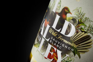 Co-Partnership scaled the Wild Valley name and sat it amongst the native flora and fauna of the region, framing the typography with an artistic illustration that includes the ferns from the classic range to add a subtle connection across the tiers.
The design is printed on a natural fibrous paper with touches of gold foil, screen varnishes and embossing to bring dimension and build premium cues.
Stoneleigh Latitude
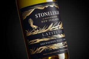 Stoneleigh Latitude is sourced exclusively from the vineyards of the ‘Golden Mile’ – one of the most fertile strips of land in Rapaura, a sub appellation of Marlborough. With such outstanding grape growing conditions Latitude is one of the most awarded wines in the portfolio.
Co-Partnership told this story by framing the Latitude name and wine style within a horizontal strip that strikes through the illustration of native Toe toe (Pronounced Toi toi), a species of tall grass found growing along the golden mile.
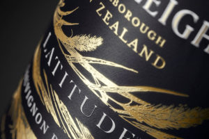 The brand identity is framed against the mountains of the Awatare Valley and captures the twilight hour when the light catches the tops of the mountain range and the tips of the Toe toe grass as they dance in the wind.
The dark blue paper stock was chosen to reflect the cool nights, when the magic of the vineyard’s sunstones come to life, by radiating heat to the vines, which they have absorbed during the day under the hot Marlborough sun. This wonder of nature allows the grapes to continue ripening after the sun goes down and harvesting can occur up to two weeks earlier, a natural phenomenon of the region which gives the brand its namesake – Stoneleigh meaning field of stones.
Rapaura Series
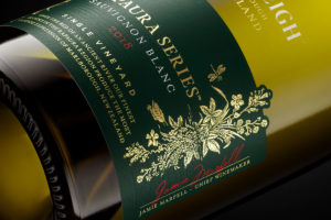 Sourced from an exceptional site in close proximity to the mighty Wairau River, Rapaura Series earned its name from the shallow rock and gravel-exposed soils of the vineyard, which were once an ancient river bed. This unique terroir defines the range’s complex and distinct wine style.
With a specific location, the inspiration for Rapaura Series came from the ancient Wairau River. Co-Partnership used the water story to set the scene, illustrating the native flora and fauna found along the river’s edge. Through the water’s reflection which they blind embossed the ripples which stretched across the illustration to bring to life the story.
 As the premium tier in the portfolio the design agency elevated the master brand above the main label to create a difference amongst the overall portfolio and add premium cues by creating a smaller more precious main label. The paper stock was printed in a dark, emerald green to represent the natural beauty of the region and the singular expression of one vineyard.
Source: Co-Partnership

You must be logged in to post a comment Login