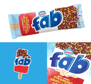
 Strategic brand design agency, Springetts have refreshed from branding of Nestle owned lollies, FAB, ahead of it’s 50th anniversary.
“FAB had lost its cool and was coming up to a milestone birthday. The packaging had evolved to look like every other lolly brand in the freezer. Everyone recognises a FAB and the packaging should be no different. We discovered that outside of FAB everyone was using the trio of colours far more iconically than the brand themselves,” said Springetts in their release. “Our task was simple…to make the brand as iconic as the lolly.”
The agency delved back through the FAB brand history and discovered the brand, like the lolly, was strongest when it celebrated the trio of flavours topped with sprinkles. They did not however want the brand to be only about nostalgia. This had to be a complete reinvention like the Mini Cooper.
“We made the lolly the hero and reconnected the brand back to the product. We also stripped back the over-engineered type to something simpler and more fun,” revealed Springetts.
The product descriptors came from a 5-year-old, Isabella, who on tasting the lolly described it as “milky, choccy, strawberry…with sprinkles on top”. The agency thought it described a FAB perfectly and so used it on the packs.
Springetts also created a limited edition ‘birthday cake’ flavour to celebrate the brand’s 50th birthday with a campaign around being “fab at fifty”.
The overall design achieves a stripped back simplicity that talks about the fun of the product.
Source: Springetts

You must be logged in to post a comment Login