A brand with quiet confidence
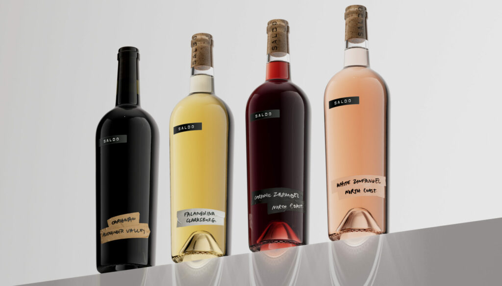
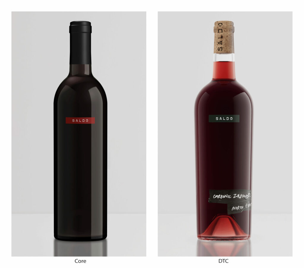
SALDO luxury wine is known for taking risks, not only with a wine style that explores uncharted territory, but also with its disruptive packaging. Defined by simplicity, SALDO’s core wines feature a Dymo label brand identity and nothing else – an intriguing minimalism that encourages curiosity and cuts through with today’s luxury consumer.
Saying more with less
When SALDO was ready to innovate with a new range of experimental direct-to-consumer (DTC) wines, they came to specialist drinks branding agency Co-Partnership to tackle the challenge of building on a brand world where less is more. With just one distinctive asset (the Dymo identity) and equity in minimalism, how
Materials found in the winemaker’s lab
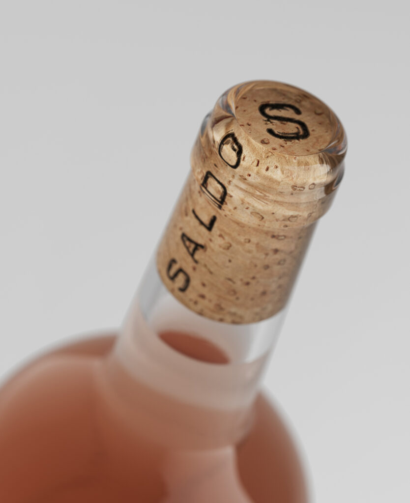
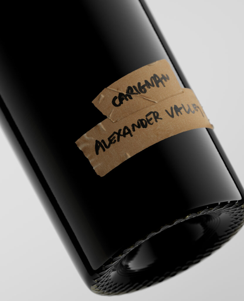
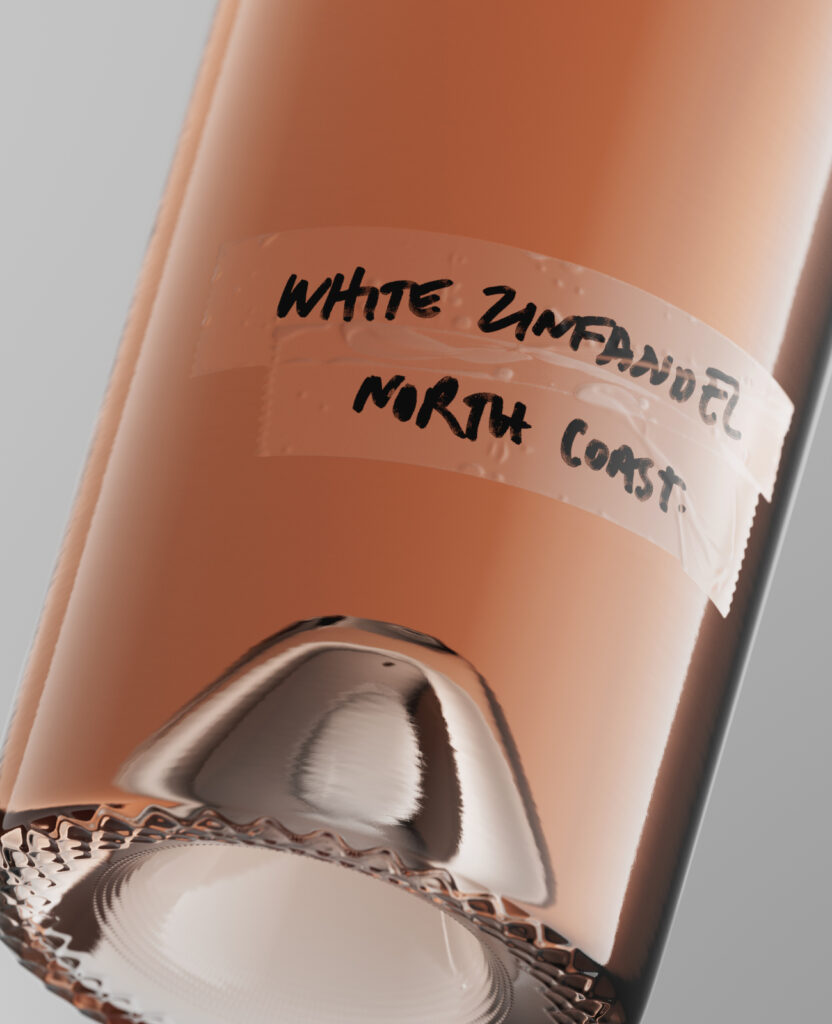
To solve this creative challenge, Co-Partnership turned to the brand’s narrative. The identity tells a story of process: a winemaker invested solely in the craft of winemaking, labelling the wine with what’s to hand in their lab. Co-Partnership’s solution extends the brand’s visual language of materials found in the winemaker’s lab using adhesive tapes and handwritten messaging. These secondary labels differentiate from the core portfolio without detracting from the brand’s powerful simplicity thanks to generous space between the identity and the varietal communication.
Scaling a small batch aesthetic
The SALDO aesthetic suggests small batch experimental wines, but SALDO is in fact a large volume, commercial brand. So print finishes were carefully chosen to not only make the labels feel like hand-applied tape, but also run down a fast bottling line – a technical feat that supports both the brand’s narrative and operational needs.
Source: Co-Partnership

You must be logged in to post a comment Login