
- innocent Drinks, Europe’s leading healthy drinks company, unveils confident new packaging for its portfolio of juices and smoothies with rollout complete by February next year.
- Its iconic ‘Dude’ has been redrawn with a custom wordmark and applied consistently across all its drinks.
- The visual language aims to help its drinkers navigate its portfolio with ease, whilst communicating the value and functionality of its drinks.
innocent Drinks, Europe’s leading healthy drinks company, is spreading the power of fruit and veg with a confident new packaging redesign, to help drinkers navigate its portfolio with ease.
innocent has created an iconic, effortlessly recognisable brand identity that stands out on the shelves. Revamping an entire portfolio of products including juices, core smoothies, iplus, and super smoothies ranges.
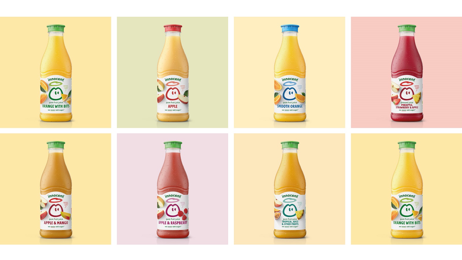
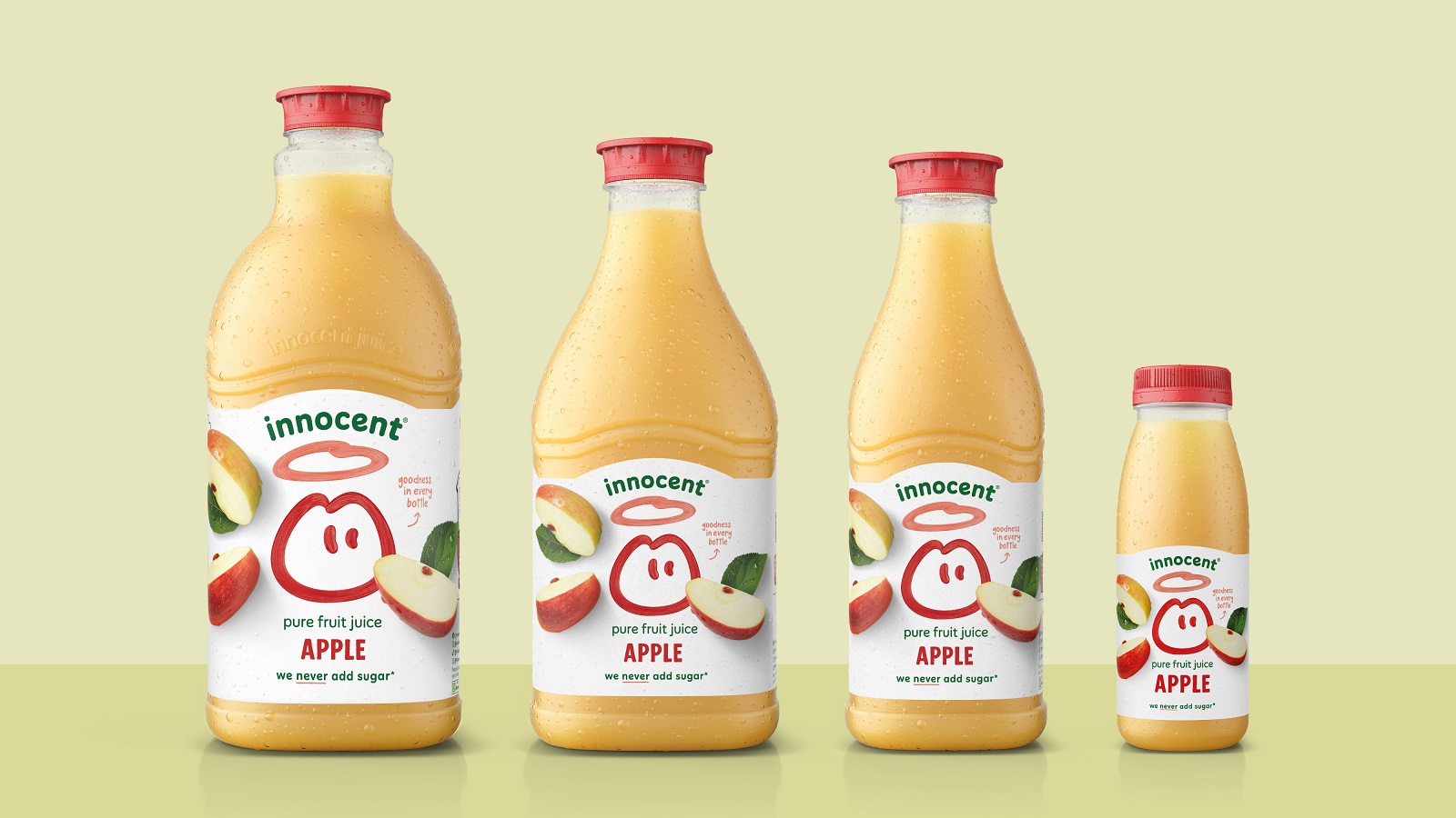
The new design strategy focusses on simplicity, and has been built around a streamlined philosophy, resulting in a confident brand block. inocent’s iconic logo, ‘Dude’, which has been redrawn with custom woodmark, stands as the star of the show. Small changes to the juice and smoothie makers signature logo, which is now straighter more confident and integrated with other design elements sees it prominently featuring on front-of-pack for all of innocent’s drink ranges.
Consistent front-of-pack labelling across each of its 18 markets is complemented by back-of-pack stories, in innocent’s unique tone of voice. Playful copy is synonymous to the brand, and this new look maintains that, with natural photography and hand drawn touches reminder its consumers that its drinks are made by humans.
Key design elements, to help communicate points of difference across the range, include:
- Juices: Delicious, natural fruit photography is set against a crisp white label to convey the refreshing nature of the range.
- Core Smoothies: Introducing a subtle, delicious tint to the labels to communicate the thicker, nourishing nature of these products.
- iplus Range: Transparent labels display the amazing liquid colours, whilst simple range descriptors help drinkers understand and navigate the range.
- Super Smoothies: Rich label colours communicate the nourishing nature of the range, with subtle gradients and tints used to demonstrate the product functionality and value.
The rollout of the new packaging begins this month and will be completed by February 2025.
Irem Mainwaring, Head of Brand and Portfolio at innocent Drinks commented:
“Our designs have evolved organically as we have grown, but as we looked ahead at our future, we found it was time for a refresh. Realising our packaging wasn’t making it easy for our drinkers to choose our bottles and enjoy the goodness of fruit and veg inside was what inspired our new design strategy – making our ‘Dude’ the star of the show again no matter where in the world our drinks are being sold.
Our dude is a beacon of goodness, with our drinks being an easy and delicious way to get more fibre, vitamins, minerals and phytonutrients into our diets, so we wanted a visual language that matched this. The result is a bold and playful system that aligns with the innocent brand whilst helping drinkers understand the goodness that goes into our juices and smoothies. We can’t wait for this to hit shelves in the following months.”
Source: innocent Drinks
You must be logged in to post a comment Login