McDonald’s menu items are so recognisable that people barely need to see them to know what they are.
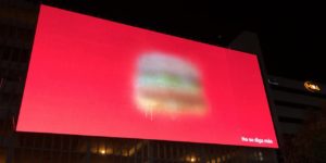
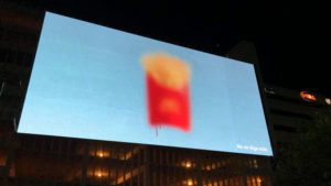
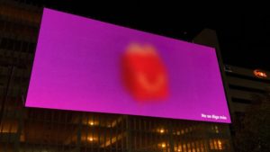
That’s the upshot of a devious new outdoor and print campaign from TBWA\San Juan, which features classic menu items from the fast food chain— a Big Mac, a Happy Meal, a carton of french fries — blurred out against simple single-colour backgrounds.

“No se diga más,” reads the only copy. In English, that’s “Say no more.”
It doesn’t hurt that each impressionistic execution evokes the marketer’s classic branding in other ways — the yellow cheese on the Big Mac against the ad’s red backdrop ticks the box on its classic colour combo, while the yellow-fries-in-a-red-box and happy meal packaging are icons in their own rights.

The real dirty trick though, is the way the images make the viewer do just enough extra work to identify the item — serving up a little puzzle-solving dopamine kick while planting the seed that maybe it’s not such a bad idea to grab two all-beef patties on a sesame seed bun.
Source: Adweek

You must be logged in to post a comment Login