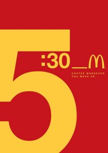
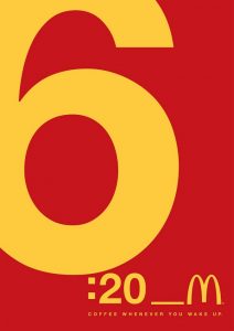
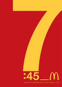
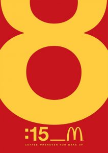
 Regardless of what time you wake up, McDonald’s has a cup of coffee ready for you.
That seems to be the message that the fast food chain is trying to convey in the following ads, which were designed by Leo Burnett Dubai.
Made only with typography elements, the ads also feature the chain’s signature colours of red and yellow.
Credits:
Advertising Agency: Leo Burnett Dubai
Regional ECD: Andre Nassar
Creative Director: Daniel Salles, Bruno Bomediano
Art Director: Daniel Salles, Bruno Bomediano
Regional Communication Director: Jad Mouhawej
Associate Regional Communication Director: Rasha Alazem
Source: Design Taxi


You must be logged in to post a comment Login