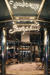
 Two successful years after launching their first site on Cannon Street, Scarpetta’s owners asked brand design experts Mystery Ltd. to handle the interior and product design for a new site in Canary Wharf that would showcase Scarpetta’s own coffee, negroni and pasta flour brands and include its own Italian spritz bar.
Brand Positioning
Embodying the true essence of Italy and all that’s great about the Italian culture, cuisine and lifestyle, Scarpetta’s aim is to be an Italian fast-casual concept that guarantees genuine quality, authenticity and a real Italian experience. Scarpetta exists to integrate genuine Italian cuisine with the fast-paced London city life, serving genuine, fresh pasta dishes, handmade daily, to hungry city workers.
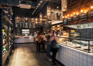
The new site has been designed as a faithful representation of the original model, while adding to the experience by introducing a new bar to service the Canary Wharf’s evening trade and providing a suitable setting for Scarpetta’s authentic branded products.
Brand Identity
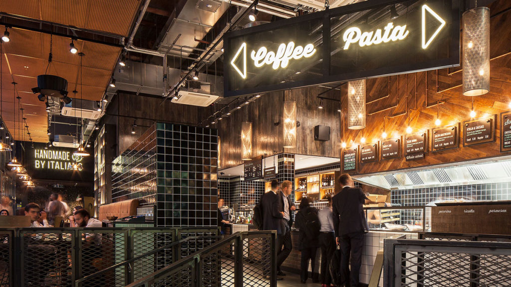
The brief was to create a space that was transitional, comfortable and exciting, but that would set apart Scarpetta from other QSR concepts, focusing on the brand’s sense of Southern Italian authenticity.
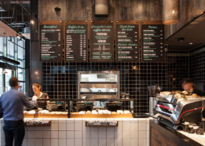
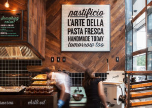
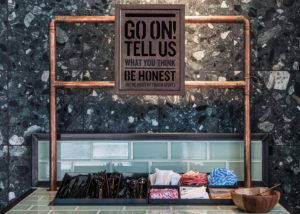
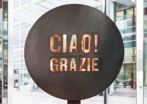
“We worked with the existing identity and evolved it different types of materials and graphics. To achieve the authentic feel, we used sign written tiled features and floor mats inspired by authentic Italian restaurant signage. Illuminated way finding graphics were introduced to assist the customer’s journey, as well as layered graphics using a mix of sign writing and neon,” revealed the design house in their release.
Interior Design
 Led by learnings from the Cannon Street site, an express till area was created for Canary Wharf, exclusively for Scarpetta’s main pasta offering. This speeds up the queuing process and aligns nicely with the restaurant’s quick daytime dining style.
A mezzanine level was created within the large double height space to house the BOH kitchen facilities, together with a large display unit to showcase Scarpetta’s own product range.
 “A key part of the brief was to communicate the quality of Scarpetta’s offer, which we did using a few carefully written wall graphics. The messages sit on a mix of iconic Italian materials and more modern hi-spec finishes, all allowing the product to take centre stage,” said Mystery.
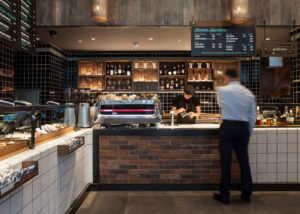
In the evening, the space transitions into an Italian spritz bar. Low lighting, Negroni displays and the smell of fresh oranges fill the air and what was once a bustling QSR filled with busy city workers on their lunch break becomes a relaxed bar, ready and waiting for a buzz of workers wanting to kick back after a long day.
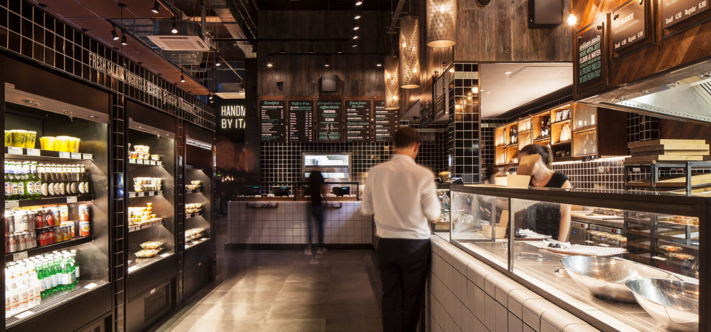
With the help of Nulty lighting, Mystery achieved the perfect lighting ambience within the space, allowing the product displays to glow and warm burnished copper shades to create a relaxed and welcoming space.
 Product and Packaging Design
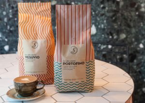
Along with the new site, Scarpetta also wanted to showcase its own brand of coffee and negroni, as well as Scarpetta’s own mix of pasta flour. While complementary to the brand, the agency designed the new product packaging to look intentionally different from the main identity, to convey the style of an authentic Italian deli brand.
The coffee packaging was designed to reflect the two locations it is named after – Vesuvio and Portofino; while the beautiful Negroni bottle features labels printed with copper foil to give them a premium and exclusive feel.
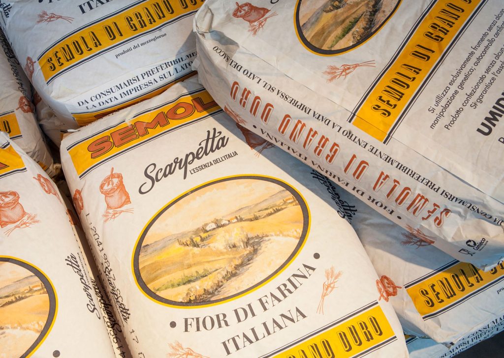
The flour is from Scarpetta’s own supplier in Southern Italy, milled to the restaurant’s own specifications and the hessian flour bags have been designed to give the impression of an authentic Italian brand that has existed for years.
Source: Mystery Ltd.

You must be logged in to post a comment Login