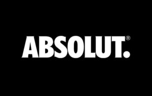
 Pernod Ricard has axed the ‘Vodka’ text from Absolut’s logo to enable it to expand its marketing to new areas without cannibalising the brand’s cache.
The new logo replaces the traditional three-line branding – Absolut Country of Sweden – on all marketing assets, with the exception of the bottle itself. It incorporates an updated typeface and colour palette, which the company claims will bring the vodka under one common look and feel.
Pernod Ricard has used the simplified Absolut name in the past, as have many drinkers, and the change has been made to reflect that recognition while also setting it up for future growth. The drinks maker says the refreshed identity has been created to “simplify, unify and amplify the brand’s messaging platforms, allowing the editorial team to tell a wide-range of stories, while still feeling distinctly Absolut”.
It is an extension of the vodka’s recently launched “Transform Today” strategy to tighten its ties to the creative arts.
http://www.youtube.com/watch?v=93uIGknDJIc
The refreshed master brand is being pushed initially through the brand’s revamped online portal, which launched on January 7, to usher in a more localised approach to how it engages fans online. The online overhaul is a move away from the more static nature of Absolut’s previous effort, which featured ads from its latest campaigns and details about the vodka’s heritage.
Pernod Ricard’s investment in its flagship vodka brand comes at a time of heightened competition in the category as spirits makers bring the heritage of their brands to the fore to exploit demand for premium drinks.

You must be logged in to post a comment Login