
Global brand experts BrandOpus, have been working with Princes following a rigorous pitch process to relaunch the brand with a new branding strategy and visual identity.

A heritage brand from Liverpool, since 1900, their broad range of canned and ambient products have been a staple in British homes for over 118 years, from fish and meat, to fruit and juice. With category and consumer attitudes shifting and changing, adapting to modern families ever evolving needs is vital.
BrandOpus’ brief was to reinvigorate the brand, establishing it as the iconic store cupboard staple for modern families and to ensure they affirmed their position as one of the leading players within the food and drink industry.
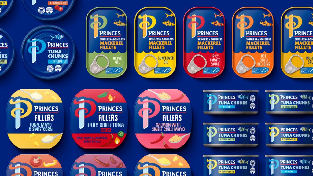
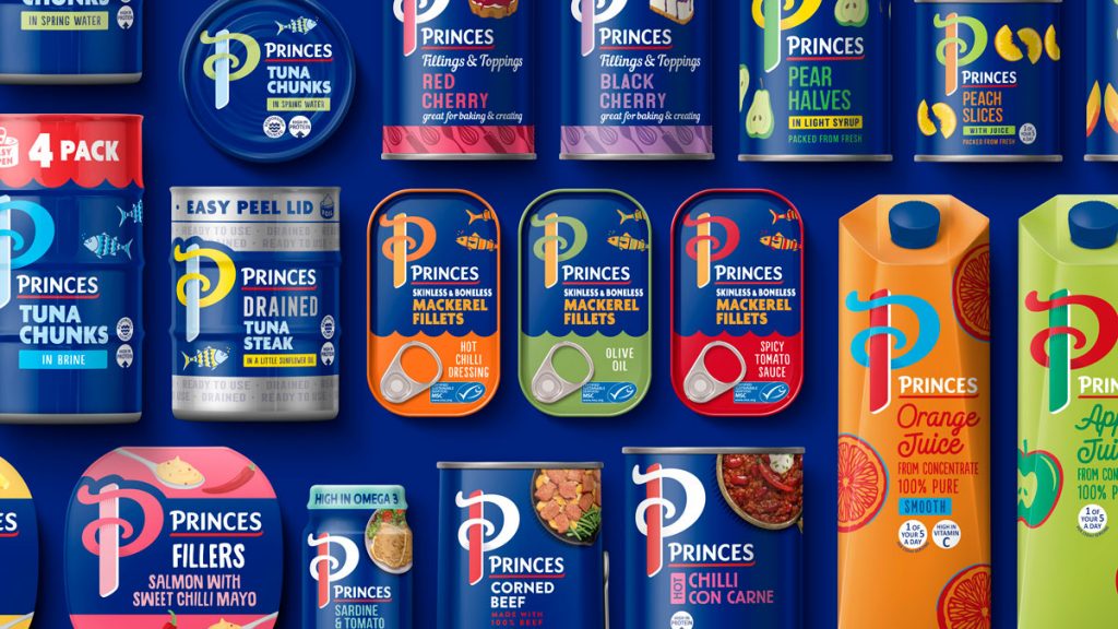
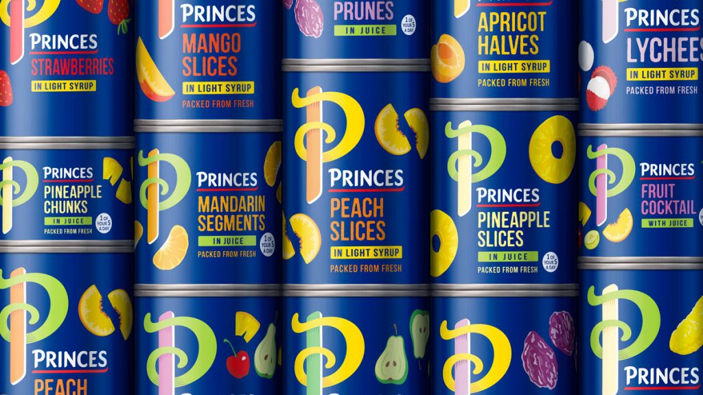
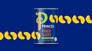
With a new visual identity, symbolised within the confident illuminated P. Positive, passionate and self-assured, Princes is about pride in the food you provide. Reimagined in a more contemporary way, the iconic lettering stands out, beaconing the familiarity and comfort that this heritage brand is known for.
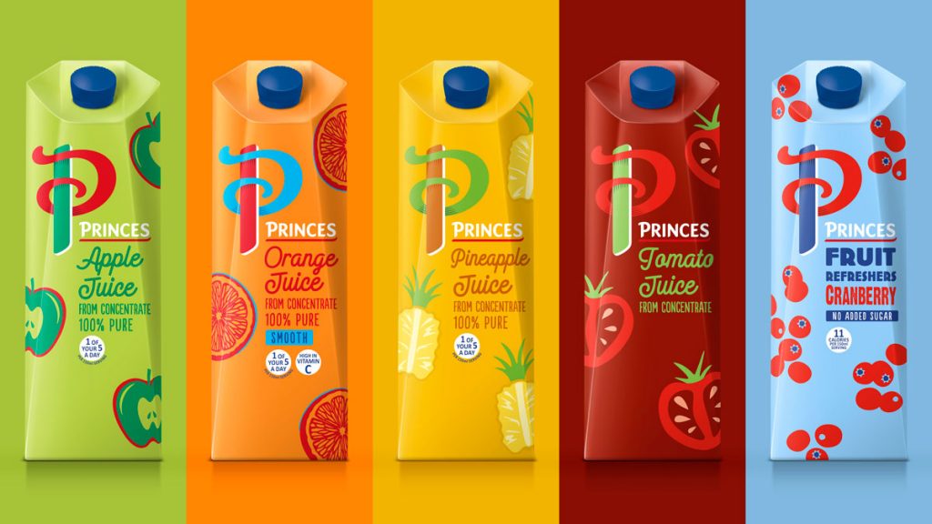
The iconic P was applied across the full portfolio of Princes products, ensuring memory structures were maintained in each category. Princes are affirming their position as a favourite for feeding a family, delivering in the moments that matter.
Princes Marketing Director, Alan Eriksen said: “The new visual identity is both distinctive and contemporary. It puts us in a strong position to grow as one of the UK’s largest food and drink brands.”
Nir Wegrzyn, CEO at BrandOpus says, “The identity proudly stands out from the crowd, championing the brand in a contemporary, engaging way. Shifting perceptions, we wanted to reflect Princes pride in where they have come from, whilst aligning with the changing modern landscape and embracing their excitement for the future. Princes are now able to drive relevance without alienating loyal consumers, with an identity that solidifies them as the go-to brand for families.”
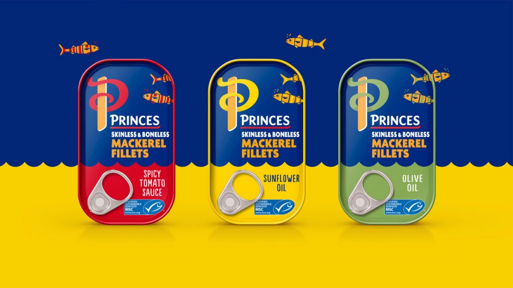
Ellen Munro, Creative Director at BrandOpus says, “The new revamped Princes visual identity style includes standout lettering and bold colour palette, which champions each product, while still maintaining important characteristics between each of Princes iconic staples. The newly flourished P prominently stands out on the shelf, reflecting and encompassing Princes pride, heritage and heart.”

Source: BrandOpus
You must be logged in to post a comment Login