
Integrated branding agency Ragged Edge has created a brand strategy and identity for disruptive new venue, WE ARE BAR, which launched in October. The name ‘WE ARE BAR’ is designed to be inclusive, bold and memorable.
Putting Customers First
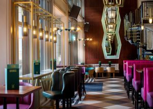
WE ARE BAR owner Kornicis, led by Richard Stringer and Ian Banks, launched its first site in Bishopsgate in the heart of The City of London. Kornicis plans to roll out the new WE ARE BAR brand in other Central London sites before moving out into the London villages and further into the commuter belt. The aim is to create a group of bars dedicated to putting their customers first.
 Confident & Bold
Focus groups and interviews enabled the team to understand WE ARE BAR’s audience and forge the brand around their needs.
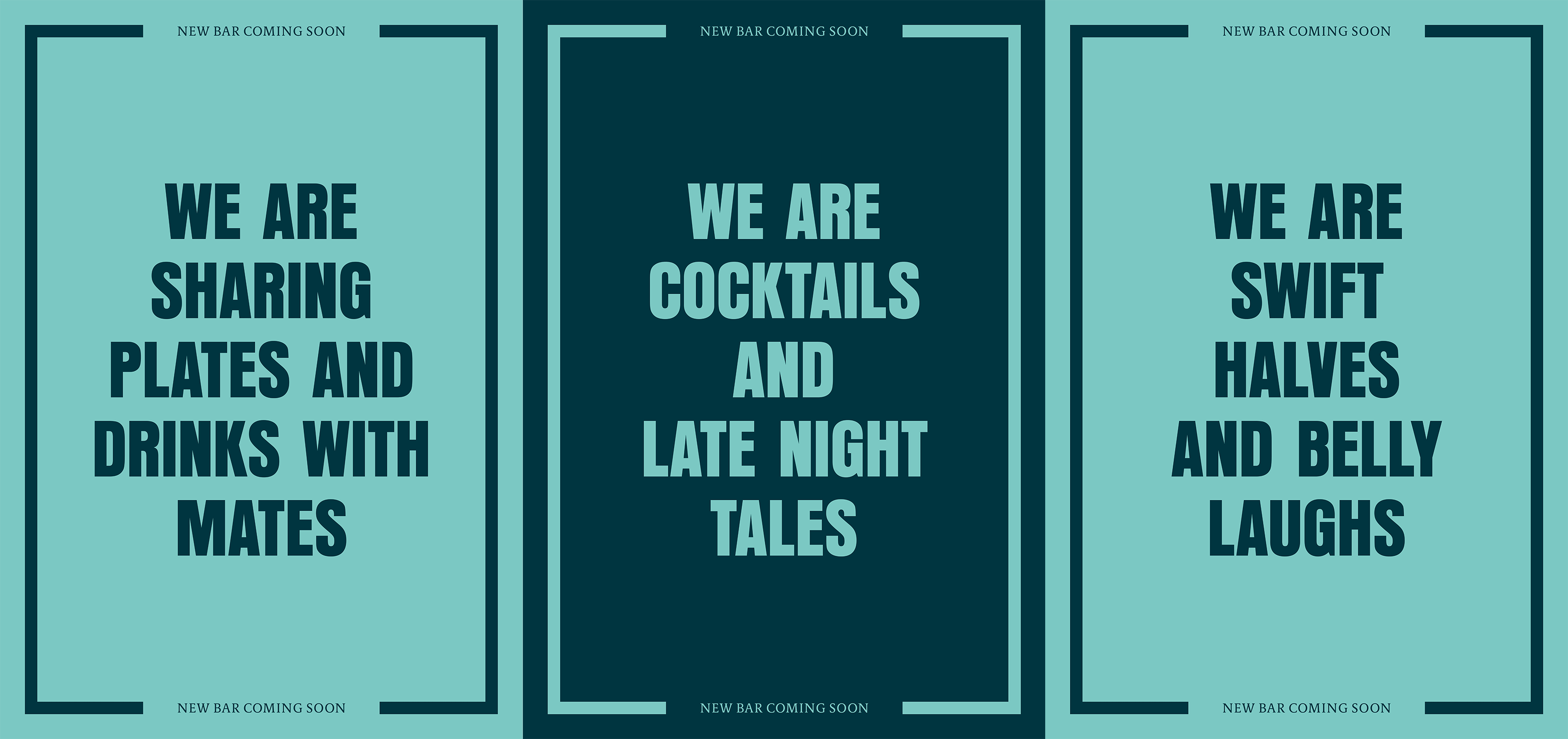
The name WE ARE BAR takes inspiration from the beat of the city: the venture was built from the ground up to meet the unique needs of those who live and work in urban environments.
The visual identity took its lead from the name, with a bold, energetic and direct approach.
Inclusive, Neighbourly & Wholehearted
Max Ottignon, Co-Founder of Ragged Edge, says: “We wanted to put down a marker with a bold, disruptive and memorable name. A statement of intent that would underpin the entire brand. It’s a name that feels inclusive, neighbourly and wholehearted – a perfect expression of our strategy that set out to give the brand a point of difference rooted in genuine substance. The name also led us to a highly distinctive tone of voice, with copy forming a fundamental part of the identity – a rarity in the category.”
Design with Substance
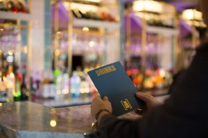
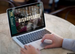 The brand was brought to life across a suite of menus, brand collateral, photography and a website.
A bracket device repeated in the interiors communicates inclusiveness, while a typographic-led system provides a distinctive tone of voice. The primary typeface, Anzeigen Grotesk is no nonsense, confident and direct, and was selected to match the bold tone of voice. It’s supported by Berlingske Serif, which was chosen for its character and legibility in the low light of the bar.
A set of illustrations for wall posters were commissioned from artist Luis Dourado to reflect the brand idea ‘The Beat of The City’ and juxtapose escapist imagery with photography of the city.
Colours used in the design touchpoints include a premium dark green, paired with a more contemporary light green and gold highlights. Ragged Edge worked closely with Grapes Design to ensure the interiors and design worked together harmoniously.
Defining Every Element
 Richard Stringer, CEO says: “We are building a brand to raise the bar for drinking in the city and asked Ragged Edge to help us to define, name, create and build it. In WE ARE BAR, we have collaborated on a fresh and exciting new concept which will be very successful. Ragged Edge guided us through every step of the brand creation process and their strategic, customer-focussed approach made all the difference. The results speak for themselves.”
As the WE ARE BAR concept expands into new sites, Ragged Edge will continue to work with the brand to bring it to life.
Source: Ragged Edge
You must be logged in to post a comment Login