
Global strategic branding studio Robot Food has unveiled a sophisticated new identity for Co-op‘s premium-tier ‘Irresistible’ spirits and cider range. The redesign champions own-brand as a desirable choice, equipping each product with a unique story and a distinctive visual style to compete with leading brands in their respective categories.
Building on a successful ten year partnership, Robot Food was briefed to elevate the quality, craft, and narrative of the specialist Irresistible tier. The project taps into a key consumer insight: shoppers are more confident than ever in the quality of own-label products, actively seeking out premium own-brand alternatives that offer both value and excitement.
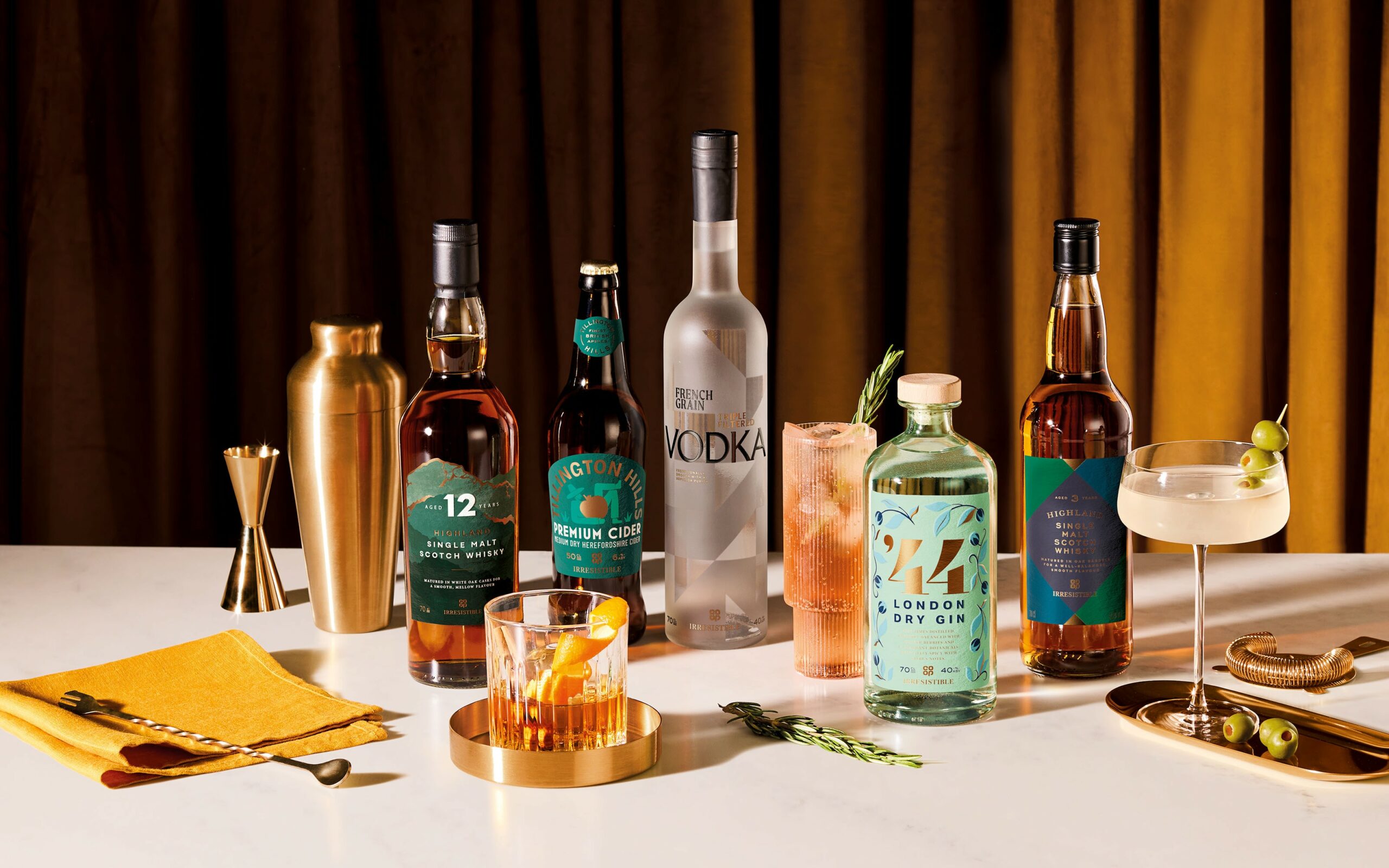
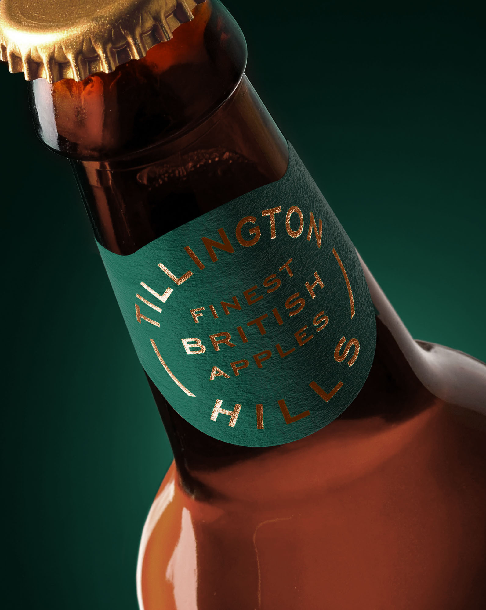
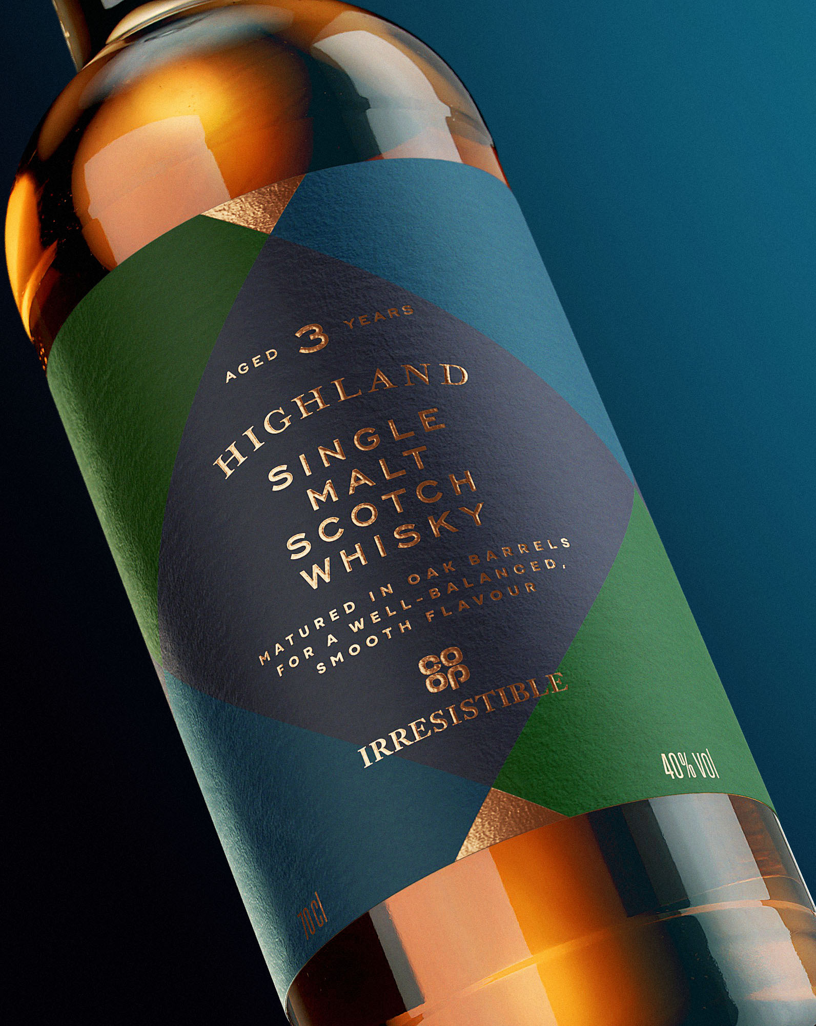
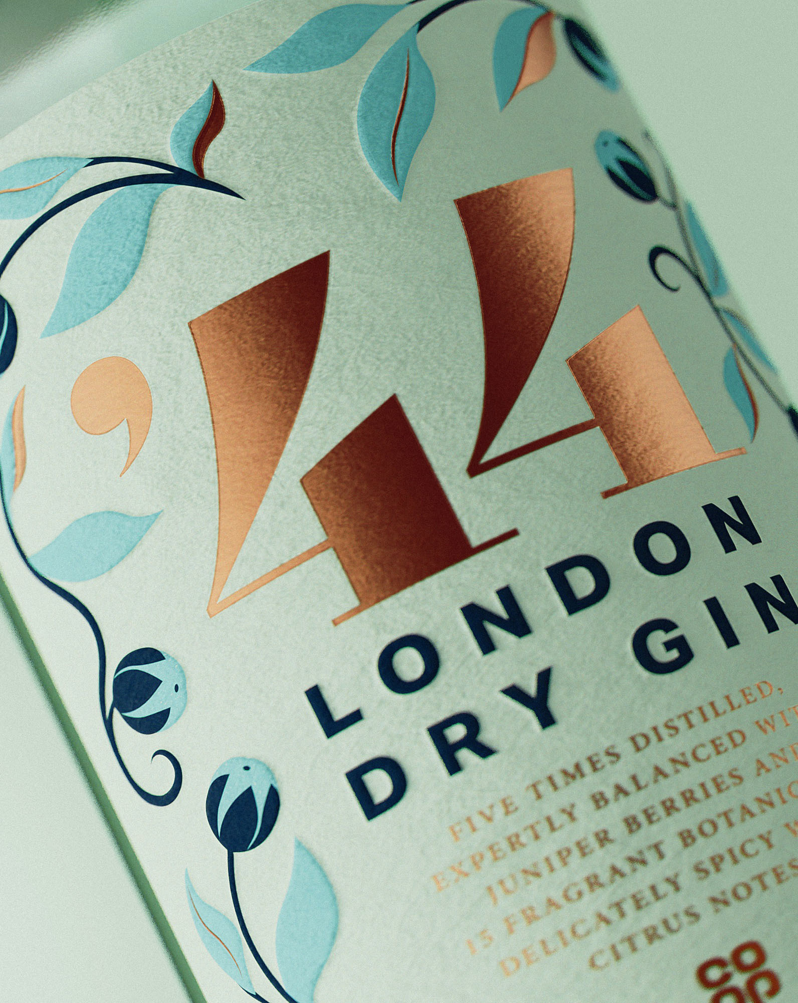
Using the core creative idea ‘Make Irresistible, irresistible’ as a springboard, Robot Food have moved the range far beyond its previous simplistic logo-based packaging, developing a suite of designs where each bottle tells its own story. To maintain a cohesive range identity, a signature copper thread now features throughout the collection, used in foils and luxury finishes to signify the premium quality of the Irresistible brand.
Rich Robinson, Design Director at Robot Food, said: “To make Co-op Irresistible, well, irresistible, it was all about the details. Moving far away from the simplistic box logo of the previous packaging, we added some much-needed craft and consideration to the range. Now with their own identities, combined with consistent copper touches and luxury finishes, each bottle feels instantly special.”
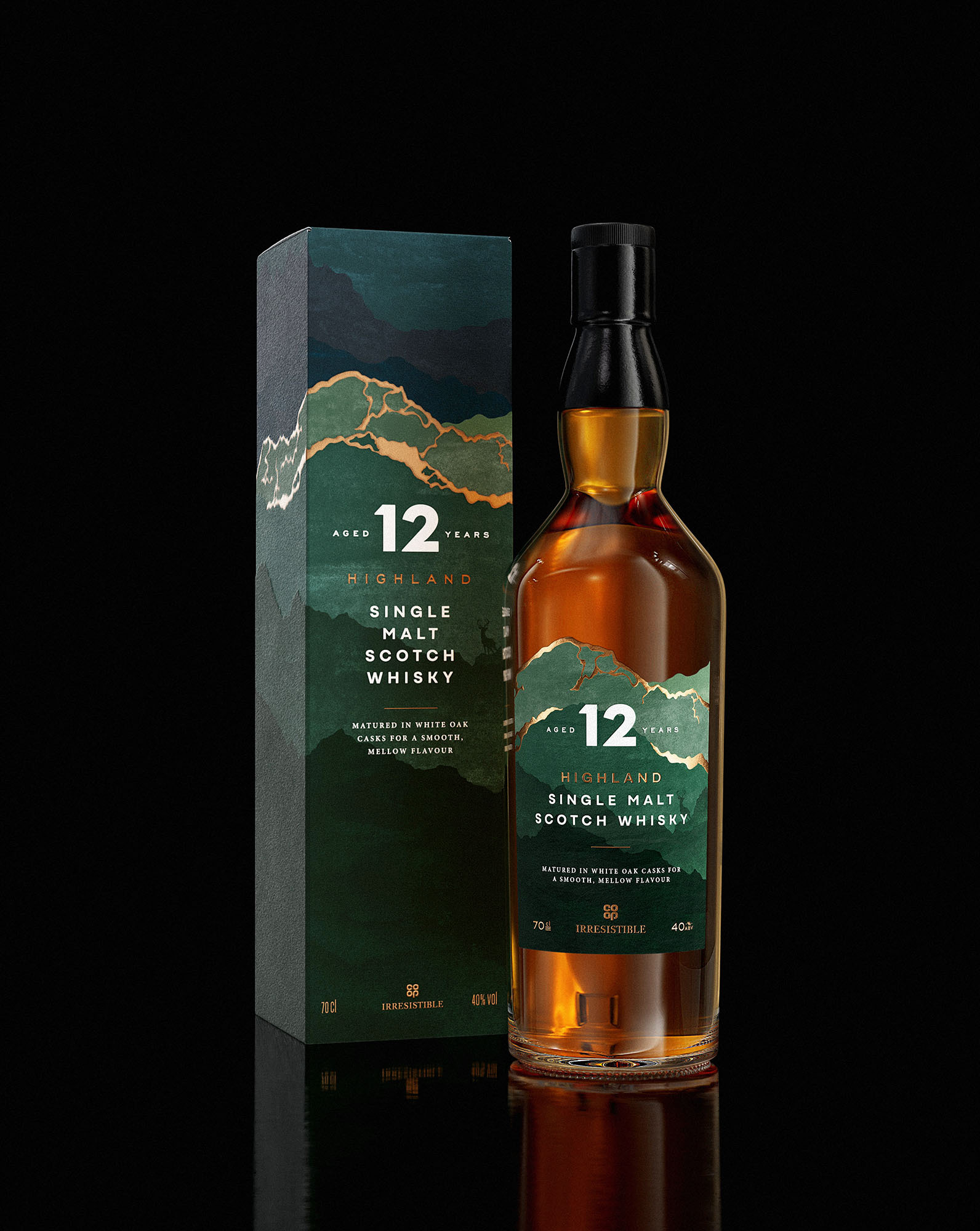
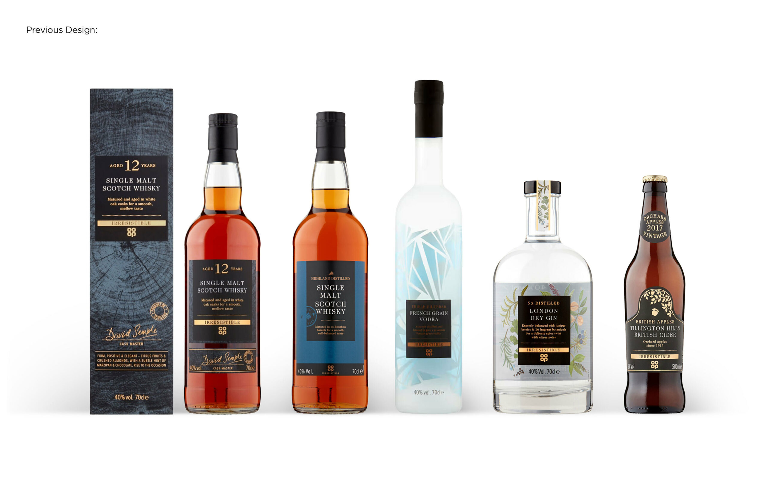
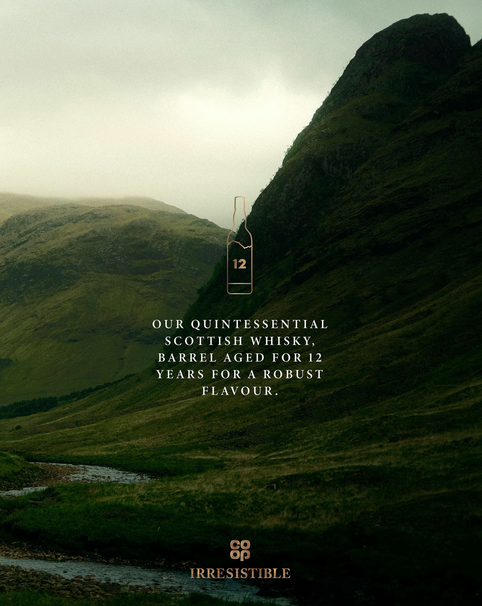
The design details for each product are now rooted in its unique provenance and character. The 12-year-old Blended Scotch Whisky evokes the dramatic panoramic views of the Scottish Highlands. A bespoke label shape and tactile paper stock hero the raw textures of the landscape, while simple, classic typography adds a refined, contemporary feel.
The Single Malt takes cues from traditional Scottish kilt design with a modern twist, using rich, deep colours and a striking diagonally cut label. The opulent copper accents act as a visual shortcut for quality and flavour.
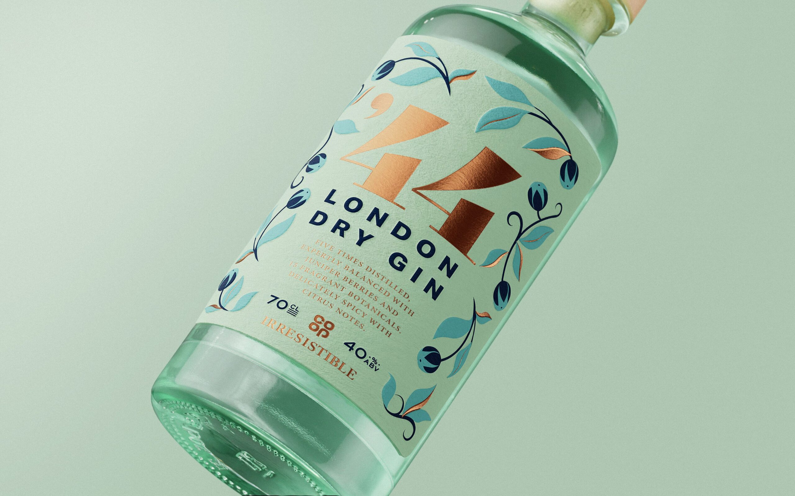
For the London Dry Gin, a light, airy, and floral aesthetic celebrates the fragrant botanicals within. The design features delicate pastels and includes a ‘44’ moniker, a subtle nod to the year the Co-operative Group was founded.
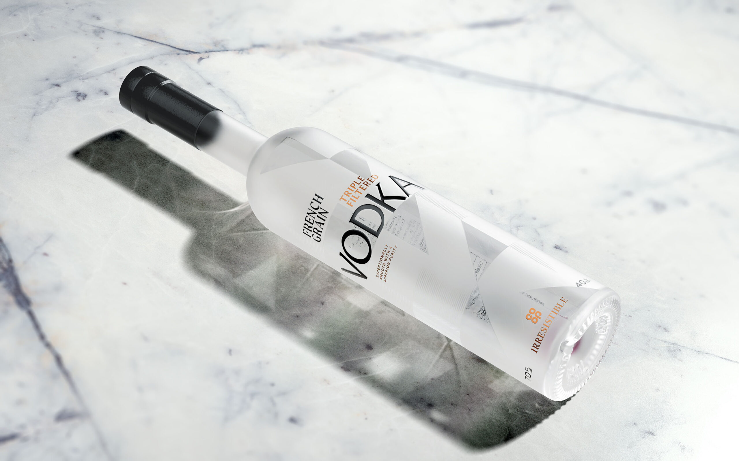
Reflecting the purity of the liquid inside, French Grain Vodka was inspired by the crisp Alpine air. A tall, elongated bottle with frosted glass and clean geometric shapes now conveys a distinct European sophistication.
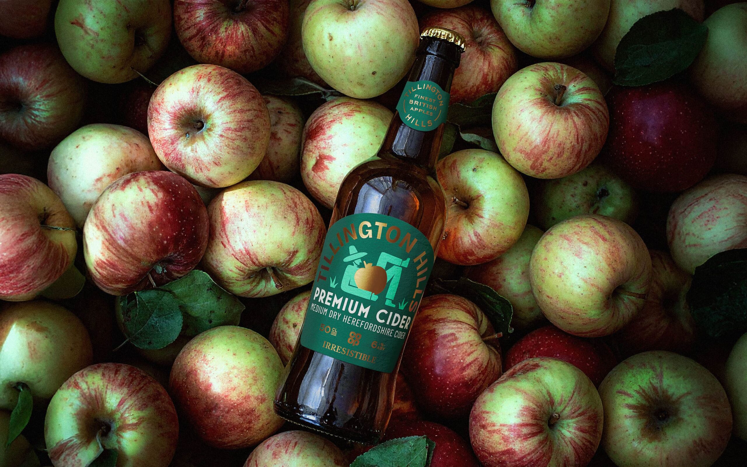
And finally, named after the orchard where the apples are harvested, Tillington Hills cider now features abstract imagery and a modern, organic feel, adding charm and depth to its story.
The result is a portfolio of products that stand confidently on their own in crowded categories, while remaining clearly and proudly part of the Co-op family.
“When looking at our Irresistible spirits and cider, we faced a big challenge – how can we make each one sit comfortably in their own categories, while still being proudly Co-op? We knew Robot Food would help us find the answer,” says Lucie Burfitt, Packaging Design Manager at Co-op. “Now each bottle is more distinct, more engaging, and much more irresistible. But they still all feel inherently us. We couldn’t be happier with the result.”
The new Co-op Irresistible spirits and cider are currently being rolled-out in Co-op stores nationwide.
Source: Robot Food
You must be logged in to post a comment Login