
Sedley Place has been collaborating with Roust’s Design Team to evolve Russian Standard Original in response to market factors and changing consumer perceptions.
Russian Standard has seen significant growth in sales volume over recent years, and has become the second largest vodka brand in the UK, but the brand hasn’t launched new, more contemporary packaging since its last refresh in 2012 to accompany this growth.
Consumer research has also identified that Russian Standard’s packaging could be developed and enhanced in order to better communicate the product’s premium positioning, its Russian provenance, its brand story and, in markets like Russia, its status and aspirational value.
The design task we were collectively set was to premiumise the overall look of the packaging, in the process making it look more expensive and valuable, and to create richer, emotionally engaging packaging cues. In particular, we were tasked to create a new closure design, a more contemporary bottle shape, a more visible bottle coating, and to design a fully revised labeling set to present the brand in a modern and impactful way.
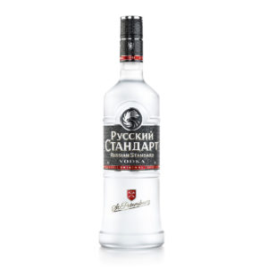
Our joint response encompassed three core areas: the closure, the bottle and the labelling. Working with Guala Closures a unique new cap was designed which features a fully embossed version of the Russian Standard pattern, top and side foiling and a more modern rendition of St. Petersburg’s city crest (the home of the brand).
The bottle has been made taller and thinner than the current bottle, to provide a slimmer and more athletic appearance. Its embossing feature has been streamlined and refined and a brighter and more frosted bottle coating introduced to enhance one of the brand’s signature features while improving its transparency.
On the labeling the onion dome has been removed to focus on proprietary and more modern graphic elements, in order to instill more pride in the brand’s uniqueness and create more consistency with the Russian Standard Platinum and Gold variants. The brand logotype has been reworked to make it more modern and more legible and other label elements have been pared back to create a minimal and modern graphic design. Lastly, a strong St. Petersburg message has been incorporated on the front of the bottle to demonstrate pride in the brand’s provenance and engender a romantic, wistful image of Russia internationally.
For Sedley Place, the project has been an interesting opportunity to get under the skin of a new brand and work collaboratively with the Roust Design Team.
“We really enjoyed diving deep into the Russian Standard brand and working with Roust on the project. As with all projects which are evolutionary rather than revolutionary the challenge was to understand what to retain and what to develop or change. Our collective solution really addresses the objectives of the brief,” says Giles Calver, Sedley Place’s Planning Director.
For Roust, the project has been equally stimulating. According to Mark Wilson, Roust’s Director of Design, “Sedley Place with their unique talents, weight of experience and track record proved to be a great partner for Roust in addressing a complex brief. The final solution bears all the hallmarks of our creative collaboration and the craftsmanship, attention-to-detail and quality Russian Standard prides itself on.”
Source: Sedley Place
You must be logged in to post a comment Login