
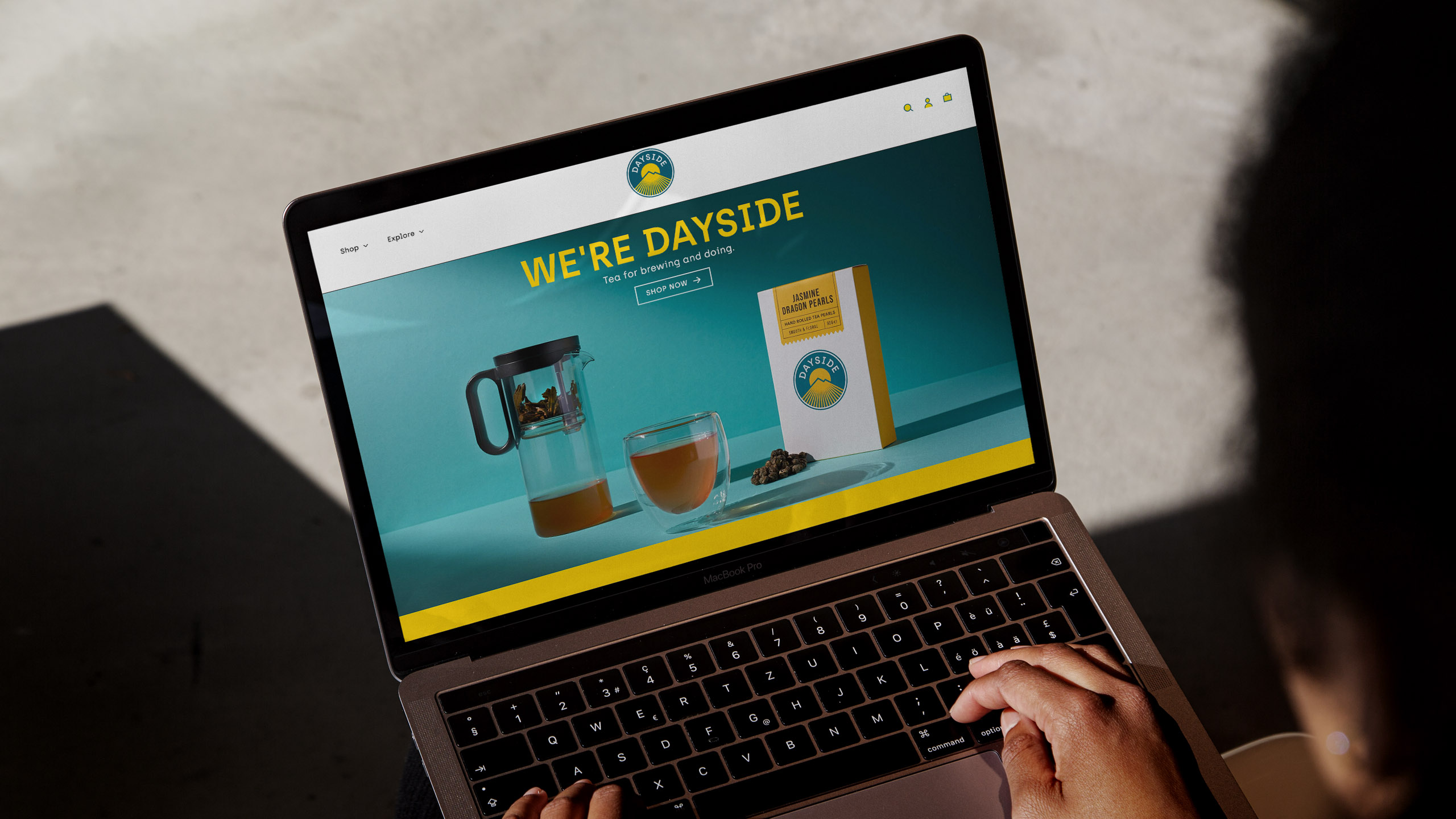
UK brand and packaging design agency, Popp Studio, has created the brand identity, packaging and e-commerce website for Dayside, a specialist D2C tea and teaware brand, launched in the UK by three co-founders, including the studio’s owners, Andrew Slade and Poppy Stedman.
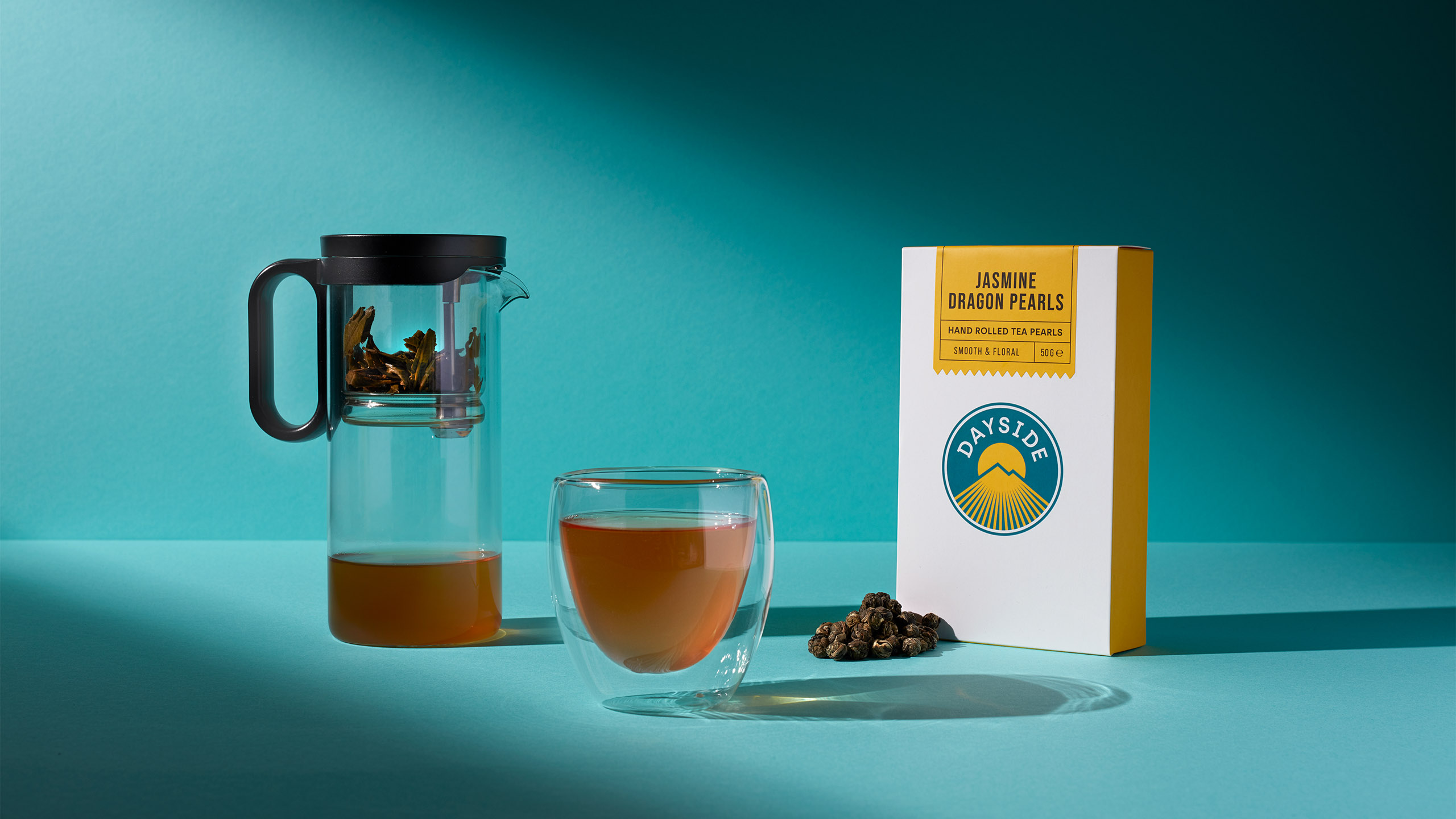
The trio are longtime drinkers of Jasmine Dragon Pearls, a Chinese green tea infused with Jasmine, and it was this special tea that inspired their vision of launching a tea lifestyle brand where great loose leaf tea, great value and great design infuse with their customer’s lives every day.
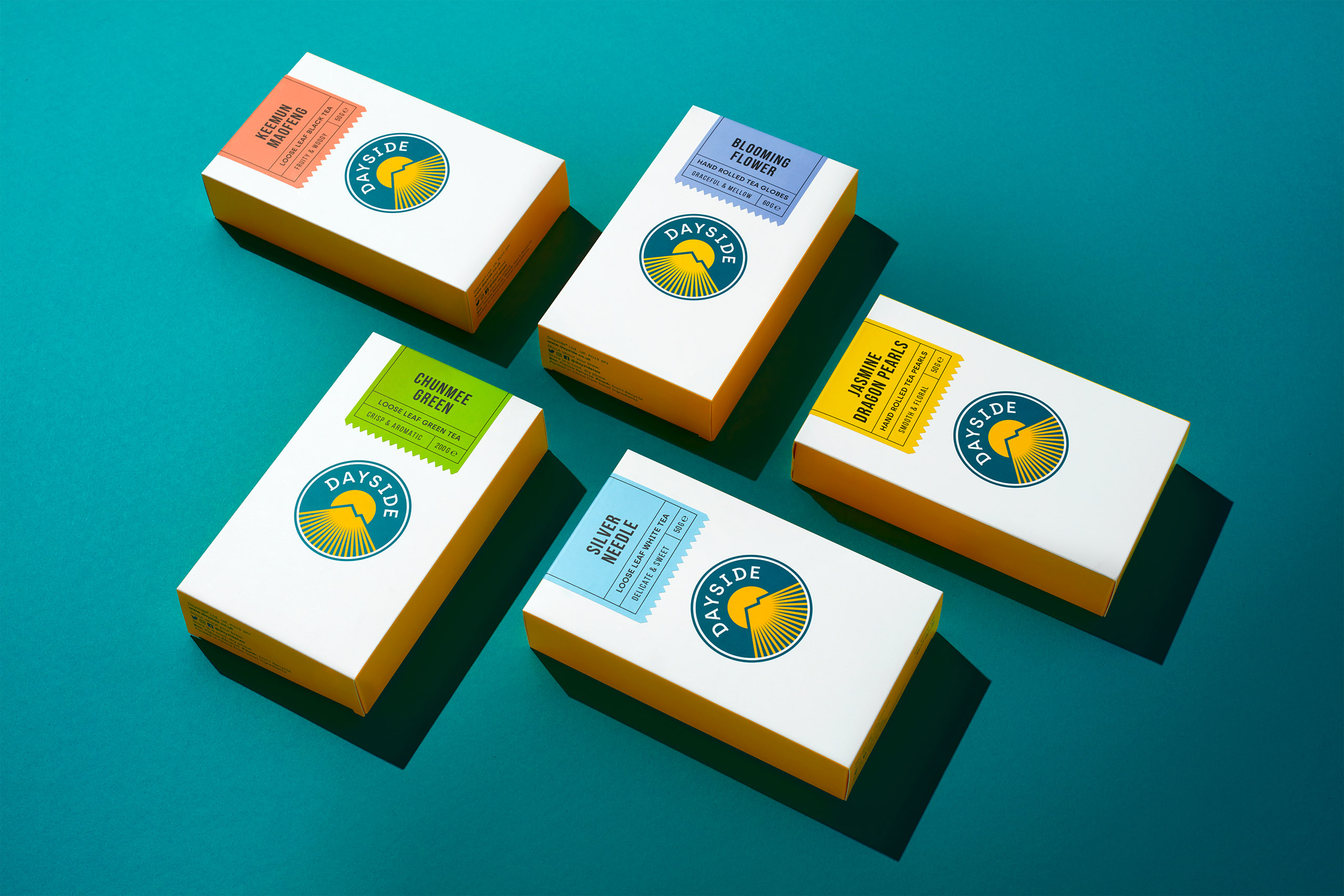
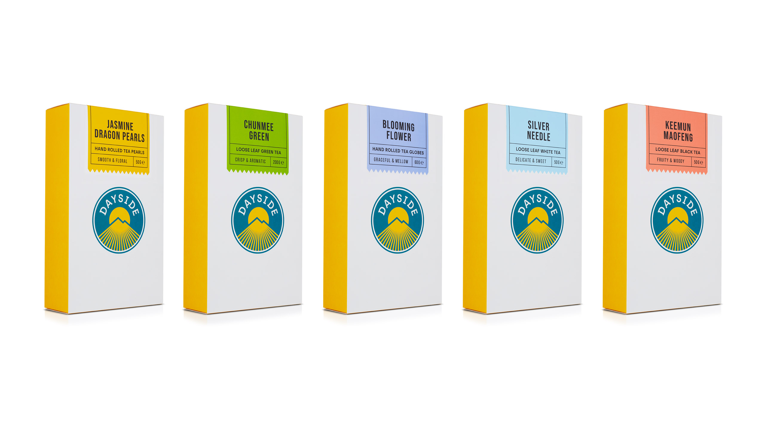
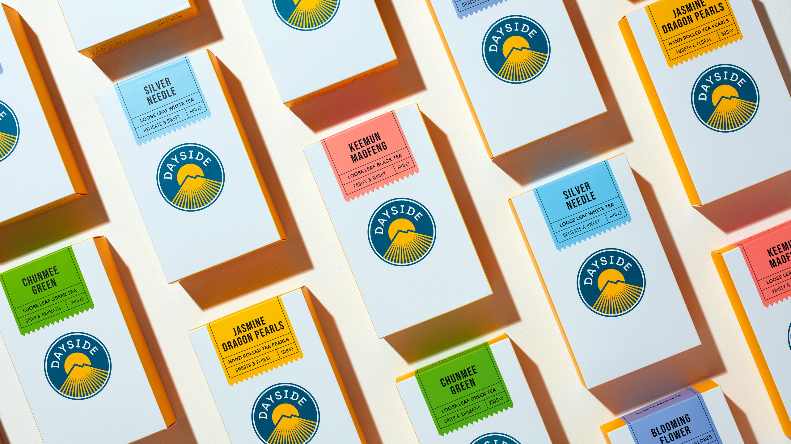
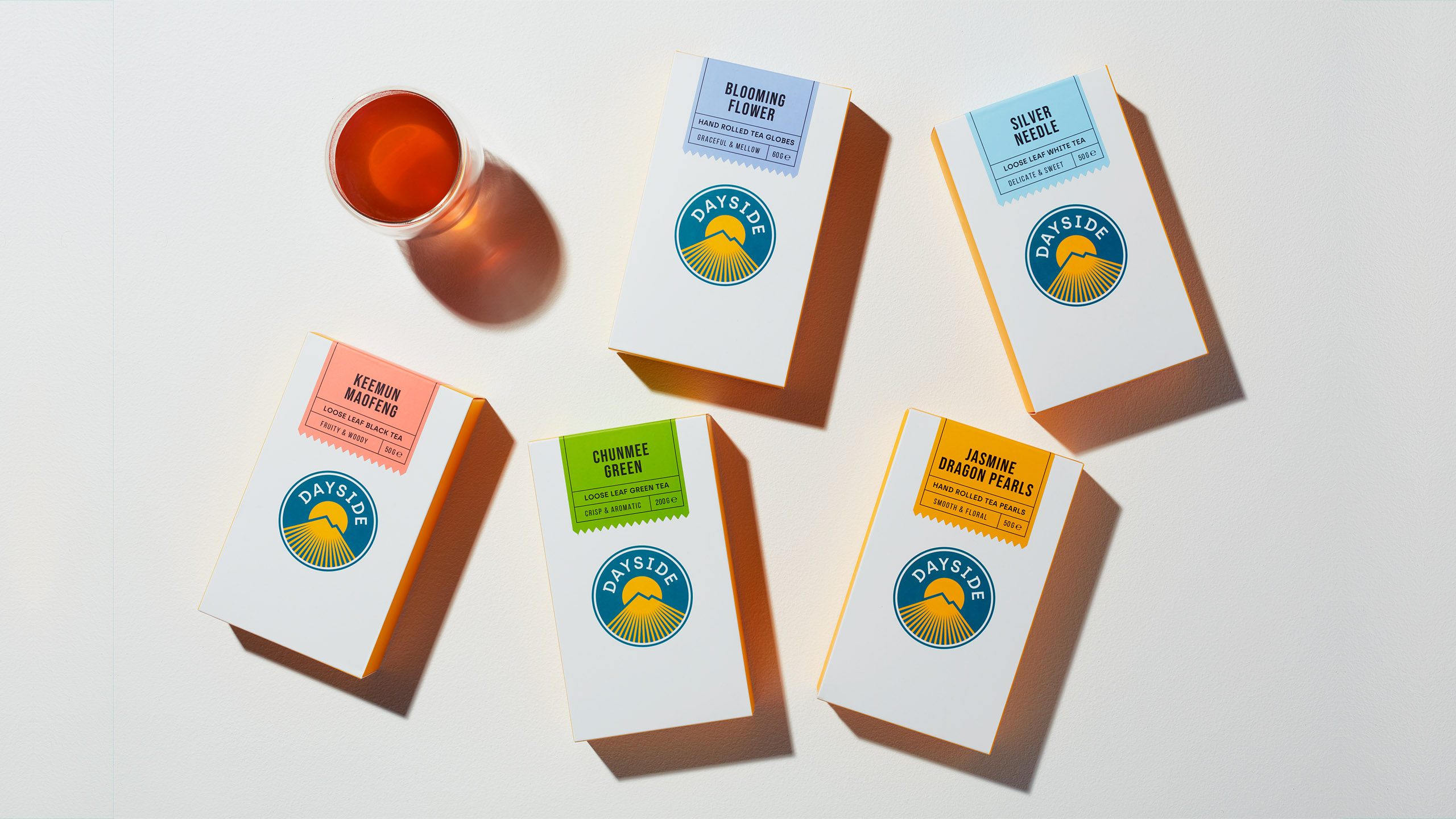
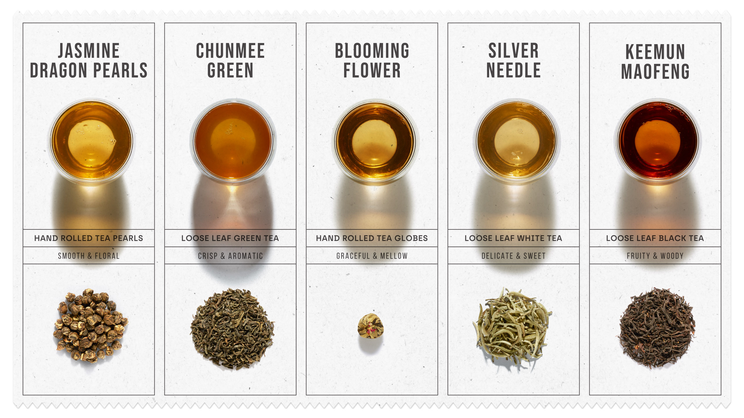
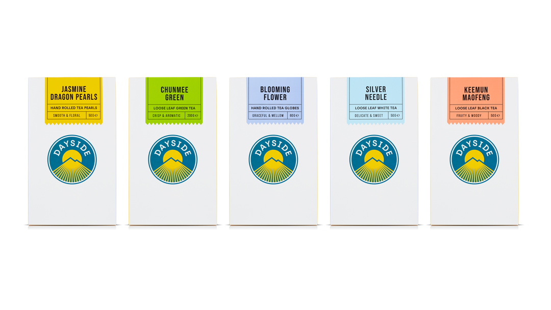
The launch range features five loose leaf teas; Jasmine Dragon Pearls, Chunmee Green, Blooming Flower, Silver Needle, and Keemun Maofeng, alongside a curated set of stylish, simple teaware for an easy, flexible and enjoyable drinking experience.
Aimed at busy Brits trying to balance work, play and chill time by helping them push pause, play or power through each day, Popp’s strategy is rooted in the idea “Embracing every dayside”.
Andrew Slade, Popp Studio and Dayside co-founder says:
“The name Dayside means the side of a planet in sunlight, facing its star. This is such a simple and powerful metaphor for a positive attitude to everyday life: embracing the day, looking after yourself for tomorrow, and enjoying the sunshine when you can.
“Embrace” has a duality in accepting everyday challenges while holding close those who are dear to you. This positive, proactive feeling is the heart of the brand because that’s how we want to connect with our audience – with an open attitude and a great product that makes every day a little better.”


The challenge was to find the right tempo, balancing simplicity with craft, vigour with calm, and modernity with heritage, all without straying into the old world of tea.
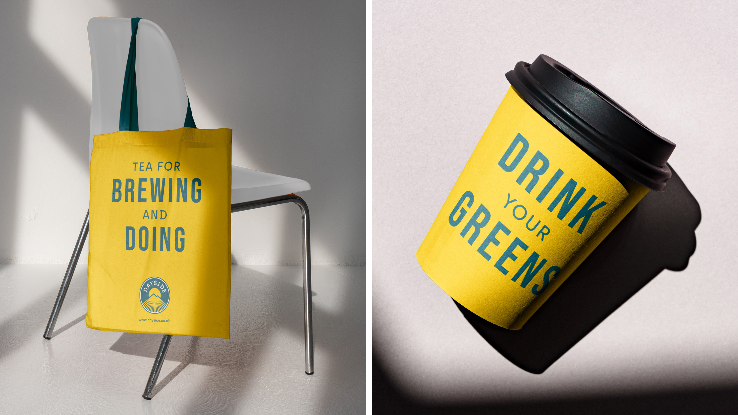
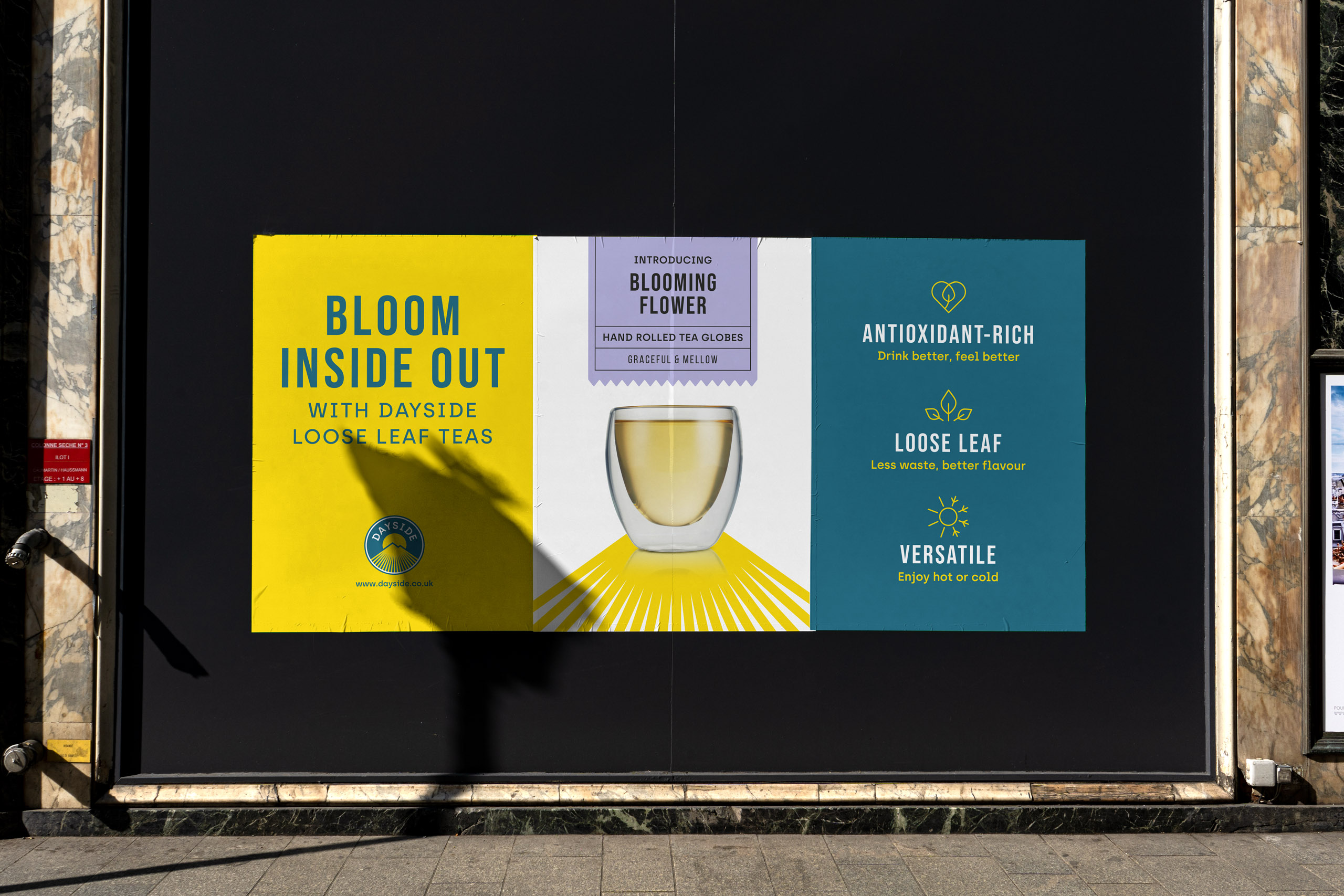
The playful and vibrant voice includes the lines “tea for brewing and doing”, “sip on the sunny side”, “drink your greens” peppering the brand story and touchpoints, and the strapline, “bloom inside out” summing up the benefits of that balanced life and days punctuated by a delicious cup of tea.
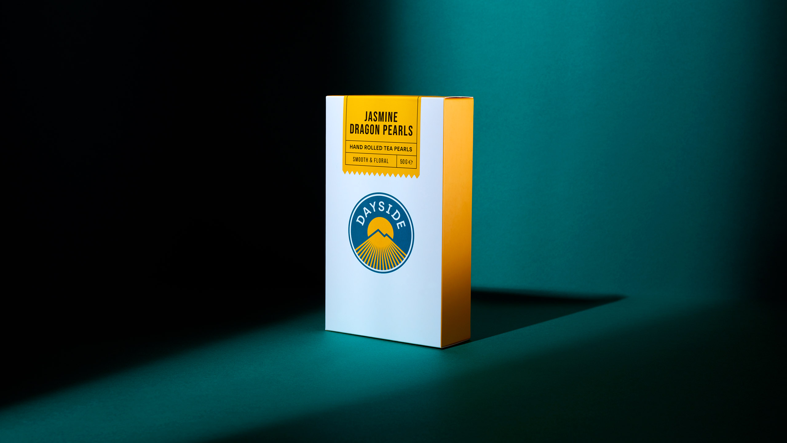
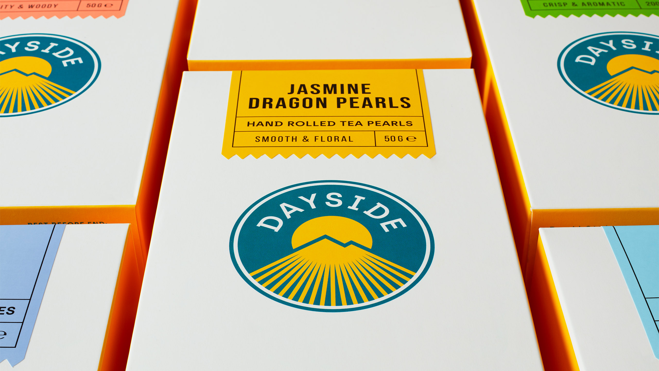
The teas are grown in the lush climate of China’s Yellow Mountain, the heart of the green tea region and the logo at the heart of the identity reflects this and the modern attitude. Slab serif typography arches over the sun of a new day, which rises from behind Yellow Mountain peaks formed by the sun’s rays.


As a new, laid-back tea brand, the logo and wider identity deliberately reject the traditional cues of the old world of tea, instead using typography and other detailing to feel crafted and considered.
On packaging, sunshine hits a simple white carton as a golden ray running around its sides. The packaging system has been deliberately designed for flexibility and cost effectiveness, with the generic, two-colour carton providing economies of scale, and two-colour, perforated labels providing variant navigation and a seal on the closure.
Variant colours create a calm yet upbeat palette that stands out on digital devices and café shelves alike.
The idea at the heart of Dayside’s brand identity really comes to life in the brand world, with rays of sunlight in photography creating a distinctive aesthetic, and vibrant yellow and lush teal flooding every touchpoint.
Popp Studio Creative Director and Co-Founder Poppy Stedman says:
“Creating the Dayside brand identity and packaging designs was not only a labour of love, but a real design and business challenge. We have maximised packaging sustainability while reducing complexity, carefully managing cost, and maintaining high quality standards. Within these constraints, the Dayside brand brings a new relaxed, modern positivity to the world of tea, with a brand identity ready to thrive in D2C and equipped for a future in retail.”
Dayside tea and teaware is currently available exclusively at www.dayside.co.uk.
Source: Popp Studio
You must be logged in to post a comment Login