 Starbucks unveiled its newest outpost, Teavana.
Unlike the company’s other 13,000+ stores, Teavana will only carry tea and it will be served in a calm environment specifically designed to lure the 158 million Americans who prefer Chamomile over cappuccinos.
In addition to an interior design that caters to tea drinkers–here food displays come after you order drinks so that you may peruse while your tea steeps–the company also revamped the most identifiable aspect of its original store: the cup.
“Even though today’s life forces most of us to be on the go, drinking tea is a traditional ritual,” says Daniele Monti, Creative Director for Emerging Brands at Starbucks.
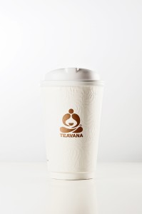
With that in mind, the Teavana cup was designed to evoke the feeling of drinking from porcelain china. That meant nixing the cardboard sleeves, which Monti calls a design “afterthought.”
 Instead, the cup has double-walled insulation that mimics the effect of a sleeve (and uses an estimated 50 percent more material than a cup-and-sleeve combo). Gone is the familiar, flat cardboard texture of the standard Starbucks cup, replaced by an embossed paper that has a feathery, foamy feel.
“It’s a Zen moment, and the cup should reflect that,” says Monti.
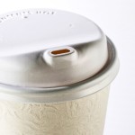
Considerable R&D was also packed into perfecting the ergonomics of the lid. The Teavana team wanted a curvier, organic look, and they widened the opening of the spout a bit so that drinkers could sip more of the beverage at once (since tea has a subtler flavor than coffee.)
In addition to how it looks, the sensory experience of the Teavana cup versus the original Starbucks coffee cup isn’t just different–it’s vastly better. No scalding fingertips, fewer splashes escaping the redesigned lid. So could this cup become the new design for Starbucks coffee drinkers as well?
“There’s a lot of love for the cup internally,” Monti says. “I wouldn’t be surprised if the question was raised.”


You must be logged in to post a comment Login