
 Tate & Lyle has updated the design of its entire sugar range to help build a stronger brand with a more clearly defined personality.
The company tasked Design Bridge to help move the perception of the brand on from its role as a household commodity to a brand with a rich heritage and personality.
As part of the revamp, Design Bridge examined the provenance and heritage of Tate & Lyle. It drew inspiration from vintage iconography, signage and old Tate & Lyle delivery trucks.
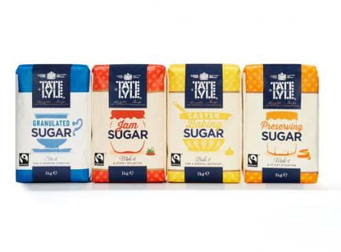
 A gingham tablecloth background is used on the baking range of sugars, with the aim of evoking an affectionate sense of all-things homemade – a nod to the brand’s British heritage. This is coupled with a font that mimics the hand-written labels of homemade preserves.
Mike Stride, creative director at Design Bridge, said developing a distinct tone of voice through both on-pack copywriting and illustration was key to the refresh.
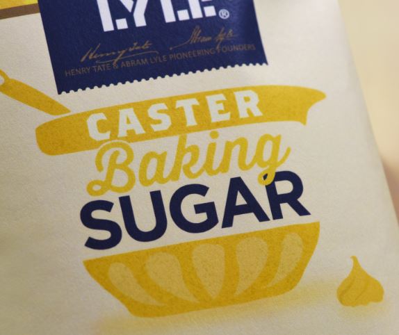
“Visually, we divided the range up using a series of quirky on-pack illustrations to communicate the usage of the different sugars while also revealing a playful, warm and witty personality. For example a fabric-covered jam jar for Preserving Sugar, a porcelain tea-cup and saucer for Granulated Sugar, and a mixing bowl 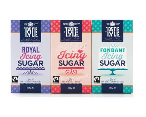 with a stray dollop of cake-mix on the worktop for Caster Baking Sugar,” he added.
Elsewhere, Tate & Lyle’s heritage comes into play on the pack designs with illustrations of the founders – Henry Tate and Abram Lyle – and their signatures on the side of the box.
Other core elements of the new brand identity include a rustic, organic texture to the packs and beverage sweeteners, which plays on the homemade ‘perfect imperfections’ look and feel inherent in the new identity.
You must be logged in to post a comment Login