Leading British charcuterie retailer Cannon & Cannon unveils new branding designed by Bath-based creative agency The Space Creative.
Cannon & Cannon was established nine years ago when the British charcuterie market was in its infancy. Fast-forward nearly a decade and they are set to reveal a striking rebrand for their online retail products.
Following significant growth in the snacks market in recent years and with this trend set to continue, The Space Creative have created a dynamic identity for Cannon & Cannon targeting foodies who are looking to experiment with new and distinctive flavours. The brief was to help the range establish its own niche within the sector, so it was crucial that the designs reflected the brand’s innovative and forward-thinking credentials.
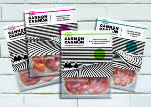
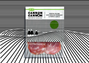
Space Creative’s illustrative packs bring to life the brand’s proposition of ‘Twisted Classic’ by communicating the unique flavour combinations and British origin of the products. The combination of black and white illustrations and a splash of colour takes the charcuterie fixture in a new direction, allowing British brand Cannon & Cannon to stand out in a category dominated by European products.

David Thomson, Creative Director of The Space Creative says the fresh approach taken by the brand is reflected in the design: “We immediately decided to steer away from traditional charcuterie packaging which typically uses reds and pinks along with images of pigs. Cannon & Cannon’s offering is original and quirky and we wanted striking pack designs that would echo that.”
There is a huge shift in the importance of buying local and British produce with consumers ranking British-made as one of the most important factors when shopping for food. This trend is driven by consumer demand for less air miles in food production and particularly in the meat category, the desire to know where the animal was raised. To tap into this trend each illustration depicts a different recognisable landscape from the British counties to communicate the location of each artisan producer.

The new logo captures something of the urban roots of the brand, with the business starting in Borough Market and now expanding across London. It deftly uses the ampersand to link the two names together in a stacked lockup that works equally well on pack, online and on merchandise.
Sean Cannon, Founder of Cannon & Cannon, said: “Having founded and grown Cannon & Cannon as a company and a brand, I must admit to some trepidation when starting the creative process with The Space Creative. The team at The Space Creative have been incredibly sensitive, supportive, kind and patient in allowing me the time and space for the process to play out and for the brand to be discovered, rationalised and delivered in some wonderful design and packaging work. Thank you The Space Creative for delivering our very exciting and beautiful new branding which I love.”
The Space Creative created the brand identity and packaging design for Cannon & Cannon. The new packaging will initially be rolled out across four of their retail products this Summer.
Source: The Space Creative

You must be logged in to post a comment Login