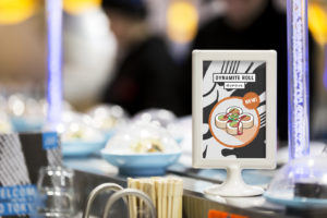
 Design agency & SMITH teamed up with Japanese restaurant YO! Sushi to refine their brand strategy and refresh their look and feel.
“As soon as I interviewed Mike Lewis (the executive chef) on day one, I knew our idea had to be centred around authenticity. He told me his tales of searching the streets, homes and restaurants of Tokyo hunting down the best recipes and ingredients to bring back to the UK. From then on it was obvious this was something we had to shout about,” said & SMITH Director, Dan Bernstein.
 Yo! Sushi was founded in 1997 and was the first to bring Japanese ‘kaiten’ conveyor belt-style eating to the UK. The brand has over 70 restaurants in the UK, plus others in the US, Denmark, the UAE, Saudi Arabia and Norway.
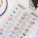
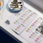
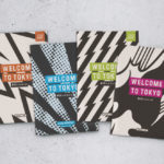
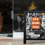
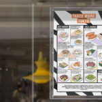
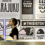
& SMITH created A-boards, menu boards and window wraps as part of a launch campaign and the brand’s menu has been reconfigured as a newspaper/zine, which features content on Tokyo music, fashion and art.
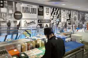 The new designs have been rolled out across all of Yo! Sushi’s UK restaurants and will appear in US sites later this month. Menus now feature black-and-white graphic patterns and illustrations loosely inspired by anime and manga comics, and Kanji script has been introduced to menus so customers can learn the Japanese names for each dish.
The new designs aims to highlight the origins of the brand’s food and re-position Yo! Sushi as a place to experience “a true taste of modern Tokyo.”
“We wanted to give everyone a taste of what’s going on in Tokyo right now. That’s where the zine/newspaper menu idea came from. It gave us the chance to show some nice snippets of art, fashion and music alongside their food. The idea is that the editorial content will change four or five times a year,” commented Dan.


You must be logged in to post a comment Login