 Last summer Nestlé appointed Taxi Studio following a three way pitch to re-affirm the POLO brand’s status as the iconic British mint.
After generations of enjoyment, the POLO brand’s packaging was in need of some TLC to keep up with the times. The team at Taxi was brought in to help refresh the POLO brand identity and enhance stand out on shelf in a way that drove relevance with a younger audience and retained existing, loyal customers.
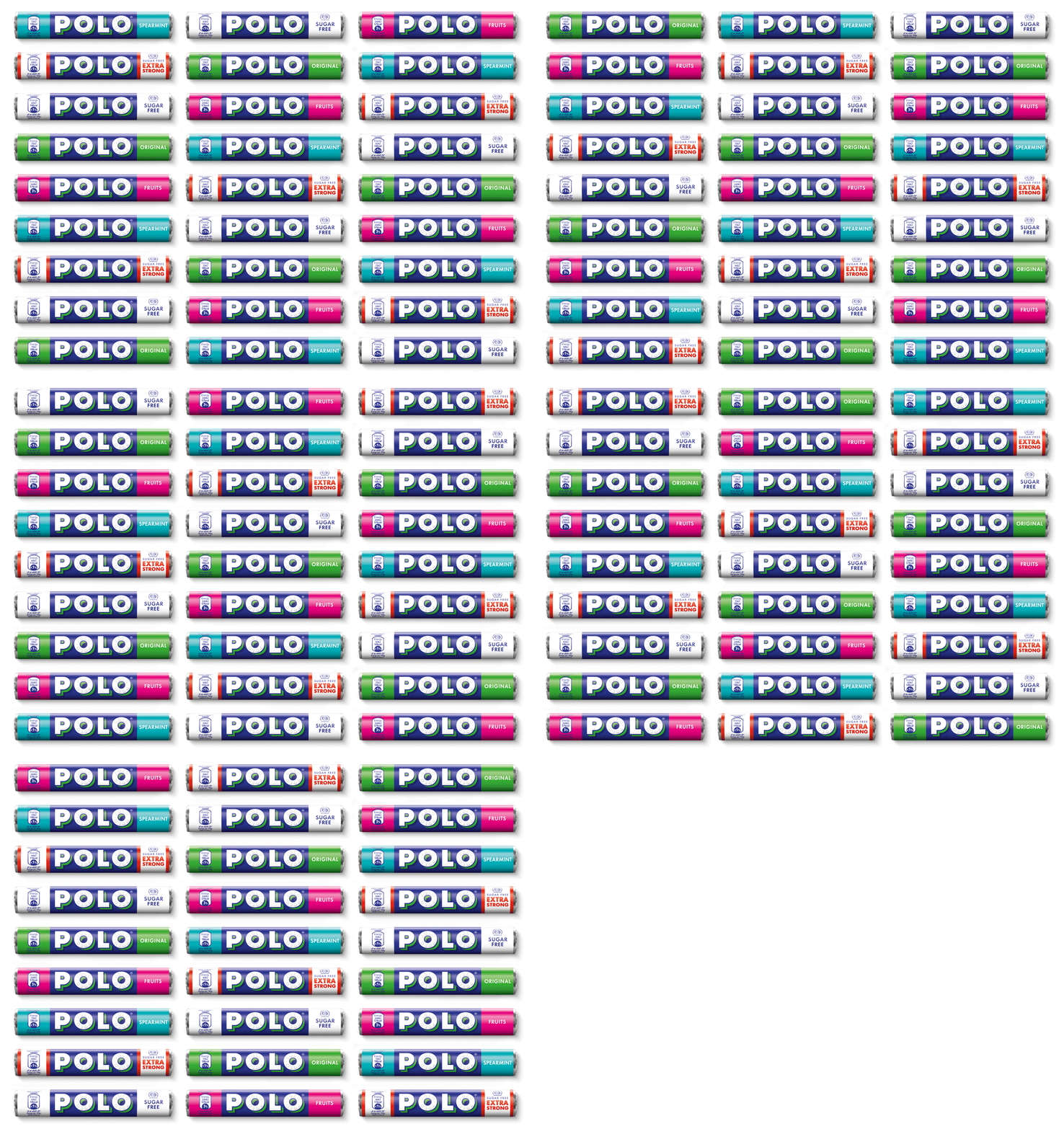
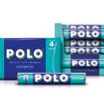
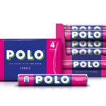
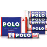
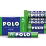
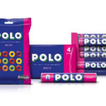
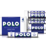
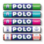
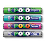
The agency set out to make the POLO brand’s packaging as iconic as the mint with the hole itself. They simplified and contemporised the design, delivering a clear modern classic with a bold new system to reflect it’s perfectly precise nature.
The new Taxi Studio designed packs will be available in stores throughout the UK later in April as the agency continue to work with POLO to activate the brand off pack.
Jonathan Turner-Rogers, Associate Creative Director at Taxi Studio expands on Taxi’s approach: “Creating an all white brandmark visually simplified the design to give greater stand out while keeping the iconic mint at the heart of the brand. The strong yet simple architecture enables the POLO brand to remain consistent regardless of flavour variant to create an impactful brand blocking effect.”
Laura Steer, Brand Manager for the POLO brand said: “We’re delighted with the sleek, new designs from Taxi Studio. Effortlessly stylish in a way that captures the heart and heritage of our brand, we’re certain that our new look will engage consumers in 2016 and re-enforce the POLO brand’s status as a true modern classic.”


You must be logged in to post a comment Login