
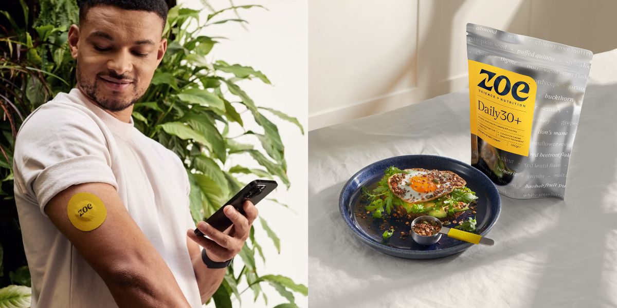
ZOE, the science and nutrition company, is on a mission to improve the health of millions by helping people make smarter food choices. Already well-known for their personalised nutrition guidance & technically advanced at-home tests with distinctive yellow branding, such as their connected skin patches, as sported by Dragon’s Den investor, Steven Bartlett. ZOE are now spreading their message to a larger audience with the launch of their first own-brand product, Daily30+, a wholefood, plant-based supplement.
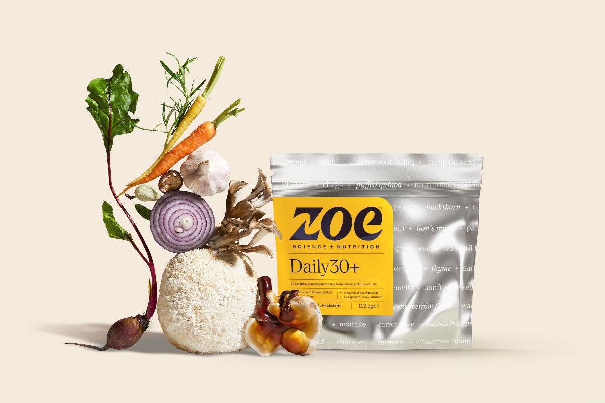
Daily30+’s blend of over 30 selected plants was formulated by ZOE scientists to set a new standard for the supplements category. Clinically proven to improve health, it challenges the status quo of synthetic micronutrients, that are presented as ‘healthy’ but are often lacking any hard evidence. ZOE came to Butterfly Cannon for a brand design that clearly positioned Daily30+ in the world of supplements, while highlighting its cutting-edge science.
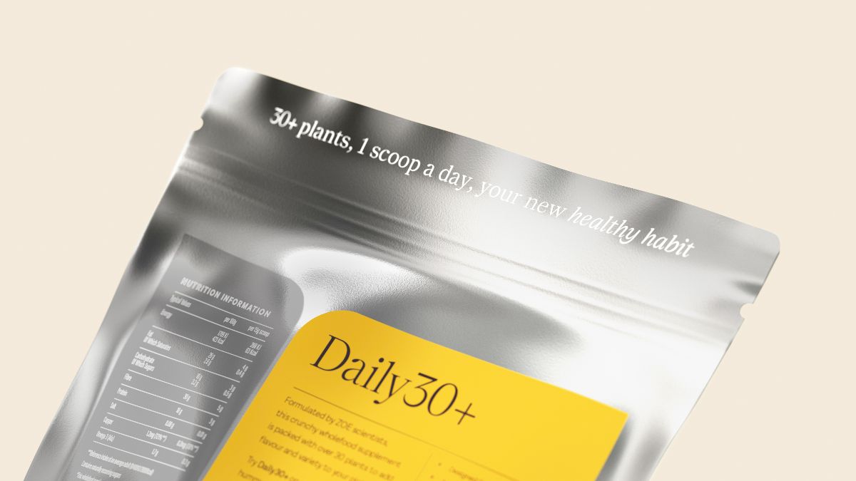
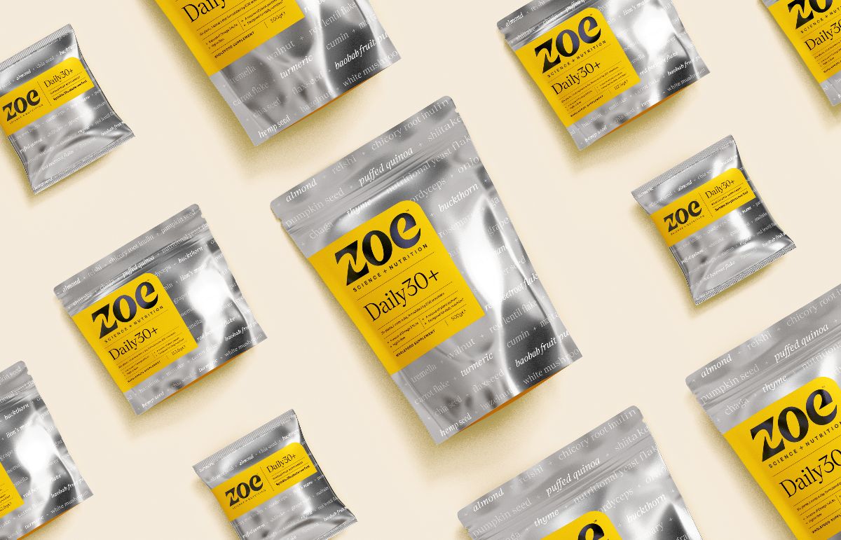
We created a new brand lockup, bringing ZOE together with ‘Science + Nutrition’, to reinforce the name already used in ZOE’s chart-topping podcast. The new brand mark is balanced with the Daily30+ wordmark and product information, all held within a keyline grid system that creates re-assurance and trust by visually echoing scientific test sheets. This is softened by the joyful yellow panel: its one rounded corner echoes the ‘e’ of ZOE.

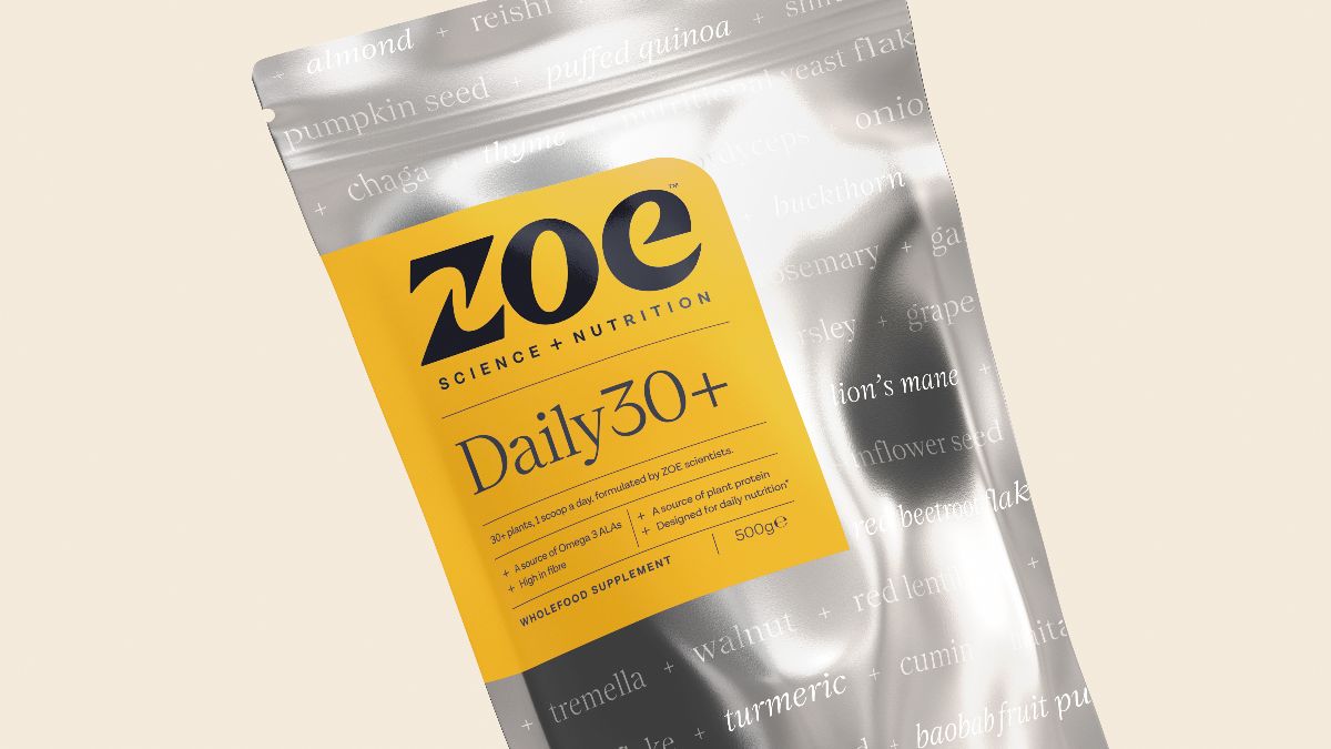
Our ‘Smart Notations’ design idea amplifies the science behind Daily30+, bringing credibility and differentiation to the category, while emphasising that it’s made from real, wholefood ingredients.
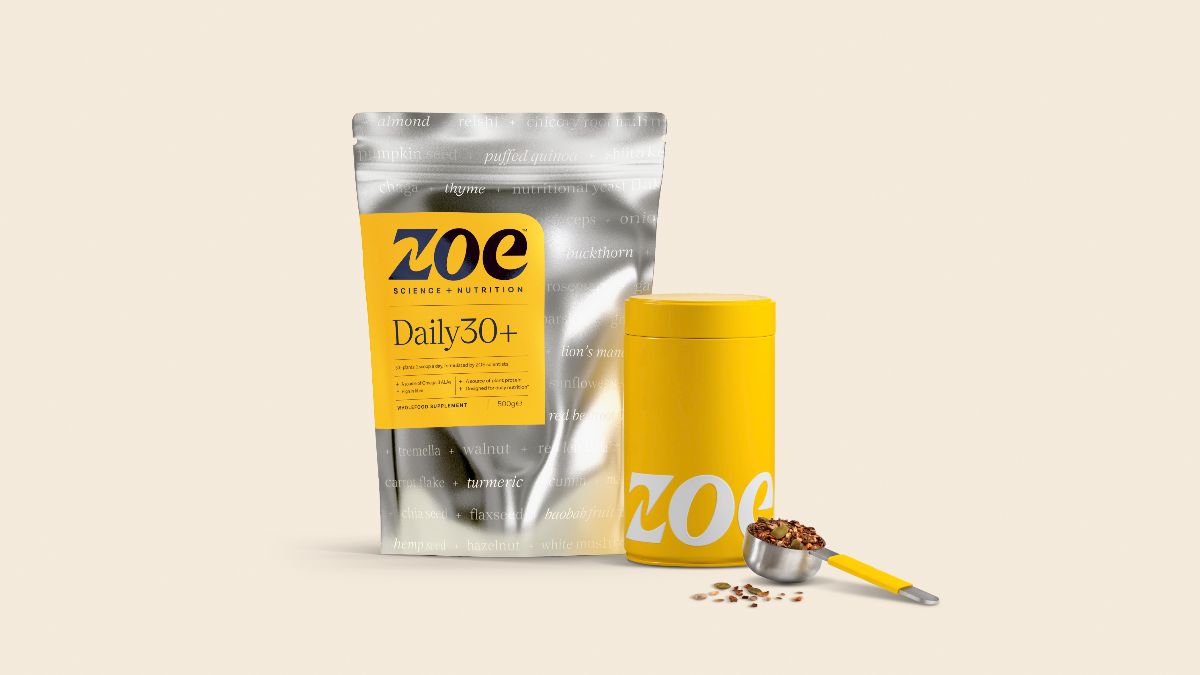
With absolutely nothing to hide, the 30+ wholefood ingredients are heroed and combined with the ‘+’ symbol from the Daily30+ wordmark to become a graphical device around the pack. Hero ingredients, such as the Lion’s Mane mushroom are picked out using different typographic treatments and tints of ink, against a glossy dark silver pack that visually communicates the scientific nature of the brand in a progressive way and dials up the difficult to access plants included inside. On the back of pack, the tagline ‘your new healthy habit’ runs along the tear strip as a discoverable detail, adding engagement at the point of opening.
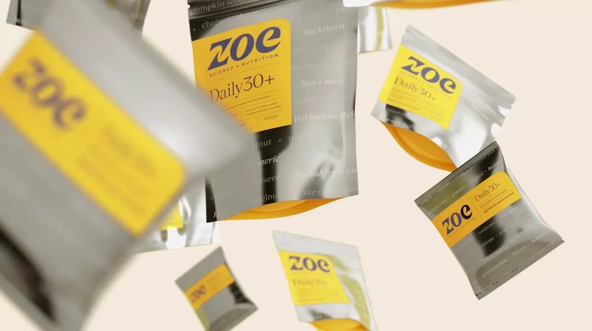
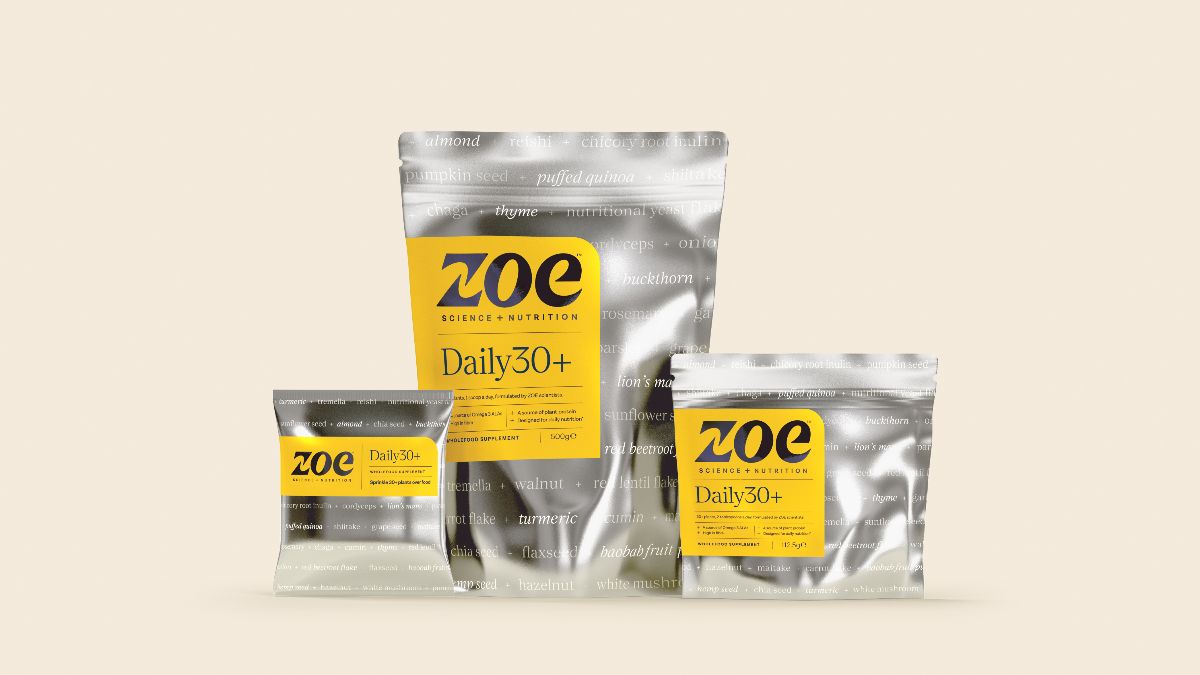
We adapted and rolled out the designs across three different formats. Monthly packs are now available on zoe.com, with weekly and single serve sachets available in the fresh and food to go aisles at Waitrose and waitrose.com. Further collaborations between ZOE and Butterfly Cannon are already in the pipeline.
“Daily30+ is the first product in our Science and Nutrition range, so we looked to Butterfly Cannon to create a system that could live across multiple formats. The team did a brilliant job from strategy to design producing work that enhances our scientific credentials and emphasises the quality ingredients inside. The final designs across pouches and retail POS reinforce ZOE’s core identity while nicely expanding it into new spaces.”
Sara Gordon, General Manager, New Product Development, ZOE
“It was a dream come true to work with the ZOE team on the creation of such a ground-breaking product. As we were essentially creating a new sub-category, our design had to simultaneously fit in and stand out within the world of supplements. No mean feat, but by leaning into the progressive science behind Daily30+, the team created a standout design that has credibility and gravitas, whilst keeping the sense of joy that is a key part of the ZOE brand.”
Sam Pittman, Associate Creative Director, Butterfly Cannon
Source: Butterfly Cannon
You must be logged in to post a comment Login