
DN Designs has completed the branding and packaging design for Wlue’s Makhana, a contemporary snack brand created to appeal to a younger, trend-aware consumer base. Positioned within the highly competitive FMCG snacks category, the project delivers a vibrant and expressive brand identity designed to stand out at shelf level and resonate with Gen Z audiences.
Wlue’s enters a category traditionally dominated by familiar visual codes and legacy branding. DN Designs approached the project with the objective of breaking away from conventional snack aesthetics and building a brand that feels energetic, confident, and culturally relevant to a new generation of consumers.
Repositioning a Traditional Category
From the outset, the project focused on redefining how a snack brand can communicate with younger audiences. Rather than relying on heritage cues or functional claims alone, the brand positioning was developed around personality, confidence, and visual impact.
DN Designs conducted an assessment of category patterns, retail environments, and youth-driven consumer behaviour to identify opportunities for differentiation. The goal was to create a brand that feels modern and playful while remaining commercially effective in retail settings.

Concept and Visual Language
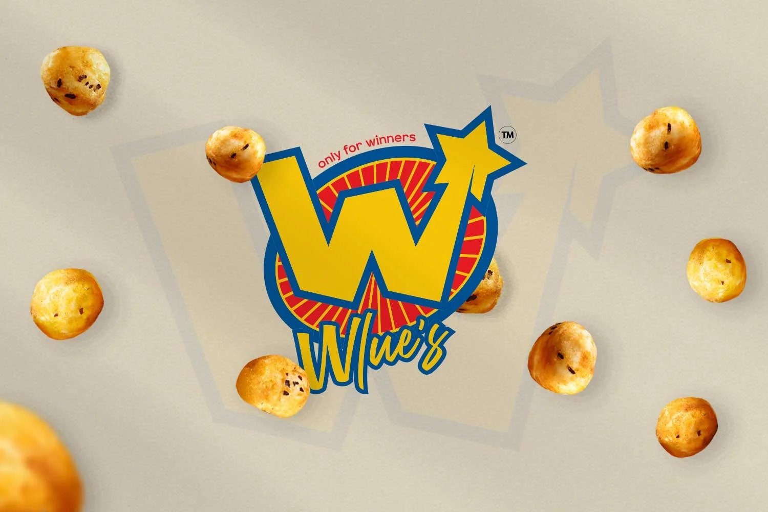
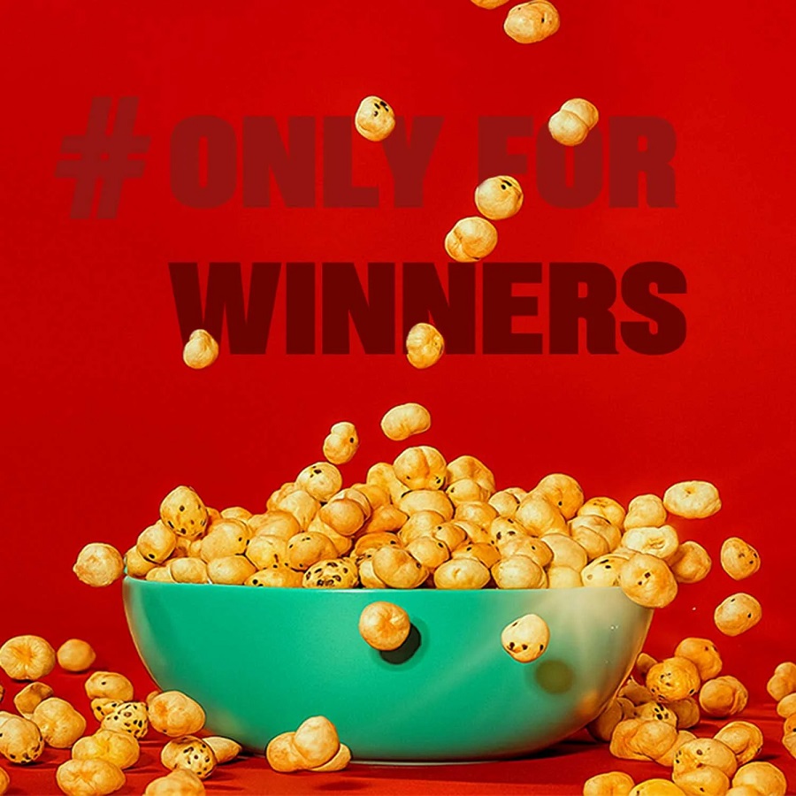
The Wlue’s brand identity is built around bold colour usage, expressive typography, and graphic elements that convey energy and attitude. The visual language is intentionally unapologetic, designed to capture attention quickly and create strong shelf presence.
Typography plays a key role in establishing brand character, supported by graphic motifs that reinforce movement and confidence. The system avoids subtlety in favour of clarity and recognisability, ensuring the brand is easily identifiable across formats.
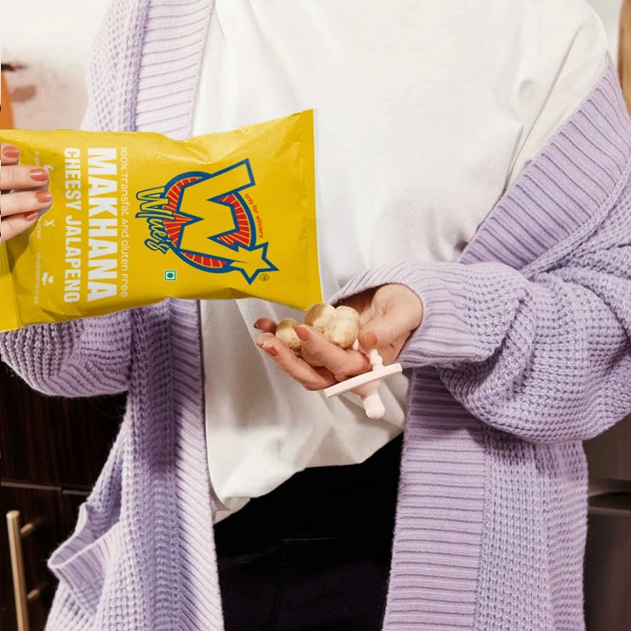
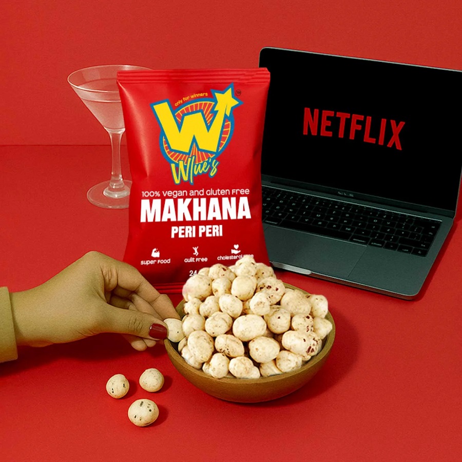
Packaging Design and Shelf Impact
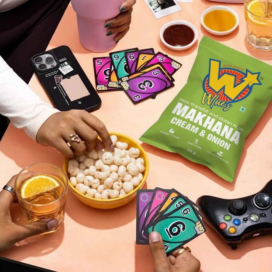
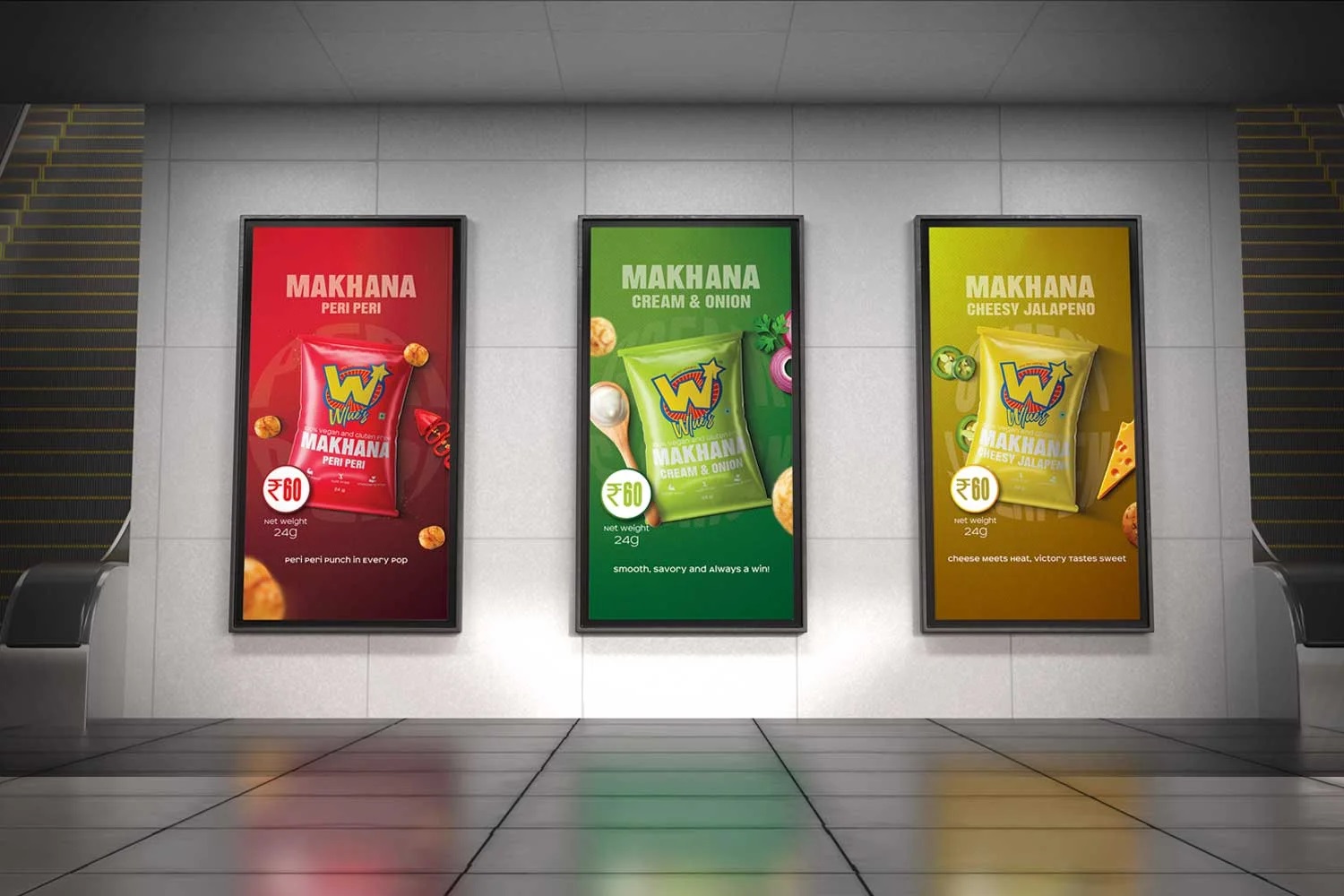
Packaging was developed as a flexible yet consistent system, allowing multiple SKUs to coexist while maintaining a unified brand presence. Colour variation is used to differentiate flavours, while layout structure and brand assets remain consistent to support recognition.
Information hierarchy was carefully considered to ensure that brand name, product type, and key details are communicated clearly without visual clutter. The packaging design balances expressive aesthetics with functional clarity, supporting quick consumer decision-making in retail environments.

Brand Outcome and Market Positioning
The completed Wlue’s identity positions the brand as confident, contemporary, and culturally aligned with a Gen Z audience. Through the strategic use of colour, scale, and graphic clarity, the packaging delivers strong shelf visibility, enabling the brand to compete effectively within a crowded snack category.
The project reflects a broader shift in FMCG branding, where emotional resonance and cultural relevance play an increasingly important role alongside product quality and pricing.
Source: DN Designs
You must be logged in to post a comment Login