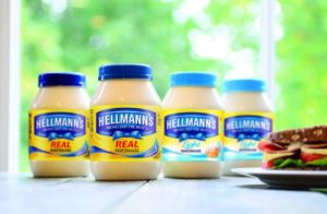
 International brand design agency Design Bridge announced details of its work on the newly refreshed global brand identity and packaging relaunch for Hellmann’s Mayonnaise.
The hugely popular Unilever brand chose Design Bridge to update the brand in order to reiterate the product’s category-leading position, and to emphasise its superior quality and taste to consumers. The new pack design is launching first in the USA, followed by Europe, and then in other important regions later in the year.
A core ethos for both Unilever and Design Bridge is ‘crafting brands for life’, whereby the full personality of a brand and its relationship with consumers is understood and leveraged for ongoing growth. As such, for Hellmann’s Mayonnaise – one of Unilever’s core product ranges – a key driver for the new identity was to future-proof the brand with a clear brand statement highlighting product quality and food appeal.
Another part of the brief to Design Bridge was that the new single identity and packaging range design for Hellmann’s Mayonnaise should reflect the brand’s leadership position and price point and aid in delivering consistency globally.
Having celebrated its 100-year anniversary in 2013, it was also an opportunity to acknowledge the heritage of Hellmann’s Mayonnaise and re-evaluate some of the key brand equities that over time had become obsolete, or lost across international variations.
Perhaps the most noticeable change with the new identity is the dramatisation of the blue ribbon motif. Reflecting the real blue ribbon famously used as a sign of top product quality by Richard Hellmann in his New York deli, the new identity pays homage to this and reinvigorates what had become a tired equity into one which underscores the quality of the real ingredients in Hellmann’s Real Mayonnaise.
Other key elements of the identity refresh include:
- The backdrop is richer, more creamy, and has more texture to reflect the product and drive taste and pleasure appeal
- Greater emphasis is given to the word ‘Real’ to highlight the quality ingredients
- The typography on pack has been softened to reflect the food values of the product
- The well-known ‘Bring Out The Best’ slogan has been positioned more prominently within the iconic blue cartouche, driving the message that with Hellmann’s Mayonnaise you can elevate your day – for example making a ‘good’ sandwich into a ‘great’ sandwich
- The resulting new branding visual has been protected with an application to register it as a distinctive trade mark in over 45 countries.
Jim Burton, Client Business Director, Design Bridge commented:
“Hellmann’s Mayonnaise has such a rich story to tell. We looked to reignite and play on that sense of craftsmanship when Richard Hellmann first opened his deli in New York, and to deliverer a new identity and pack reflective of a quality food product. The previous design lacked food appeal and emotion, while the blue ribbon and its story was almost lost. The new identity celebrates the heritage of Hellmann’s Mayonnaise and its quality ingredients and engages at an emotional level which helps in justifying its price point.”
David Lowes, Senior Vice President of Dressings at Unilever added:
“Born in a deli over 100 years ago, Richard Hellmann crafted and nurtured a product that is now truly loved by over 450 million people in over 50 countries. This redesign continues the commitment to quality and taste and brings back to life our Blue Ribbon – our stamp of quality used by Hellmann himself in his New York deli. Design Bridge has been a great partner through the process providing strategic understanding of the brand, our consumer, our heritage and the market place. The result is a true evolution of the Hellmann’s story that takes us towards our ambition of being irresistible.”

You must be logged in to post a comment Login