 Jacob’s biscuits is rolling out a new identity and packaging designs as part of a £10 million push to create a new “masterbrand” for the biscuits.
The new designs for the United Biscuits brand have been created by JKR.
Jacob’s announced the brand push last April, when it launched a new advertising campaign created by Publicis.
As part of the move, all UB’s savoury biscuit brands – which include Mini Cheddars and Twiglets – are being brought under the Jacob’s masterbrand.
 Martin Glenn, chief executive of UB, said at the time, “[This project] will improve and simplify the shopping experience for customers, putting all our savoury brands clearly under the same premium masterbrand.”
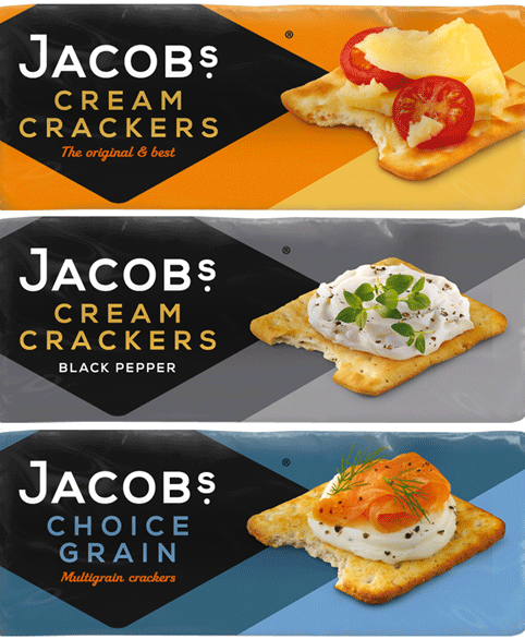
New designs and packaging for the Jacob’s range are now rolling out.
The new packs see the Jacob’s typeface updated and new pack graphics used. A new strapline “baked to delight” replaces the previous “simply baked” line. The apostrophe in the Jacob’s name has also been dropped.
The Jacob’s black diamond remains, but the wordmark has moved up to make space for the product names.

You must be logged in to post a comment Login