 Strategic brand design agency bluemarlin has supported Tropical Forest Products in unifying its range of premium honeys with the new brand, Wainwrights Honey. Blending a modern artisan aesthetic with vibrant creative energy, the new identity and packaging design tell a dynamic story of craft, community and commitment.
Wainwrights Honey has recently launched nationwide in select specialty grocers including Waitrose. The Wainwright Bee Farm in the UK has been producing honey since 1974. After a volunteer trip to Zambia working with traditional bark hive beekeepers, founder David Wainwright set up Tropical Forest Products.
It became the first UK company to import organic honey and beeswax from Africa and its development work in the region makes a real and lasting change to the livelihoods of beekeepers and their families. The company’s efforts also contribute to the continued protection of the forest by the local communities who benefit from them.
 Whilst Wainwright’s had a delicious product with a strong purpose, it was in need of an identity that reflected its premium quality, communicated its rich brand story, and showcased its commitment to the traditional craft. Bluemarlin was tasked with articulating new positioning that reflected Wainwright’s unique place in the market and a harmonious brand approach that united artisanship, delicious flavour and global community.
After a comprehensive strategic analysis, bluemarlin defined a central idea for Wainwright Honey’s brand positioning: The Honey Collective. The sentiment of this idea holds true to the brand’s philosophy and ethos as a company that works with independent, like-minded beekeepers that champion traditional practices around the world to ensure the integrity of the distinctive flavours of these regions are captured. Its products appeal to consumers excited about unique flavours created from the natural flowers and plants of the bees’ habitats as well as those supportive of brands that have a meaningful purpose.
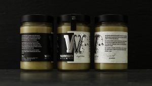
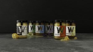
 The new brand mark establishes the brand with distinct typography that reflects its artisan commitment and British roots. The packaging solution is driven by the creative idea, ‘Tale of Two.’ To powerfully communicate the brand’s compelling story, the Wainwright’s “W” is divided in two. Whilst the left side consistently reinforces the brand with a strong black and white expression and the tagline, ‘United by Bees,’ the right side uses vibrant colours and distinctive patterns to convey the local area from which the honey is harvested.
On back of pack, each variant features a unique story. Told with passion by David Wainwright, they detail his travels to new lands in search of honey, the traditional methods and craft he discovered, his observations of bees in different regions, and how these all these factors contribute to distinctive flavour of each honey. David’s signature appears at the end of each story adding a layer of authenticity and acting as a seal of approval.
 “Tropical Forest already possessed a powerful story and purpose,” comments David Hodgson, Creative Director at bluemarlin. “Its honey range deserved an identity that disrupted the category with modern appeal and energy. Whilst the new logo acts as a seal of artisan quality and commitment, the packaging solution brings to life the incredible story and flavour profile that sets Wainwright’s Honey above the rest.”
David Wainwright, Founder of Tropical Forest Products comments, “Bluemarlin’s creative solution for Wainwright’s Honey heralds a new exciting chapter for our company. It successfully brings together modern sophistication and expressive vibrancy, whilst also strategically setting up Wainwright’s Honey for future growth.”
Source: bluemarlin

You must be logged in to post a comment Login