
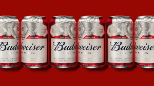
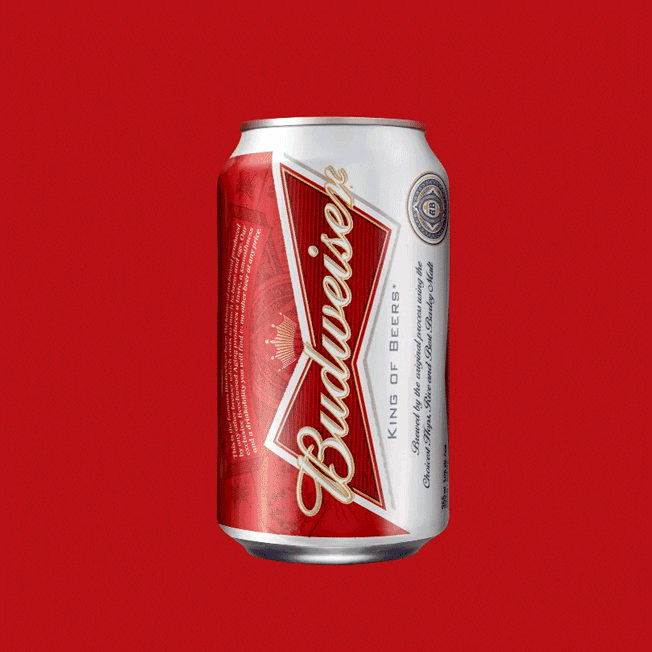
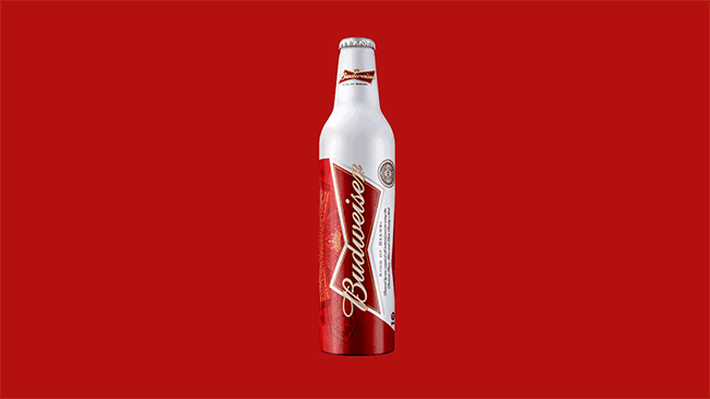
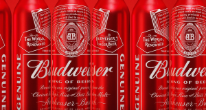
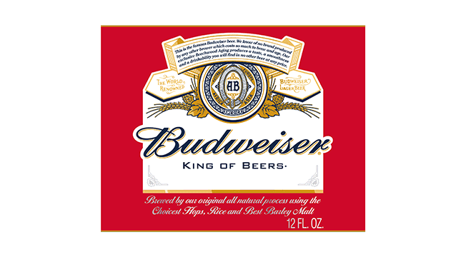
 Budweiser has just given its visual identity a refresh, choosing to focus on the brand’s original logotype.
The signature red, script font, and famous creed still feature prominently, but in a flatter, monochromatic fashion. Its iconic bowtie, which was the highlight of the 2011 redesign, has been scaled down to appear only on the bottle’s neck.
The redesign comes from the creative firm Jones Knowles Ritchie, and will be rolled out worldwide by mid-February.
 It was inspired by two trends—“ the rise of craft beer and better living through quality ingredients”, which were addressed by “stripping down the design to the visual essentials, emphasizing their crest and creed—all with a fresh aesthetic.”
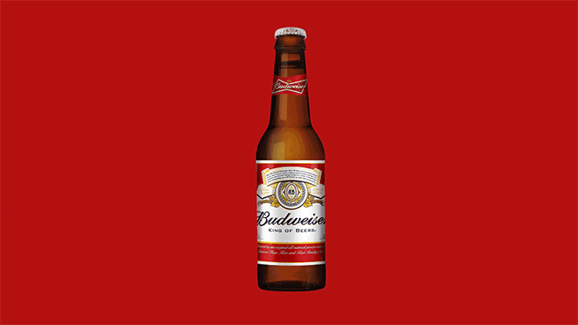
 With this cleaner, sharper relook at its heritage, Budweiser hopes that the new packaging will reflect the level of care and attention that goes into the beer they produce.
You must be logged in to post a comment Login